Café, Paciencia y Guardias – Coffee, Patience and On-Call Shifts
Across Spain, the dedication of its medical professionals is in the spotlight. While headlines might focus on negotiations and demands, there’s an undeniable undercurrent of shared experience and camaraderie that binds doctors, nurses, and residents. It’s in these everyday realities, often fueled by endless shifts and copious coffee, that a unique opportunity for resonant e-commerce design emerges.
The Cultural Significance
Currently, the Spanish healthcare system is at the heart of a significant national conversation. Medical professionals across the country have united in a nationwide strike, protesting challenging working conditions and advocating for a dedicated professional statute. This isn’t just a fleeting news item; it’s a deep-seated movement reflecting the daily pressures faced by those on the front lines of public health. The widespread support and discussions surrounding this topic reveal a collective desire for recognition and improvement, making it a highly relevant, if sensitive, subject that has captured the nation’s attention.
Design Brainstorm: Capturing the Aesthetic
Navigating politically charged trends in e-commerce requires a nuanced approach. For this situation, the design concept pivots from the immediate political tension to celebrate the universal, relatable humor found within the medical community itself. It’s about creating a subtle nod to their daily grind, fostering a sense of shared identity and appreciation.
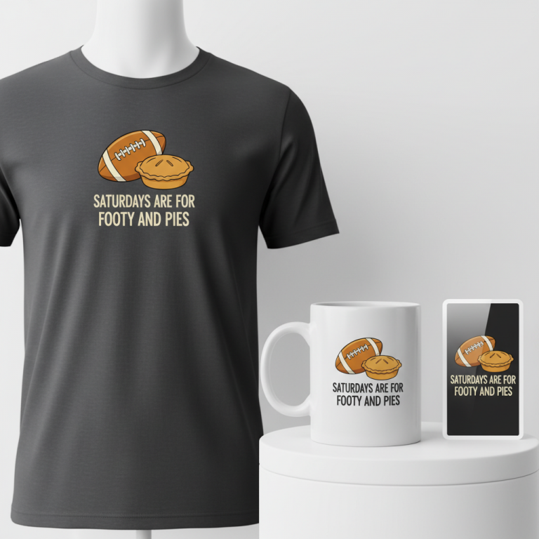
- 🎨 Visual Concept: The vision here is elegantly straightforward and instantly recognizable within its intended community. A simple, text-based design stands out for its clarity and wit. The core message is arranged in a clean, stacked list format, making it easy to read at a glance. A charming, stylized coffee cup icon subtly placed next to the first line adds a touch of warm, human relatability, instantly signaling the long hours and essential pick-me-ups inherent to medical life.
- ✍️ Typography Ideas: The choice of typography plays a crucial role in setting the tone. A friendly, rounded sans-serif font would provide approachability and comfort, softening the edges of a demanding profession. The chosen text, “Café, Paciencia y Guardias,” encapsulates the core elements of a medical professional’s routine – the essential coffee, the infinite patience required, and the ubiquitous, often grueling, shifts. This specific phrasing resonates deeply with those who live it daily.
- 👕 Product Canvas: Light-colored apparel provides an ideal backdrop for this design. Not only does it offer a clean, crisp canvas that allows the text and icon to pop, but light fabrics are also often preferred by healthcare professionals for their comfort and breathability during long, demanding shifts.
Strategic Market Insight
Diving into a trend born from a political event, such as a strike, naturally carries certain risks. However, the true genius of this particular design strategy lies in its diplomatic pivot. Instead of directly engaging with the potentially divisive “strike” narrative, it thoughtfully shifts focus to the positive, appreciative, and universally relatable aspects of a medical professional’s daily life. The target demographic becomes Spanish doctors, nurses, and medical residents – individuals who intimately understand the subtle humor and shared struggles implied by “Café, Paciencia y Guardias.” This approach taps into a powerful psychological trigger: the desire for belonging and recognition within a demanding field. By offering a design that articulates an inside joke or a shared reality, it cultivates a sense of camaraderie, appreciation, and lighthearted self-awareness, making the merchandise a badge of honor rather than a political statement.
⚖️ Estimated Copyright Risk: LOW
Our Findings: The phrase is a unique combination of common Spanish words that describe a doctor’s life. It is not a registered trademark or a well-known slogan, making it safe to use.
Always verify intellectual property rights before listing.
Check EU Trademark Search for “Huelga Médicos” ➔
AI Image Generation Prompts
The following prompts are optimized for leading generators to produce production-ready assets:
👕 Apparel / T-Shirt Prompt
A print-ready, clean vector illustration for a t-shirt. The design prominently features the humorous text 'Café, Paciencia y Guardias' arranged in a modern, stacked, and perfectly centered format. The typography employs a friendly, rounded sans-serif font, specifically chosen for its soft, approachable character, exceptional legibility, and contemporary aesthetic, with smooth, clean lines and robust, yet gentle, letterforms. Each word is distinctly placed on its own line, creating a clear visual hierarchy and balanced composition. A small, minimalist, stylized coffee cup icon, depicted in a simple line art style with two subtle, curved steam lines, is elegantly positioned directly to the left of the word 'Café,' on the top line. The entire graphic design is characterized by its crisp, precise vector lines, perfectly smooth curves, and uniform stroke weights, ensuring a professional, high-quality, and scalable print output. The color palette within the design is flat, solid, and vibrant, devoid of any complex gradients, internal shadows, or textures, making it highly versatile for various garment colors and printing methods like screen printing or direct-to-garment. The rendering is akin to a meticulously crafted digital graphic, sharp, defined, and optimized for maximum clarity on fabric. The overall mood conveyed is one of calm, comfort, and gentle, relatable humor, made inviting through the choice of typography and simple, effective iconography. The illustration is isolated on a solid Light background, clean vector illustration style, guaranteeing effortless integration into product mockups. The ONLY text allowed in the image is exactly 'Café, Paciencia y Guardias'. Absolutely NO other names, words, or random letters.--ar 3:4 --v 6.0
☕ Drinkware / Mug Prompt
A duplicated side-by-side layout showing the exact same graphic on the left and right, designed perfectly for a panoramic mug wrap. The central design features the charmingly humorous text 'Café, Paciencia y Guardias' arranged in a clean, vertically stacked list format. The typography utilized is a warm, friendly, rounded sans-serif font, selected for its inviting character, excellent readability from all viewing angles, and its smooth, approachable letterforms. Each word is clearly separated on its own line, contributing to a balanced and visually pleasing composition suitable for a cylindrical surface. A small, neatly stylized coffee cup icon, presented in a flat, solid fill graphic style with subtle, soft steam lines emanating from its top, is elegantly placed to the left of the word 'Café,' on the uppermost line. The entire graphic maintains a pristine, vector-art aesthetic with precise contours, perfectly smooth transitions, and a polished, flat color application that meticulously avoids any internal shadows, highlights, or complex lighting effects, ideal for high-quality ceramic sublimation printing. The design itself is contained within a clean, vertical rectangular space that ensures a seamless wrap around a standard coffee mug. The visual effect is comforting, highly appealing, and fully legible, specifically crafted for daily utility. The rendering is sharp, digital, and print-ready, emphasizing vibrant colors and durable imagery for a glossy ceramic finish. The mood evoked is relaxed, everyday-comfort, and subtly humorous, perfect for a morning coffee ritual. The duplicated arrangement guarantees a consistent visual experience from any perspective around the mug. The ONLY text allowed in the image is exactly 'Café, Paciencia y Guardias'. Absolutely NO other names, words, or random letters.--ar 3:1 --v 6.0
✨ Die-Cut Sticker Prompt
A vibrant, eye-catching die-cut sticker design featuring the humorous text 'Café, Paciencia y Guardias'. The text is arranged in a bold, impactful stacked list format, utilizing a friendly, rounded sans-serif font that embodies a playful, modern, and instantly recognizable pop-art style. The typography features thick, solid strokes and clean, expressive curves, meticulously optimized for maximum visual punch and legibility as a standalone item. A small, boldly stylized coffee cup icon, depicted in a simple, graphic, pop-art aesthetic with strong, defining outlines and a flat color fill, is prominently placed to the left of the word 'Café,' on the top line. The entire design is rendered in a distinct 2D flat pop-art style, characterized by crisp, thick black outlines, extremely high contrast between elements, and vivid, solid blocks of color, reminiscent of classic comic book panels or contemporary street art graphics. There are absolutely no gradients, subtle shadows, or complex textures within the graphic itself, focusing purely on graphic shape, bold lines, and impactful color. The sticker has a perfectly smooth, high-gloss finish texture, suggesting a premium, durable vinyl material that is resistant to wear. A thick white outline border, approximately 3-5mm wide, meticulously surrounds the entire perimeter of the design, providing a clear visual separation and enhancing the 'die-cut' aesthetic, making it ready to be peeled and stuck. The mood is energetic, fun, lighthearted, and modern, making it an appealing, collectible accessory. The lighting is perfectly flat and even, ensuring no shadows distort or interfere with the graphic's clear presentation. The ONLY text allowed in the image is exactly 'Café, Paciencia y Guardias'. Absolutely NO other names, words, or random letters.--ar 1:1 --v 6.0
Frequently Asked Questions
How does this design approach avoid the controversial aspects of the doctors’ strike?
The design strategically sidesteps the direct political rhetoric of the strike by focusing on the universally understood, often humorous, realities of medical life. “Café, Paciencia y Guardias” speaks to the long hours, the need for endurance, and the essential role of coffee for anyone working in healthcare, regardless of their stance on the specific protest. It fosters a sense of shared experience and community within the profession itself, rather than taking a side on the contentious issues.
Why is “Café, Paciencia y Guardias” particularly resonant for Spanish medical professionals?
This phrase is a perfect encapsulation of their daily grind. “Café” (coffee) is a universal symbol for alertness during long shifts. “Paciencia” (patience) is a critical virtue in dealing with complex cases and demanding situations. “Guardias” specifically refers to the overnight or extended on-call shifts common in Spanish hospitals. Combined, these words succinctly capture the demanding yet relatable essence of a medical professional’s life in Spain, making it an instant “if you know, you know” moment.
What makes light-colored apparel an ideal product canvas for this concept?
Light apparel is not only practical but also aesthetically fitting for this design. Healthcare environments often require clean, professional appearances, and lighter colors provide that crisp, fresh look. More importantly, light fabrics are typically more comfortable and breathable, which is a significant factor for professionals enduring long, physically demanding shifts. Aesthetically, it allows the friendly, rounded sans-serif text and the subtle coffee cup icon to stand out clearly and pleasantly.
Final Thoughts
The e-commerce potential for designs that tap into shared professional identity and humor, especially within demanding fields like medicine, is immense. This “Café, Paciencia y Guardias” concept for Spanish medical professionals is a prime example of turning a broad societal event into a targeted, appreciative niche. Success in this space hinges on understanding the nuances of the audience, carefully crafting a message that resonates positively, and recognizing that execution—from the font choice to the product quality—is paramount. By offering items that celebrate the unsung heroes of healthcare in a lighthearted, relatable way, creators can build a loyal following and tap into a powerful sense of community.
💬 What’s Your Take?
Art is subjective, and this is just one angle! How would you spin this “Huelga Médicos (doctors’ strike)” trend? Drop your design ideas and let’s brainstorm in the comments below!