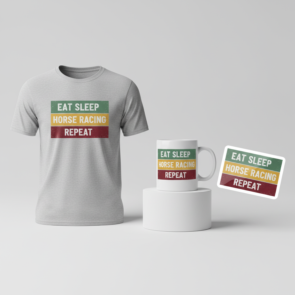
EAT SLEEP HORSE RACING REPEAT
As the roar of the crowd fades from another exhilarating Cheltenham Festival, the UK finds itself once again steeped in the unique charm and intense passion of horse racing. This isn’t just about a few days of sport; it’s a national obsession, a cultural phenomenon that captivates millions and sparks conversations from the local pub to national news. The recent flurry of activity surrounding major racing events underscores a deep-seated enthusiasm, highlighting a prime opportunity to connect with fans through their shared love for the turf.
The Cultural Significance
Horse racing in the United Kingdom is far more than just a sport; it’s a cornerstone of British tradition and social calendar. Events like the Cheltenham Festival are grand spectacles where history, high fashion, and thrilling competition converge. It’s a day out, an annual pilgrimage for many, bringing together friends and family for a shared experience of anticipation, excitement, and communal cheer (or commiseration!). This isn’t fleeting pop culture; it’s an enduring passion, a lifestyle, and for many, a significant part of their personal identity. Tapping into this inherent enthusiasm means connecting with a demographic that truly lives and breathes the sport, fostering a sense of belonging and camaraderie among fellow enthusiasts.
Design Brainstorm: Capturing the Aesthetic
When approaching merchandise for such a beloved niche, the goal is often to create something that feels both classic and relatable. One design avenue that could translate well to this enduring passion is a simple, bold aesthetic that speaks directly to the enthusiast’s core identity. Imagine a design that feels both heritage and contemporary, instantly recognizable by those in the know.
- 🎨 Visual Concept: One angle to consider is a clean, retro design featuring three distinct horizontal bars. These bars could be rendered in vintage, faded colors – perhaps a forest green evoking the lush turf, a mustard yellow reminiscent of classic race silks, and a rich burgundy for a touch of sophistication. A slightly weathered, distressed texture applied across the entire design could lend an authentic, worn-in feel, suggesting a beloved item that has seen many a race day.
- ✍️ Typography Ideas: Within each horizontal bar, a single word of the phrase “EAT SLEEP HORSE RACING REPEAT” could be placed in a clean, sans-serif font. This classic “Eat Sleep X Repeat” format is a highly effective and proven Print-on-Demand trope because it immediately communicates the wearer’s dedication and passion, making it an instant conversation starter among fellow fans.
- 👕 Product Canvas: Given the often outdoor nature of race days and general casual wear, this design concept would likely pop best on light-colored apparel. Think classic white or cream t-shirts, hoodies, or even light grey sweatshirts, allowing the vintage color palette and distressed texture to truly stand out.
Strategic Market Insight
Targeting UK horse racing enthusiasts, particularly those who follow events like the Cheltenham Festival, presents a robust market opportunity. The genius of the “Eat Sleep Horse Racing Repeat” concept lies in its ability to pivot from a specific, trademarked company trend to a broader, evergreen lifestyle niche. This phrase clearly defines the wearer’s passion without infringing on intellectual property related to betting companies, specific racecourses, or famous horses. Purchasers in this demographic are often looking for ways to outwardly express their interests and connect with a community. A design that directly articulates their dedication resonates deeply, transforming a simple piece of clothing into a badge of honor. It taps into the psychological trigger of identity expression, making it a compelling purchase for anyone who considers horse racing a significant part of their life.
⚖️ Estimated Copyright Risk: LOW
Our Findings: The phrase format ‘Eat Sleep X Repeat’ is a widely used meme and is not protectable by copyright. While the single word ‘Repeat’ may be trademarked in some classes, its use within a larger, common phrase is generally considered safe. The design uses no specific imagery or names associated with copyrighted or trademarked entities in the horse racing world.
Always verify intellectual property rights before listing.
Check UK Trademark Search for “Paddy Power” ➔
AI Image Generation Prompts
The following prompts are optimized for leading generators to produce production-ready assets:
👕 Apparel / T-Shirt Prompt
A retro-inspired graphic design for a t-shirt print, isolated on a solid light background. The design prominently features three distinct horizontal bars stacked vertically. The topmost bar is rendered in a muted, vintage faded forest green, exhibiting subtle color variations and an aged appearance. The middle bar is a soft, distressed mustard yellow, with a slightly irregular, 'worn-in' quality. The bottom bar is a deep, rich burgundy, showcasing a slightly faded and weathered characteristic. Centered within the top bar are the words 'EAT SLEEP'. Centered within the middle bar are the words 'HORSE RACING'. Centered within the bottom bar are the words 'REPEAT'. All text is presented in a clean, highly legible, bold sans-serif typeface, such as a sturdy Montserrat or a classic Helvetica Neue, in a crisp white color, ensuring strong contrast against the vintage hues of the bars. The entirety of the design, encompassing both the colored bars and subtly overlaying the white text, exhibits a refined weathered and distressed texture. This texture includes fine grit, subtle speckles, faint ink imperfections, and softened edges, meticulously simulating the authentic feel of a well-loved, vintage screen print on fabric. Despite the distressed overlay, the core shapes of the bars and text maintain sharp, defined edges and precise forms, adhering to a clean vector illustration style. The rendering is high-resolution, sharp, and entirely free of pixelation or blurry lines. The lighting is flat and even, purely emphasizing the graphic integrity and texture without casting any external shadows. The overall aesthetic is nostalgic, simple, graphic, and enduring, conveying a classic equestrian theme. The background is a plain, solid, untextured light color, like crisp white or a very light heather grey, ensuring the graphic stands out clearly for apparel printing. The ONLY text allowed in the image is exactly 'EAT SLEEP HORSE RACING REPEAT'. Absolutely NO other names, words, or random letters. --ar 3:4 --v 6.0
🔍 Search this niche on:
☕ Drinkware / Mug Prompt
A print-ready, high-resolution graphic design for a panoramic coffee mug wrap layout. The composition features a duplicated side-by-side arrangement, showcasing the exact same graphic perfectly mirrored or repeated on both the left and right sides, specifically tailored for a full wrap-around mug design. The core graphic consists of three distinct horizontal bars stacked vertically. The uppermost bar is rendered in a vintage, faded forest green. The middle bar is a soft, muted mustard yellow. The lowest bar is a deep, weathered burgundy. Centered neatly within the top bar are the words 'EAT SLEEP'. Centered within the middle bar are the words 'HORSE RACING'. Centered within the bottom bar are the words 'REPEAT'. All text is displayed in a clean, bold, highly readable sans-serif font, such as Gotham or Open Sans, in a crisp white color, providing excellent readability against the muted bar colors. The entire graphic, including both the bars and the text, is imbued with a subtle yet effective weathered and distressed texture. This texture is consistent across both duplicated graphics and includes fine grain, a faded print effect, and slight irregularities, giving it an authentic vintage screen-printed appearance ideal for sublimation. The design maintains a flat graphic style, with sharp, well-defined lines and consistent color reproduction across the entire panoramic canvas. There are no shadows, environmental elements, or three-dimensional effects, as this is purely a digital artwork intended for printing. The rendering is clean, sharp, and optimized for print production. The ONLY text allowed in the image is exactly 'EAT SLEEP HORSE RACING REPEAT'. Absolutely NO other names, words, or random letters. --ar 3:1 --v 6.0
🔍 Search this niche on:
✨ Die-Cut Sticker Prompt
A bold, 2D flat pop-art style graphic design for a die-cut sticker, rendered with exceptional clarity and vibrance. The central design features three prominent horizontal bars stacked vertically, forming a cohesive rectangular block. The topmost bar is a distinct faded forest green. The middle bar is a vivid mustard yellow. The bottom bar is a deep, weathered burgundy. These colors, while vintage, possess the striking impact characteristic of pop art. Centered prominently within the top bar are the words 'EAT SLEEP'. Centered within the middle bar are the words 'HORSE RACING'. Centered within the bottom bar are the words 'REPEAT'. All text is rendered in a thick, clean, blocky sans-serif font, such as Impact or Bebas Neue, in a stark, opaque white color to ensure maximum contrast and graphic impact, embodying a vintage graphic aesthetic. The bars and, subtly, the text itself are infused with a distressed, weathered texture, showcasing fine grain, subtle ink bleeds, and slight fading along the edges, giving it an authentic, aged sticker feel without compromising readability or the bold pop-art aesthetic. A distinct, uniform, and thick white outline border cleanly encapsulates the entire stacked bar design, precisely defining the intended die-cut edge of the sticker. The style is strictly 2D flat, graphic, and iconic, devoid of complex gradients, shading, or three-dimensional effects. The edges of all elements are sharp and clean against the surrounding white outline. The rendering is high-resolution digital artwork, with vector-like precision suitable for professional sticker production. The graphic is isolated on a pure white or transparent background, ready for manufacturing. The ONLY text allowed in the image is exactly 'EAT SLEEP HORSE RACING REPEAT'. Absolutely NO other names, words, or random letters. --ar 1:1 --v 6.0
🔍 Search this niche on:
Frequently Asked Questions
Why choose the “Eat Sleep X Repeat” format for this niche?
The “Eat Sleep X Repeat” format is a powerhouse in Print-on-Demand because it’s a direct, unambiguous statement of passion. For horse racing enthusiasts, it instantly communicates their dedication and love for the sport, making the apparel a clear identifier. It’s a popular trope because it quickly resonates with the target audience, forming an immediate connection and often serving as an icebreaker or a nod of recognition among fellow fans.
What makes a retro, distressed look suitable for horse racing merchandise?
Horse racing is a sport steeped in history, tradition, and a certain timeless elegance. A retro, distressed aesthetic harks back to classic eras of racing, lending an air of authenticity and heritage to the design. The faded colors and weathered texture suggest an item that feels familiar and cherished, much like the sport itself. It avoids overly modern or trendy designs that might quickly become dated, instead offering a classic feel that appeals to a broad spectrum of fans.
Beyond race days, when might someone wear this kind of design?
While perfect for attending race meetings, this design is versatile enough for everyday wear. A horse racing enthusiast might proudly wear this while watching races at home, at their local pub with friends, or simply as casual attire to express their passion. It’s also ideal for social gatherings, local equestrian events, or even just running errands, acting as a subtle but clear declaration of their interest in the world of horse racing.
Final Thoughts
The enduring appeal of horse racing in the UK offers fertile ground for creative Print-on-Demand ventures. By focusing on the lifestyle and passion rather than specific brands, designers can create evergreen merchandise that truly resonates with a dedicated audience. The “Eat Sleep Horse Racing Repeat” concept, paired with a classic, distressed aesthetic, provides a clear pathway to producing items that are both commercially viable and deeply meaningful to fans. As with any e-commerce endeavor, execution quality, understanding the audience, and adding your unique spin will be key to galloping ahead in this exciting market.
💬 What’s Your Take?
Art is subjective, and this is just one angle! How would you spin this “Paddy Power” trend? Did we miss the mark, or is there a better inside joke to use here? Drop your design ideas and let’s brainstorm in the comments below!