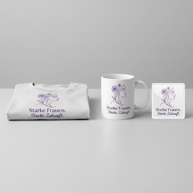
Fede, Speranza, Carità – Faith, Hope, Charity
📍 Target Market: Italy
🔥 Trend: Cardinale Konrad Krajewski (Cardinal Konrad Krajewski) ↗
A ripple has moved through Italy’s deeply Catholic heart. The news of Cardinal Konrad Krajewski, famously known as the Pope’s Almoner, transitioning from his impactful Vatican role to become the Archbishop of Łódź, Poland, has captured significant attention across the peninsula. His reassignment isn’t just a bureaucratic change; it’s a moment of reflection on a figure synonymous with direct, compassionate charity and the very essence of Christian service, resonating with many who admire his hands-on approach to faith.
The Cultural Significance
Cardinal Krajewski’s unique appeal in Italy stems from his practical embodiment of faith. As the Pope’s Almoner, he wasn’t confined to the Vatican’s gilded halls; he was often found on the streets, ministering directly to the homeless and needy, performing acts of charity that transcended typical protocol. This directness, this living example of “caring for the least among us,” has endeared him to many Italian Catholics and beyond. His reassignment, therefore, isn’t just a headline; it’s a poignant moment that highlights the values he so clearly represents. It’s a cultural touchstone that prompts contemplation on universal Christian principles, reminding observers of the foundational virtues that underpin such devoted service.
Design Brainstorm: Capturing the Aesthetic
Translating a moment of such spiritual depth into merchandise requires a thoughtful, respectful approach. One compelling angle focuses not on the individual’s name, but on the enduring virtues he exemplifies, creating a design that is both timely and evergreen.
- 🎨 Visual Concept: Imagine a design that speaks volumes through its elegant simplicity. The core idea here is a faith-based typographic arrangement, stacking the Italian words “Fede,” “Speranza,” and “Carità” vertically. Each word could be subtly accompanied by its traditional symbol: a minimalist cross for Fede (Faith), a delicate anchor for Speranza (Hope), and a graceful heart for Carità (Charity). These elements would be discreetly placed, perhaps slightly to the side or subtly integrated, maintaining an understated and tasteful aesthetic that respects the profound nature of the message.
- ✍️ Typography Ideas: The choice of typeface is crucial for conveying sincerity and modernity. A clean, contemporary sans-serif font would lend itself well to each of the three words. Think along the lines of a subtle, legible humanist sans-serif or even a refined geometric sans-serif, ensuring readability and a timeless appeal. The consistent application of this typeface across all three words would create visual harmony, allowing the message itself to be the primary focus rather than elaborate ornamentation.
- 👕 Product Canvas: Given the desire for “light” apparel, this design could translate beautifully onto garments like premium white, cream, or pastel-colored t-shirts, light long-sleeved tops, or even airy tote bags. The subtle visual and textual elements would pop elegantly against these lighter backgrounds, enhancing the minimalist and refined feel. The goal is to produce apparel that feels comfortable and natural, embodying a sense of gentle devotion rather than overt display.
Strategic Market Insight
Targeting Italian Christians and Catholics with a design centered on “Fede, Speranza, Carità” is a particularly shrewd strategy. While inspired by a specific trending figure, the design cleverly pivots to universal theological virtues. This move ingeniously sidesteps potential intellectual property concerns that might arise from using a living person’s name or image, while still honoring the spirit of the trend. The psychological trigger here is profound: buyers aren’t just purchasing a piece of clothing; they’re acquiring an expression of their core values and faith, a wearable affirmation of what is important to them. This makes the design broadly appealing and incredibly potent, tapping into a demographic that values meaningful symbolism and spiritual identity. It’s an investment in a message that transcends fleeting trends, becoming an evergreen piece that resonates year-round.
⚖️ Estimated Copyright Risk: LOW
Risk Assessment: ‘Faith, Hope, and Charity’ are the three theological virtues of Christianity and are in the public domain. The phrase is a fundamental religious concept, not proprietary IP, making it entirely safe for commercial apparel.
Always verify intellectual property rights before listing.
Check EU Trademark Search for “Cardinale Konrad Krajewski” ➔
AI Image Generation Prompts
The following prompts are optimized for leading generators to produce production-ready assets:
👕 Apparel / T-Shirt Prompt
A clean, modern, vector illustration of the words "Fede, Speranza, Carità" stacked vertically. Each word is rendered in a sophisticated, elegant, medium-weight sans-serif typeface, with excellent legibility and generous letter spacing, suggesting a sense of calm and clarity. The text should be a deep charcoal grey. Next to each word, on its right side, a small, subtle, minimalist graphic symbol is placed: a slender, upright cross next to "Fede", a perfectly symmetrical, abstract heart next to "Speranza", and a stylized, classic anchor design next to "Carità". These symbols are monochromatic, a slightly lighter shade of grey than the text, with thin, precise lines and solid, flat fills, maintaining an extremely understated and discreet presence. The overall design is balanced, with uniform spacing between the words and symbols. The style is that of a pristine, high-fidelity digital vector graphic, characterized by absolutely sharp edges, pixel-perfect lines, smooth, unblemished curves, and flat, uniform color fills without any gradients, textures, or grunge effects. The entire design is isolated cleanly on a solid, light, off-white background, making it ready for print. The aesthetic is timeless, minimalist, and tastefully reverent, conveying a sense of quiet strength and enduring virtue. --ar 3:4 --v 6.0 The ONLY text allowed in the image is exactly 'Fede, Speranza, Carità'. Absolutely NO other names, words, or random letters.
☕ Drinkware / Mug Prompt
A panoramic graphic designed for a coffee mug wrap, featuring a duplicated side-by-side layout. The exact same central design appears on the left and right sides of the canvas, ensuring a seamless wrap. The design itself is a simple, faith-based typographic arrangement of "Fede, Speranza, Carità" stacked vertically. Each word is rendered in a robust, modern sans-serif font, with excellent readability and a strong, clean presence. The text is colored in a sophisticated, deep forest green. Subtly placed to the right of each word is its corresponding minimalist symbol: a clean, slender cross for "Fede", a symmetrical, understated heart for "Speranza", and a classic, stylized anchor for "Carità". These symbols are rendered in a slightly lighter, muted sage green, using fine, even lines and solid, flat fills, maintaining a discreet and harmonious balance with the typography. The overall aesthetic is one of clean, contemporary graphic design, with razor-sharp edges, precise geometric forms, and perfectly smooth, flat color areas devoid of any gradients, textures, or imperfections. The entire composition is presented on a pristine, solid off-white background, providing excellent contrast and a sense of understated elegance. This graphic is optimized for clear, high-quality ceramic printing. --ar 3:1 --v 6.0 The ONLY text allowed in the image is exactly 'Fede, Speranza, Carità'. Absolutely NO other names, words, or random letters.
✨ Die-Cut Sticker Prompt
A vibrant, modern, 2D flat pop-art style graphic specifically designed for a die-cut sticker. The central design features the words "Fede, Speranza, Carità" stacked vertically, each in a bold, clean, slightly rounded sans-serif typeface, evoking a friendly and approachable feel. The text is rendered in a solid, bright navy blue. To the right of each word, a distinctly minimalist yet iconic symbol is placed: a crisp, stylized cross for "Fede", a perfectly formed, cheerful heart for "Speranza", and a simplified, strong anchor for "Carità". These symbols are colored in a contrasting, cheerful bright golden yellow, maintaining their flat, graphic appeal with solid fills and sharp, defined edges. The entire design, including the text and symbols, is encased within a very thick, prominent, solid white outline border, clearly defining the sticker's die-cut shape and making it pop against any background. The illustration style is pure vector art, characterized by perfectly smooth curves, razor-sharp lines, and unblemished, flat areas of intense color saturation, completely devoid of gradients, textures, or any form of shading or depth. The overall mood is positive, clear, and direct, ideal for a standalone adhesive product. --ar 1:1 --v 6.0 The ONLY text allowed in the image is exactly 'Fede, Speranza, Carità'. Absolutely NO other names, words, or random letters.
Frequently Asked Questions
Why focus on universal virtues instead of referencing Cardinal Krajewski directly?
By centering the design on “Fede, Speranza, Carità,” it becomes timeless and avoids any potential intellectual property issues that might arise from using a public figure’s name or image without permission. This approach allows designers to tap into the cultural conversation surrounding the Cardinal’s good works while creating a broadly appealing product that resonates with anyone who values these core Christian principles, ensuring its relevance long after the initial news cycle.
What types of “light apparel” are best suited for this understated design?
For a design focused on subtle elegance, lighter-colored apparel is ideal. Think soft white, ecru, heather grey, pale blue, or even a very light olive green on premium t-shirts, lightweight hoodies, or casual long-sleeved tops. The minimalist graphics and text would stand out tastefully without being overpowering, appealing to those who prefer a more refined expression of their faith.
How can I ensure this design resonates authentically with the Italian Catholic market?
Authenticity is key. Beyond the Italian text, ensure high-quality printing and garment materials. Emphasize the design’s understated elegance in product descriptions, highlighting its reverence for traditional virtues. Visuals showing the apparel in everyday Italian settings, perhaps paired with classic, modest styling, could also enhance its appeal to a demographic that appreciates both faith and refined taste.
Final Thoughts
The convergence of a timely cultural moment and timeless spiritual values presents a compelling opportunity for designers. By artfully translating the inspiration of Cardinal Krajewski’s service into a design focused on “Fede, Speranza, Carità,” there’s significant e-commerce potential. It’s a testament to how print-on-demand can capture the zeitgeist, offering consumers a tangible way to express their beliefs and connect with a broader cultural narrative. Success, as always, hinges on careful execution and adding one’s unique creative spin to these foundational ideas.
💬 What’s Your Take?
Art is subjective, and this is just one angle! How would you spin this “Cardinale Konrad Krajewski (Cardinal Konrad Krajewski)” trend? Drop your design ideas and let’s brainstorm in the comments below!