Gioca per divertirti – Play to have fun
📅 Published: June 3, 2026
📍 Target Market: Italy
🔥 Trend: Silvio Baldini ↗
In the vibrant heart of Italian football culture, a recent moment transcended the usual discourse of tactics and triumphs, sparking a national conversation about the very soul of the beautiful game. When a prominent youth coach took to the press, not to dissect formations or lament missed opportunities, but to passionately advocate for the simple, unadulterated joy of play, the nation listened. This isn’t just a fleeting headline; it’s a resonant chord struck deep within the Italian psyche, offering a compelling opportunity for designers to capture a universal sentiment through a unique lens.
The Cultural Significance
The moment Silvio Baldini, coaching an Italian national youth football team, delivered an emotional press conference emphasizing the importance of players having fun, it wasn’t just a soundbite—it was a cultural touchstone. In Italy, where football, or ‘calcio,’ is more than a sport; it’s a religion, an identity, and a source of immense national pride. The pressure to win can be overwhelming, even at youth levels. Baldini’s refreshing stance cut through the usual intensity, reminding everyone of the game’s fundamental purpose: enjoyment. His words resonated deeply because they tapped into a collective yearning for authenticity and passion over pure, unyielding victory. It became a viral sentiment, highlighting a powerful shift in perspective towards mental well-being and the intrinsic love of the sport, rather than just the outcome.
Design Brainstorm: Capturing the Aesthetic
Translating such an emotionally charged, culturally specific moment into a compelling design requires a thoughtful approach. One exciting avenue for expression could be a concept that is both timeless and deeply rooted in Italian football heritage.
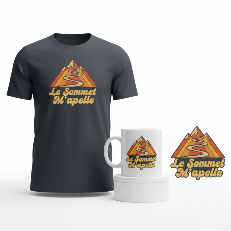
- 🎨 Visual Concept: Imagine a design that harks back to an era of pure football. A retro, 1970s-inspired aesthetic with a circular layout could provide that nostalgic frame. At its core, a vintage-style soccer ball with subtle motion lines would capture the dynamic spirit of the game. To embed the Italian identity without being overtly nationalistic, the colors of the Italian flag—green, white, red—could be used, but in a muted, faded palette to give it an aged, cherished appearance. This approach speaks to the history and passion of Italian calcio without relying on specific team branding, making it broadly appealing.
- ✍️ Typography Ideas: Complementing the retro visual, groovy typography could be chosen for the central message. This style would reinforce the 70s vibe, adding a playful yet sophisticated touch. The chosen text, “Gioca per divertirti,” (Play to have fun), is the heartbeat of this concept. Rendered in flowing, stylized letters, it not only communicates Baldini’s core message but does so in Italian, making it authentic and deeply resonant for the target audience. The phrase becomes a positive, evergreen mantra, transcending the specific news event to embody a shared love for the game.
- 👕 Product Canvas: Given the muted, faded color palette and the overall lighthearted sentiment, this design could translate beautifully onto light-colored apparel. Think classic white, cream, or light grey t-shirts, sweatshirts, or even retro-style jerseys. The lighter canvas allows the vintage colors and groovy typography to truly pop, creating a comfortable, stylish piece that appeals to fans who appreciate both fashion and football culture.
Strategic Market Insight
This design targets Italian football fans (‘calcio’) who value the passion and joy of the sport above mere winning. The genius lies in its ability to take a timely, emotional message from a current trend (Baldini’s quote) and transform it into an evergreen, positive mantra. By avoiding all specific intellectual property—no coach’s name, no team name, no league branding—it becomes universally appealing to the broader Italian football community. The use of the authentic Italian phrase “Gioca per divertirti” is crucial; it’s not just a translation, but a cultural affirmation, deeply resonating with the target demographic. This isn’t just about showing support for a team; it’s about making a statement about the values that define one’s love for ‘calcio.’ It taps into nostalgia, shared cultural understanding, and a desire to celebrate the pure essence of the game, creating a powerful emotional trigger for purchase.
AI Image Generation Prompts
The following prompts are optimized for leading generators to produce production-ready assets:
👕 Apparel / T-Shirt Prompt
A retro 1970s-inspired circular graphic design, optimized for a t-shirt print. The design features a vintage-style soccer ball with classic hexagonal and pentagonal panels, rendered in a muted and faded palette of olive green, creamy off-white, and dusty brick red, evoking an aged, sun-bleached appearance. Stylized, hand-drawn motion lines radiate outwards from the soccer ball, also in desaturated tones, giving a sense of dynamic movement. The groovy typography for 'Gioca per divertirti' is integrated into the circular layout, possibly arcing above and below the ball, using a chunky, rounded, slightly psychedelic 1970s bubble font in a faded cream or pale yellow color. The entire composition is a clean vector illustration, isolated on a solid Light background, such as a pale stone grey or soft beige. The illustration style is flat and graphic, with precise, crisp outlines but subtle, uniform halftone texture overlayed across the colors to mimic vintage screen printing, adding to the aged aesthetic without appearing rough. No strong gradients or complex shading; focus on bold, graphic shapes and a nostalgic, feel-good mood. The ONLY text allowed in the image is exactly 'Gioca per divertirti'. Absolutely NO other names, words, or random letters. --ar 3:4 --v 6.0
☕ Drinkware / Mug Prompt
A duplicated side-by-side layout showing the exact same circular graphic design on the left and right, designed perfectly for a panoramic coffee mug wrap. The graphic is a retro 1970s-inspired visual, showcasing a vintage-style soccer ball with classic paneling, rendered in a muted yet distinct palette of sage green, antique white, and terracotta red, giving a faded, aged look. Dynamic, stylized motion lines emanate from the ball, also in desaturated tones, conveying playful energy. The text 'Gioca per divertirti' is rendered in a groovy, chunky 1970s bubble font, integrated seamlessly into the circular design, perhaps arcing around the main motif in a faded ochre or cream color. The art style is a clean, scalable vector illustration with a flat, bold rendering. Each instance of the design is perfectly centered and proportioned for a mug surface. The overall texture is smooth to represent a clean print, with only the visual elements appearing aged. The background is a pristine white, serving as a clean canvas for the wrap. The mood is nostalgic, playful, and energetic. The ONLY text allowed in the image is exactly 'Gioca per divertirti'. Absolutely NO other names, words, or random letters. --ar 3:1 --v 6.0
✨ Die-Cut Sticker Prompt
A vibrant 2D flat pop-art style die-cut sticker design, perfectly circular. The central graphic is a retro 1970s-inspired vintage soccer ball, simplified and stylized with bold outlines, in a faded yet eye-catching palette of desaturated olive green, creamy off-white, and brick red, giving it an aged, collectible appearance. Stylized, thick 'whoosh' motion lines extend from the ball in a comic-book fashion, adding dynamic flair. The text 'Gioca per divertirti' is prominently featured in a chunky, groovy, 1970s bubble font, integrated into the circular composition, perhaps with a subtle dark outline for definition, rendered in a bright faded yellow or cream. The entire design is encased within a distinct, thick white outline border, typical of a vinyl die-cut sticker. The rendering is extremely crisp with sharp, defined edges, solid flat color fills (no gradients), and a glossy implied finish. The aesthetic is clean, iconic, and reminiscent of vintage sports memorabilia or pop-culture stickers. The background is a solid, pure white. The ONLY text allowed in the image is exactly 'Gioca per divertirti'. Absolutely NO other names, words, or random letters. --ar 1:1 --v 6.0
Frequently Asked Questions
How does this design avoid IP issues while still being relevant to the trend?
The design cleverly sidesteps intellectual property concerns by focusing on the core emotional message—”Gioca per divertirti”—rather than specific names, team logos, or league branding. It draws inspiration from the *sentiment* of the trending story and the general cultural value it represents within Italian football, making it a safe, evergreen product that resonates with fans on a deeper, values-based level.
Why is the retro 1970s aesthetic a good fit for this message?
The 1970s aesthetic often evokes a sense of nostalgia for simpler times, a period when football, perhaps, felt less commercialized and more about the pure joy of the game. This aligns perfectly with Baldini’s message about playing for fun. The muted colors and groovy typography create a timeless, classic appeal that speaks to heritage and an enduring love for football, rather than just current trends.
Beyond apparel, what other products might suit this design?
Given its universal appeal and positive message, this design could extend beautifully to a range of products beyond apparel. Consider vintage-style posters or art prints for a sports den, ceramic mugs for morning coffee, or even phone cases. The design’s evergreen nature means it could also work well on tote bags, keychains, or stickers, allowing fans to carry and display their love for the game’s joyful spirit in multiple ways.
Final Thoughts
The Silvio Baldini trend in Italy presents a prime example of how a fleeting news moment can reveal a deeper cultural value, offering a fertile ground for print-on-demand innovation. By distilling an emotional narrative into a timeless, aesthetically pleasing design, designers can create merchandise that speaks volumes without relying on overt branding. The key lies in understanding the nuance of cultural resonance and transforming it into a design concept that is both relevant and enduring. Success in this niche, as always, will come down to careful execution and the unique spin each creator brings to these inspired concepts.
💬 What’s Your Take?
Art is subjective, and this is just one angle! How would you spin this “Silvio Baldini” trend? Drop your design ideas and let’s brainstorm in the comments below!
⚖️ Disclaimer, Copyright & Earnings Notice
This article provides insights, design concepts, and strategies for educational and informational purposes only. By utilizing this information, you acknowledge and agree to the following:
- No Legal Advice: The content provided does not constitute legal counsel. Intellectual property laws are complex and constantly evolving.
- Independent Verification Required: There is no guarantee that the suggested niches, keywords, or AI-generated design concepts are free from trademarks, copyrights, or IP claims. You are solely responsible for conducting independent due diligence using official databases (e.g., USPTO, Trademarkia) before listing any product.
- Platform Compliance: You are entirely responsible for ensuring your final designs, keywords, and descriptions comply with the Terms of Service of your chosen Print-on-Demand platforms.
- No Earnings Guarantee: Mentions of “trending” topics or “buyer intent” do not guarantee sales, profits, or financial success. Your results depend on your individual execution and market conditions.
By acting on any information in this article, you accept full responsibility for your business operations and any resulting commercial or legal consequences.