Horology Addict
📅 Published: May 16, 2026
📍 Target Market: Spain
🔥 Trend: Swatch X Audemars Piguet ↗
The bustling streets of Spain are once again alive with an electrifying buzz, reminiscent of a prior, equally frantic horological moment. A new collaboration, ‘Royal Pop’, between a celebrated Swiss watchmaker and a titan of luxury timepieces, has ignited a consumer frenzy, with enthusiasts eagerly queuing outside stores. This phenomenon isn’t just about owning a new watch; it’s a cultural spectacle, blending accessibility with aspiration and creating a palpable excitement around the art of timekeeping.
The Cultural Significance
The profound allure of the ‘Royal Pop’ collaboration stems from several converging currents. Firstly, it democratizes a slice of high-end luxury, making it accessible to a wider audience, which inherently generates massive demand. This fusion of a globally recognized, fun-loving brand with an iconic luxury marque creates a unique tension – a high-low dynamic that savvy consumers adore. Secondly, it taps into the deep-seated human desire for exclusivity and collecting. The scarcity, the anticipation built through strategic leaks and reveals, and the physical act of waiting in line transform a simple purchase into a memorable event. This mirrors the previous ‘MoonSwatch’ phenomenon, proving that when two powerful brand narratives collide, the result is often a cultural supernova, captivating not just watch aficionados but also pop-culture enthusiasts looking for the next ‘must-have’ item.
Design Brainstorm: Capturing the Aesthetic
Translating such a specific cultural moment into a resonant design for a passionate audience requires a thoughtful approach. One compelling angle focuses not on the brands themselves, but on the enduring passion that fuels their desirability: the intricate world of watchmaking.
- 🎨 Visual Concept: A powerful visual concept for this trend could feature a highly stylized, exploded diagram of a mechanical watch movement. Imagine gears, springs, and rotors meticulously rendered in a blueprint or patent drawing style. The lines would be clean and precise, emphasizing engineering elegance. This technical yet sophisticated aesthetic celebrates the inner workings, appealing directly to those who appreciate the mechanics behind the magic.
- ✍️ Typography Ideas: To complement this technical visual, a clean, modern, sans-serif font would be an ideal choice. It conveys clarity and professionalism, aligning with the sophisticated nature of watchmaking. The accompanying text, “Horology Addict,” acts as a direct identifier, a badge of honor for the truly devoted. This phrase is universally understood within the watch community and avoids any direct brand references, making it a safe and evergreen choice.
- 👕 Product Canvas: For apparel, dark bases are a strong recommendation. Think deep blacks, charcoal greys, or rich navy blues. These dark canvases provide an excellent contrast for the intricate, often lighter-colored lines of a blueprint-style design. The dark background helps the technical details pop, enhancing the sophistication and ensuring the design elements are clearly visible and impactful.
Strategic Market Insight
The strategic brilliance of targeting the ‘Watch Enthusiasts’ or ‘Horologists’ demographic lies in its passion and evergreen nature. While the ‘Royal Pop’ collaboration is a fleeting moment of hype, the love for watchmaking is a timeless pursuit. Buyers in this segment are typically well-informed and deeply appreciate the artistry, engineering, and history of timepieces. A design proclaiming “Horology Addict” acts as a powerful psychological trigger, fostering a sense of belonging and identity. It allows individuals to subtly express their passion and connection to the broader watch community, without needing to wear specific brand logos. This niche appreciates authenticity and insight into their hobby, making a design that celebrates the mechanics of a watch movement highly resonant and desirable, tapping into their pride and enthusiasm for the craft.
AI Image Generation Prompts
The following prompts are optimized for leading generators to produce production-ready assets:
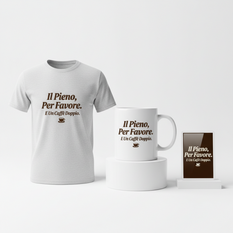
👕 Apparel / T-Shirt Prompt
A sophisticated vector illustration of a deconstructed mechanical watch movement. The design features a highly stylized, exploded diagram with individual gears, delicate springs, balance wheel, intricate escapement, and rotating rotors meticulously depicted as if floating in precise alignment, revealing the intricate internal mechanics. Rendered in a clean, precise line art style strongly reminiscent of a vintage patent drawing or a modern technical blueprint. Each component is outlined with ultra-fine, consistent dark lines, with subtle internal cross-hatching, dashed lines, and minimalist shading patterns (like flat washes or subtle gradients) used sparingly to suggest depth, form, and material without overt photorealism. Some metallic elements exhibit a very subtle, almost implied, polished gleam through clean, sharp highlights, enhancing the technical feel. The overall aesthetic is extremely detailed, highly technical, and inherently sophisticated. The lines are exceptionally sharp, crisp, and clean, achieving a high-resolution, professional vector look. Typography: The phrase "Horology Addict" is integrated seamlessly and prominently below the main watch diagram, utilizing a modern, clean, geometric sans-serif font (e.g., Lato Bold, Montserrat, Open Sans), perfectly aligned and scaled to complement the technical drawing's precision. The entire graphic design is meticulously isolated cleanly on a solid, deep charcoal black background (#1a1a1a or similar dark tone), intensely emphasizing the intricate details of the watch movement and creating high contrast. The mood is precise, intellectual, elegant, and appreciative of mechanical craftsmanship. The ONLY text allowed in the image is exactly 'Horology Addict'. Absolutely NO other names, words, or random letters. --ar 3:4 --v 6.0
☕ Drinkware / Mug Prompt
A panoramic graphic specifically designed for a coffee mug wrap layout, featuring a duplicated side-by-side arrangement showing the exact same intricate illustration on both the left and right sides, creating a continuous, visually balanced composition. The central illustration is a highly stylized, exploded diagram of a mechanical watch movement, showcasing individual gears, delicate coiled springs, rotating weighted rotors, and the intricate escapement mechanism in precise, technical detail. The rendering style is immaculate line art, strongly evoking the aesthetic of an antique patent drawing or a contemporary engineering blueprint. Ultra-fine, consistent lines (e.g., deep navy blue or white) define each component, with subtle schematic cross-hatching, light dashed lines indicating assembly paths, and minimal flat graphical elements used for implied material texture. The aesthetic is sharply defined, highly technical, and sophisticated, with a pristine, almost architectural quality. The color palette is restricted to a refined monochrome or duotone (e.g., crisp white lines on a deep matte black background, or subtle metallic silver lines on a deep blue background) with potentially very subtle, muted metallic accents (like aged brass or brushed steel tones) within the watch components, rendered as flat graphical elements for print clarity. The typography "Horology Addict" is integrated elegantly and legibly within or below the watch diagram, utilizing a clean, modern, geometric sans-serif font that perfectly matches the technical precision of the illustration. This entire graphic is then duplicated and arranged side-by-side to create a seamless, visually continuous composition perfectly suited for a panoramic mug wrap. The image must clearly display two identical, complete design iterations side-by-side. The ONLY text allowed in the image is exactly 'Horology Addict'. Absolutely NO other names, words, or random letters. --ar 3:1 --v 6.0
✨ Die-Cut Sticker Prompt
A bold, flat 2D graphic optimized for a high-quality die-cut sticker, featuring a stylized, exploded diagram of a mechanical watch movement. Individual gears, springs, rotors, and other intricate components are depicted in a clean, precise, technical drawing style, simplified for maximum clarity and immediate visual impact. The aesthetic leans into a modern, minimalist pop-art style, characterized by crisp, hard-edged shapes, strong outlines, and completely flat, unshaded areas of color. All intricate details are conveyed purely through robust, consistent line work, without the use of gradients, complex textures, or subtle light effects. The exploded diagram appears as a cohesive, single design element, almost iconic in its graphic representation. The lines are stark, well-defined, and create a high-contrast image, ensuring legibility even at small sizes. The overall composition is sophisticated and technical, yet rendered with a clear, almost playful graphic quality typical of pop art. The typography "Horology Addict" is integrated prominently and legibly within the design, using a strong, clean, modern sans-serif font that perfectly complements the technical graphic. A thick, clean, and consistent pure white outline border (e.g., 3-5mm thickness) surrounds the entire finished design (including the text), creating a distinct, sharp die-cut shape and ensuring high visibility and separation when applied to any background surface. The background within the sticker's design itself is white or transparent, allowing the artwork to pop. The ONLY text allowed in the image is exactly 'Horology Addict'. Absolutely NO other names, words, or random letters. --ar 1:1 --v 6.0
Frequently Asked Questions
How does this design approach avoid trademark infringement given the trending brand collaboration?
This design concept cleverly pivots by celebrating the generic art of watchmaking rather than specific brands. By using a general “exploded diagram” of a mechanical movement and the broad term “Horology Addict,” it avoids using any trademarked names, logos, or specific product likenesses from the collaboration, making it a safe and legally sound approach to capitalize on the overarching interest in watches.
Who is the ideal customer for a “Horology Addict” design, and what motivates their purchase?
The ideal customer is someone deeply passionate about the inner workings, history, and craft of watchmaking – a true watch enthusiast or collector. They are motivated by a desire to express their identity and affiliation with the horology community. This design offers a subtle, sophisticated way to declare their passion, acting as an insider nod that fellow enthusiasts will appreciate, without being overtly promotional for any single brand.
Why are dark-colored apparel items specifically recommended for this visual concept?
Dark apparel, such as black or deep navy, serves as an optimal backdrop for the technical, blueprint-style exploded watch movement design. The contrast between the typically lighter lines of a schematic diagram and the dark fabric allows the intricate details of the gears, springs, and rotors to truly stand out. This enhances the sophistication of the design, making it visually striking and ensuring the delicate artistry is clearly visible.
Final Thoughts
The energy surrounding collaborations like the ‘Royal Pop’ offers a fantastic springboard for print-on-demand designers. By smartly sidestepping specific brand IP and instead focusing on the underlying passion – in this case, the timeless fascination with horology – designers can tap into a vibrant, engaged market. The key to success lies in exceptional execution of these detailed concepts and, perhaps most importantly, in bringing a unique artistic spin to the fundamental elements that resonate with a passionate audience. Connecting with a niche on a deeper, more conceptual level often yields the most enduring appeal and loyal customers.
💬 What’s Your Take?
Art is subjective, and this is just one angle! How would you spin this “Swatch X Audemars Piguet” trend? Drop your design ideas and let’s brainstorm in the comments below!
⚖️ Disclaimer, Copyright & Earnings Notice
This article provides insights, design concepts, and strategies for educational and informational purposes only. By utilizing this information, you acknowledge and agree to the following:
- No Legal Advice: The content provided does not constitute legal counsel. Intellectual property laws are complex and constantly evolving.
- Independent Verification Required: There is no guarantee that the suggested niches, keywords, or AI-generated design concepts are free from trademarks, copyrights, or IP claims. You are solely responsible for conducting independent due diligence using official databases (e.g., USPTO, Trademarkia) before listing any product.
- Platform Compliance: You are entirely responsible for ensuring your final designs, keywords, and descriptions comply with the Terms of Service of your chosen Print-on-Demand platforms.
- No Earnings Guarantee: Mentions of “trending” topics or “buyer intent” do not guarantee sales, profits, or financial success. Your results depend on your individual execution and market conditions.
By acting on any information in this article, you accept full responsibility for your business operations and any resulting commercial or legal consequences.