I HATE GOLF. I LOVE GOLF.
The Valspar Championship recently set the golf world abuzz, and at the heart of the chatter was professional golfer Matt Fitzpatrick. His candid remarks about the sport at a high-stakes PGA Tour event struck a deeply resonant chord across the United States, sparking conversations that extend far beyond the greens of Innisbrook. It seems Fitzpatrick articulated a sentiment many golfers secretly, or not so secretly, feel – a powerful push and pull with the game that can drive you to both ecstasy and despair.
The Cultural Significance
What makes a professional golfer’s frustration with the game so captivating? It’s simple: relatability. Matt Fitzpatrick’s honesty wasn’t just a soundbite; it was a window into the universal struggle inherent in golf. Every amateur, every weekend warrior, every recreational player has experienced those moments of wanting to throw their club into the nearest water hazard, only to be drawn back by an inexplicable love for the sport after one perfect shot. This emotional rollercoaster, this maddeningly addictive dance, is what creates such a strong bond among golfers. Fitzpatrick’s comments momentarily transcended the professional tour, speaking directly to the soul of anyone who has ever teed up a ball. It validates their own love-hate relationship with the game, transforming a trending event into a timeless, shared experience.
Design Brainstorm: Capturing the Aesthetic
Translating such a powerful, dualistic emotion into a visual design offers an exciting challenge. The goal here is to capture that universal sentiment in a way that feels both authentic and aesthetically pleasing, resonating with anyone who understands the unique agony and ecstasy of golf.
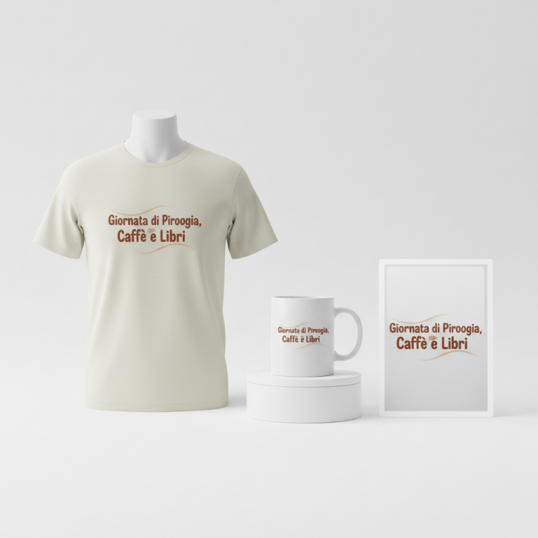
- 🎨 Visual Concept: One angle to consider is a minimalist design featuring a slightly bent and broken golf club. Rendered in a clean, vector art style, this graphic subtly conveys frustration without being overly aggressive. The choice of a simple white and green color palette could offer a fresh, clean look that contrasts nicely with the raw emotion it represents, making the overall design feel sophisticated yet impactful.
- ✍️ Typography Ideas: The core message, “I HATE GOLF. I LOVE GOLF.”, is incredibly potent. Using a clean, sans-serif font for both parts of the quote ensures readability and a modern aesthetic. Placing the first part above the graphic and the second part below it creates a visual tension that mirrors the emotional duality, allowing the club graphic to act as a pivot point between the two opposing sentiments.
- 👕 Product Canvas: This type of design could translate exceptionally well onto dark apparel. The crisp white and green elements would pop beautifully against a darker background, enhancing visibility and giving the merchandise a premium feel. Imagine it on a charcoal hoodie or a navy t-shirt – the simple graphic and powerful text would truly stand out.
Strategic Market Insight
The brilliance of this design concept lies in its strategic pivot. While Matt Fitzpatrick’s performance sparked the initial trend, the merchandise itself avoids any intellectual property conflicts by focusing on a universally understood golfing emotion. The target demographic of amateur and recreational golfers deeply understands the frustrating yet addictive nature of the sport. This design concept taps directly into that shared psychological trigger: the bittersweet reality of playing golf. It’s a statement piece that says, “I get it, you get it.” By transforming a specific news cycle into an evergreen sentiment, the design ensures relevance year-round, long after the buzz of the Valspar Championship has faded. It’s not about being a fan of one golfer; it’s about being a golfer, period.
⚖️ Estimated Copyright Risk: LOW
Copyright Evaluation: The design avoids using the athlete’s name, image, or likeness. The quote is a common, generic sentiment within the golfing community and is not subject to trademark.
Always verify intellectual property rights before listing.
Check US Trademark Database (Justia) for “I HATE GOLF. I LOVE GOLF.” ➔
AI Image Generation Prompts
The following prompts are optimized for leading generators to produce production-ready assets:
👕 Apparel / T-Shirt Prompt
A bold, striking vector illustration featuring a minimalist design of a slightly bent and broken golf club. The design is executed in an extremely clean, crisp, and precise vector art style, characterized by sharp geometric lines, smooth curves, and flat, vibrant color blocking. Above the golf club graphic, the text 'I HATE GOLF.' is displayed in a modern, clean, bold sans-serif font. Below the graphic, the text 'I LOVE GOLF.' is displayed in the identical sans-serif font. The color palette for the design elements (golf club and text) is strictly limited to a pure, bright white and a distinct, vibrant golf course green. The illustration is expertly isolated on a solid Dark background (e.g., deep charcoal, navy blue, or forest green), ensuring maximum contrast and visual impact. The rendering should emphasize vector purity, with no gradients, textures, or grunge effects, aiming for a perfectly smooth, screen-print-ready aesthetic. The mood is ironic and bold, perfect for a statement t-shirt print. The design is perfectly centered and proportioned for apparel. The ONLY text allowed in the image is exactly 'I HATE GOLF. I LOVE GOLF.'. Absolutely NO other names, words, or random letters. --ar 3:4 --v 6.0
☕ Drinkware / Mug Prompt
A panoramic, seamless design perfectly optimized for a coffee mug wrap layout. The central design features a minimalist, clean vector art illustration of a slightly bent and broken golf club. This graphic is depicted with precise lines and flat, bold color fills, using a vibrant golf course green and pure white as the primary color palette. Above the golf club, the text 'I HATE GOLF.' is presented in a clean, modern, sans-serif font. Below the golf club, the text 'I LOVE GOLF.' is presented in the exact same sans-serif font. The entire graphic (text and golf club) is then duplicated side-by-side, creating a perfectly mirrored or identical repeating layout that spans the entire width, designed to wrap seamlessly around a cylindrical mug. Each instance of the graphic is rendered with sharp edges and a consistent, print-ready vector aesthetic, ensuring legibility and impact from all angles. The background of the mug wrap design is a clean, light, solid color to make the white and green elements pop. The mood is simple, ironic, and highly graphic, suitable for a functional yet stylish coffee mug. The ONLY text allowed in the image is exactly 'I HATE GOLF. I LOVE GOLF.'. Absolutely NO other names, words, or random letters. --ar 3:1 --v 6.0
✨ Die-Cut Sticker Prompt
A die-cut sticker design in a vibrant, 2D flat pop-art style. The central element is a minimalist, slightly bent and broken golf club, rendered with bold, thick outlines and solid color fills in a pure, striking golf course green and crisp white. The art style features hard edges, simplified forms, and a strong graphic novel aesthetic, making it instantly recognizable and impactful. Above the golf club graphic, the phrase 'I HATE GOLF.' is prominently displayed in a clean, sans-serif font, rendered in pure white or vibrant green. Below the graphic, 'I LOVE GOLF.' is displayed in the identical sans-serif font and color. The entire completed design (text and golf club) is encapsulated by a distinct, thick white outline border, clearly defining the sticker's edge for precise die-cutting. The background outside the white border is transparent or a single plain, contrasting color to highlight the sticker's shape. The overall mood is playful yet bold, with a high-contrast, eye-catching finish, perfect for a standalone sticker. The ONLY text allowed in the image is exactly 'I HATE GOLF. I LOVE GOLF.'. Absolutely NO other names, words, or random letters. --ar 1:1 --v 6.0
Frequently Asked Questions
How does this design avoid potential IP issues related to Matt Fitzpatrick?
The design concept cleverly sidesteps direct intellectual property issues by focusing on a universal golfing sentiment rather than using Matt Fitzpatrick’s likeness, name, or specific copyrighted phrases. While his trending comments inspired the idea, the merchandise pivots to the shared, relatable experience of “I hate golf. I love golf,” which is a common feeling among players and not exclusive to any individual. The broken club graphic is also a generic symbol of frustration, not a specific brand or item, ensuring broader appeal and legal compliance.
Why choose a minimalist design for such a strong, dualistic emotion?
A minimalist design approach often amplifies the impact of a strong message. By stripping away unnecessary elements, the focus remains squarely on the powerful quote and the symbolic bent golf club. The clean vector art and simple color palette prevent the design from becoming cluttered, allowing the emotional tension of “hate” and “love” to resonate more clearly. It suggests a sophisticated understanding of the sport’s core paradox, appealing to those who appreciate understated yet meaningful statements.
What makes this design concept relevant beyond the immediate news cycle of the Valspar Championship?
The true strength of this design lies in its evergreen appeal. While Matt Fitzpatrick’s comments created a timely trigger, the core message of “I HATE GOLF. I LOVE GOLF.” is a timeless sentiment for anyone who plays the sport. The universal experience of golf’s highs and lows ensures that this design concept will resonate with amateur and recreational golfers year-round, regardless of specific tournament results or trending athletes. It speaks to the enduring, cyclical nature of the game itself, making it perpetually relatable.
Final Thoughts
Tapping into cultural moments like Matt Fitzpatrick’s trending comments at the Valspar Championship can be a goldmine for e-commerce, but the real artistry lies in extracting the universal truth from the fleeting trend. This strategy brilliantly illustrates how to capture that zeitgeist, translating a specific event into a broad, evergreen appeal for the avid golf community. The potential for connecting with passionate consumers is immense when designs authentically reflect their shared experiences. Ultimately, success hinges on keen observation, creative design, and the courage to put a unique spin on what’s resonating with the public right now.
💬 What’s Your Take?
Art is subjective, and this is just one angle! How would you spin this “Matt Fitzpatrick” trend? Drop your design ideas and let’s brainstorm in the comments below!