I Survived the Security Line
Travelers across the United States share a common, almost ritualistic, sigh of resignation whenever they approach the airport security checkpoint. It’s a universal experience, fraught with shoe removal, laptop extraction, and the silent prayer that your carry-on isn’t flagged. This shared sentiment of minor peril and eventual triumph is currently sparking a vibrant trend in consumer merchandise, tapping into a collective cultural touchstone.
The Cultural Significance
The collective groan at the sight of a snaking security queue is more than just a fleeting annoyance; it’s a deeply relatable part of the modern travel narrative. This trend isn’t just about a specific news cycle; it encapsulates the timeless, often humorous, frustration associated with navigating one of the most bureaucratic parts of air travel. By focusing on the shared journey through the security line, designs can connect with a broad audience, from seasoned business travelers to families embarking on their annual vacation. It’s a nod to the resilience and good humor of millions who regularly face this specific hurdle, transforming a stressful moment into a badge of honor or a shared inside joke.
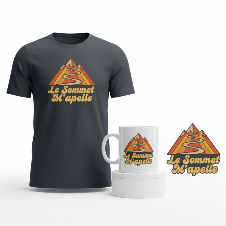
Design Brainstorm: Capturing the Aesthetic
To truly resonate with this sentiment, the design could lean into an aesthetic that evokes a sense of enduring nostalgia, almost as if these travel woes have always been part of the journey, softened by time and a touch of retro charm. One angle to consider is a look that feels both classic and subtly sarcastic, perfectly aligning with the understated humor of the theme.
- 🎨 Visual Concept: Imagine a stylized, minimalist icon, perhaps a simple graphic of a suitcase gliding through an x-ray scanner, rendered with clean lines but a hint of vintage texture. This visual could be the understated centerpiece. The color palette might embrace muted oranges, soft browns, and off-whites, reminiscent of late 20th-century travel posters or even classic airline branding, giving it that distressed, timeless appeal.
- ✍️ Typography Ideas: The text, “I Survived the Security Line,” could be presented in a distressed, 1970s-inspired font. Arranging this text in a gentle arc above or around the central graphic could add to the retro feel, creating a sense of a classic travel stamp or souvenir badge. The distressed nature of the font suggests wear and tear, subtly mirroring the ‘ordeal’ of the security line itself.
- 👕 Product Canvas: This type of design, with its muted color scheme and vintage vibe, would translate exceptionally well onto dark apparel. Think deep navy t-shirts, charcoal grey hoodies, or even black crewneck sweatshirts. The lighter, muted design colors would pop beautifully against a darker background, enhancing readability and overall aesthetic appeal.
Strategic Market Insight
Targeting frequent flyers and casual vacationers with this concept taps into a universally understood experience. The psychological trigger here is the shared sense of camaraderie among travelers. Purchasing an item with “I Survived the Security Line” isn’t just buying merchandise; it’s buying into a relatable narrative, a humorous acknowledgment of a common hurdle overcome. It’s a conversational piece, a subtle “wink” to fellow travelers, and a memento of a journey. By strategically avoiding direct mention of any specific government agency, the design sidesteps potential pitfalls of rapidly changing news cycles or controversial topics, instead focusing on an evergreen, universally humorous complaint that transcends specific events, ensuring broader and longer-lasting appeal.
⚖️ Estimated Copyright Risk: LOW
Copyright Evaluation: The phrase ‘I Survived the Security Line’ is a generic, humorous statement and not a registered trademark. The design avoids using any official logos, brand names, or government agency acronyms.
Always verify intellectual property rights before listing.
Check US Trademark Database (Justia) for “I Survived the Security Line” ➔
AI Image Generation Prompts
The following prompts are optimized for leading generators to produce production-ready assets:
👕 Apparel / T-Shirt Prompt
An isolated, clean vector illustration for a t-shirt print, set against a solid Dark background. The design is a retro-style graphic with a deeply distressed, 1970s-inspired chunky sans-serif font. The text 'I Survived the Security Line' is arranged in a prominent, upward-curving arc. Below the arc, the central graphic is a highly stylized, minimalist icon of a suitcase passing through an x-ray scanner. The suitcase silhouette is rendered in a muted cocoa brown, with its interior x-ray view depicted by simplified, ghosted lines and abstract shapes in creamy off-white and soft, muted orange. The x-ray scanner itself is a geometric, blocky form in a deep burnt orange. The entire illustration embodies a vintage screen-printed aesthetic: precise vector outlines are intentionally given a subtle, rough edge and halftone dot texture overlay, simulating slight ink bleed and natural wear without losing clarity. Colors are strictly limited to a palette of muted burnt orange, warm ochre, rich cocoa brown, and creamy off-white, with subtle color variations within shapes to enhance the aged, authentic feel. The mood is nostalgic, subtly humorous, and distinctly travel-themed. The artwork features sharp edges and deliberate imperfections, perfectly optimized for direct-to-garment or screen printing on a dark fabric, ensuring all design elements are crisp and legible while retaining the desired retro grunge. The ONLY text allowed in the image is exactly 'I Survived the Security Line'. Absolutely NO other names, words, or random letters. --ar 3:4 --v 6.0
☕ Drinkware / Mug Prompt
A duplicated side-by-side layout showing the exact same graphic on the left and right, designed perfectly for a panoramic mug wrap. The design is a high-detail, retro-style illustration, optimized for seamless repetition and continuous flow around a cylindrical coffee mug. The core graphic features the phrase 'I Survived the Security Line' rendered in a bold, distinctive, 1970s-inspired distressed sans-serif font, arcing gently upwards. Below this textual arc, a stylized, minimalist icon of a suitcase passing through an x-ray scanner is prominently displayed. The suitcase is outlined with clean, earthy brown lines, and its internal 'x-ray' structure is suggested with lighter, abstract shapes in creamy off-white and soft, muted terracotta orange. The scanner element is a solid, geometric form in a rich, vintage burnt orange. The entire artwork is designed with a simulated screen-print texture, incorporating subtle grunge speckles, faded edges, and minor misregistration effects to achieve an authentic worn, vintage poster aesthetic, while remaining perfectly sharp and legible for mug printing. The color palette is carefully restricted to muted burnt orange, warm ochre, deep cocoa brown, and creamy off-white. The rendering is flat and graphic, emphasizing clear shapes and bold typography, with a consistent distressed overlay applied evenly across all elements, ensuring a high-quality, durable print on ceramic. The duplication is executed with precision, guaranteeing a flawless visual wrap without any discernible seam or disruption. The ONLY text allowed in the image is exactly 'I Survived the Security Line'. Absolutely NO other names, words, or random letters. --ar 3:1 --v 6.0
✨ Die-Cut Sticker Prompt
A vibrant, 2D flat pop-art style die-cut sticker design with a prominent, thick white outline border around the entire design. The central text, 'I Survived the Security Line', is rendered in a bold, chunky, distressed 1970s-inspired sans-serif font with slightly rounded edges, mimicking aged vinyl lettering or vintage graphic novel typography. The text arcs dynamically upwards. Below the text, a highly stylized, minimalist icon of a suitcase passing through an x-ray scanner is depicted with clean, graphic lines and a strong visual impact. The suitcase itself is a solid, flat shape in a rich, muted earthy brown, with simplified, almost abstract 'x-ray' internal details rendered in crisp off-white lines and subtle, flat orange shapes, reminiscent of comic book styling. The x-ray scanner is a blocky, geometric form in a distinct, bright burnt orange. The design uses a limited, high-contrast color palette of muted oranges (burnt orange, tangerine), earthy browns (sepia, chocolate), and creamy off-whites, with strong, defined outlines and minimal shading, typical of classic pop art. Subtle halftone dot patterns and deliberate distressed texture overlays are meticulously integrated into the flat color areas to evoke a vintage screen-printed effect without sacrificing clarity or the bold pop-art aesthetic. The overall impression is a graphically strong, two-dimensional artwork, perfect for a high-quality, weather-resistant die-cut sticker, exuding a nostalgic, slightly quirky, travel-themed vibe. The thick white border provides a clean separation and enhances the die-cut appearance. The ONLY text allowed in the image is exactly 'I Survived the Security Line'. Absolutely NO other names, words, or random letters. --ar 1:1 --v 6.0
Frequently Asked Questions
How does this design resonate with travelers without directly mentioning a specific government agency?
The strength of this design lies in its universality. “Security Line” is an experience every air traveler in the United States recognizes instantly, regardless of the agency overseeing it. The focus is on the shared, human experience of waiting, processing, and ultimately, passing through. This broadens its appeal significantly, making it relatable to anyone who has ever traveled by air.
What makes a retro aesthetic particularly effective for this modern travel frustration?
A retro, 1970s-inspired aesthetic often evokes a sense of nostalgia, perhaps for a simpler, less complicated era of travel, or at least a time perceived differently. By applying this vintage style to a very modern frustration, it creates a humorous contrast. It suggests that while the processes might have changed, the fundamental experience of navigating travel hurdles remains a timeless part of the journey, making the humor more enduring and less transient.
Beyond apparel, what other products could this “I Survived the Security Line” design suit?
Considering the travel theme, this design could extend beautifully to a range of travel accessories. Think sturdy canvas tote bags perfect for carry-ons, sleek luggage tags that stand out on a carousel, passport holders for an extra touch of humor, or even insulated travel mugs for that pre-flight coffee. Keychains and bumper stickers could also be popular, allowing travelers to subtly display their “badge of survival” beyond their wardrobe.
Final Thoughts
The “TSA airport security” theme, when approached with a focus on shared experience and timeless humor, presents a compelling opportunity in the e-commerce space. By capturing the collective sigh and turning it into a relatable, retro-inspired statement, designers can create merchandise that resonates deeply with a vast audience of travelers. Ultimately, success in this niche, like any other, will hinge on thoughtful execution and injecting a unique, creative spin that truly captures the spirit of the message.
💬 What’s Your Take?
Art is subjective, and this is just one angle! How would you spin this “Tsa Airport Security” trend? Drop your design ideas and let’s brainstorm in the comments below!