Keep Portland Rosy
Basketball fever is a distinct pulse across the United States, and in Portland, Oregon, the energy around their professional team is undeniably electric. The city buzzes with conversations about player matchups, game outcomes, and the latest team news. Yet, beneath the surface of sports enthusiasm, there’s a powerful undercurrent of civic pride that flows strongly through the Rose City, a unique local spirit ripe for celebration and creative expression.
The Cultural Significance
The Portland Trail Blazers consistently command headlines, with news detailing their recent game performances, player movements, and upcoming highly anticipated matchups. This ongoing narrative keeps the team – and by extension, the city of Portland itself – in the national spotlight. For many residents, the team is more than just a sports franchise; it’s a vital part of the city’s identity, a shared experience that fosters community and connection. This passionate engagement with local institutions often extends beyond the arena, creating fertile ground for designs that allow residents to showcase their deep-rooted affection for their home city in unique, personal ways.
Design Brainstorm: Capturing the Aesthetic
Translating this profound sense of local pride into merchandise requires a design approach that’s both evocative and accessible. One exciting avenue is to lean into a timeless, artful aesthetic that resonates with Portland’s unique vibe.
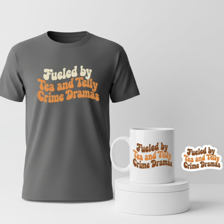
- 🎨 Visual Concept: Imagine a retro-inspired typographic masterpiece. The core idea here is a groovy, slightly distressed font, reminiscent of the vibrant 1970s, arranged in a playful, wavy layout that feels organic and flowing. The chosen color palette could be a delightful combination of rose pink, a deep forest green, and a soft off-white, echoing the charming faded hues of vintage travel posters. A truly clever touch might involve subtly integrating a stylized rose graphic, perhaps as the dot on the ‘i’ in “Portland” or as a discreet background element, providing a nod to the city’s iconic nickname.
- ✍️ Typography Ideas: The strength of this concept lies in its typography. A font that exudes a 70s feel – think flowing curves and a touch of psychedelic influence – could be perfect. The distressed texture adds authenticity and a worn-in, comfortable feel. Arranging the text, “Keep Portland Rosy,” in a wavy or undulating pattern could further enhance the retro vibe, suggesting movement and a laid-back coolness that aligns well with Portland’s reputation.
- 👕 Product Canvas: To make these charming colors and retro lines truly pop, apparel in a dark base color would be an ideal canvas. Dark navy, charcoal grey, or classic black t-shirts and hoodies would allow the rose pink, forest green, and off-white elements to stand out vibrantly, enhancing the vintage appeal and ensuring the design makes a statement.
Strategic Market Insight
The brilliance of this particular design concept lies in its intelligent pivot. While the initial trend might stem from a sports team, focusing directly on team branding carries significant intellectual property risk. By shifting to a ‘Local Pride’ niche, leveraging Portland’s beloved nickname “Rose City” and crafting a unique, positive slogan like “Keep Portland Rosy,” a designer can effectively sidestep trademark infringement concerns. The target demographic of proud Portland residents is actively seeking authentic ways to express their connection to their city. This evergreen design concept allows them to celebrate their hometown year-round, completely detached from the basketball team’s performance, wins, or losses. It taps into the psychological triggers of belonging, identity, and civic attachment, offering a piece of merchandise that feels personal, unique, and deeply rooted in local culture.
⚖️ Estimated Copyright Risk: LOW
Copyright Evaluation: Pivoted from the high-risk sports team to a local pride angle. The proposed slogan ‘Keep Portland Rosy’ is a unique phrase that avoids using the more heavily trademarked ‘The Rose City’ or ‘City of Roses’ while still being recognizable to the target audience.
Always verify intellectual property rights before listing.
Check US Trademark Database (Justia) for “Keep Portland Rosy” ➔
AI Image Generation Prompts
The following prompts are optimized for leading generators to produce production-ready assets:
👕 Apparel / T-Shirt Prompt
An ultra-detailed, clean vector illustration of the text 'Keep Portland Rosy', meticulously optimized for a t-shirt print, presented in isolation on a solid, deep charcoal gray background. The typography is a masterpiece of 1970s groovy aesthetic, featuring thick, plump, rounded letterforms with an authentic, subtle screen-print distress texture that adds character without sacrificing legibility. Each letter exudes a playful, organic quality, reminiscent of hand-drawn psychedelic poster art. The words are arranged in a captivating, dynamic wavy layout, with 'Keep' gently ascending a curvilinear arc, 'Portland' gracefully flowing downwards into a smooth trough, and 'Rosy' elegantly rising again, creating a rhythmic, undulating visual harmony across the composition. The exclusive color palette is a sophisticated blend of vintage travel poster hues: a muted, desaturated rose pink (like a dried rose petal), a rich, earthy forest green (like deep pine needles), and a warm, creamy off-white (like aged parchment paper). A singular, highly stylized, minimalist rose graphic, rendered with clean lines and a graphic silhouette, precisely replaces the traditional dot on the 'i' in 'Portland', seamlessly integrating as a subtle, charming focal point. The illustration style is defined by razor-sharp, crisp vector edges, immaculate curves, and perfectly flat color fills, showcasing impeccable graphic design principles suitable for high-fidelity screen printing. There are no harsh gradients or complex shading; instead, the impact comes from bold shapes and the harmonious color scheme. The overall rendering emphasizes clarity, scalability, and a nostalgic, optimistic retro mood. The design is presented flat, perfectly centered, with no external shadows, only the intrinsic details of the graphic itself. The texture is implied as smooth and ink-on-fabric ready. The mood is one of timeless, cheerful regional pride. --ar 3:4 --v 6.0 The ONLY text allowed in the image is exactly 'Keep Portland Rosy'. Absolutely NO other names, words, or random letters.
☕ Drinkware / Mug Prompt
A visually continuous, high-resolution graphic designed perfectly for a panoramic coffee mug wrap, featuring a distinct duplicated side-by-side layout that presents the exact same central graphic on both the left and right halves of the canvas. The core graphic is the text 'Keep Portland Rosy', rendered in an authentic 1970s-inspired groovy font characterized by its plump, organically rounded, and slightly distressed letterforms that evoke a nostalgic, worn-in feel. The typography exhibits a subtle, tactile print texture, hinting at an ink-on-ceramic application. The words are artfully arranged in a smooth, horizontally expansive wavy layout, where the letters gently rise and fall with an elegant, rhythmic flow, creating a dynamic visual journey across the mug's surface. The color scheme is strictly curated from a vintage travel poster aesthetic: a soft, almost pastel rose pink, a rich, subdued forest green, and a warm, aged off-white, providing a sophisticated yet playful contrast. A singular, elegantly stylized rose graphic, minimalist and clean-lined, is cleverly integrated as the dot on the 'i' in 'Portland', serving as a subtle design flourish. The rendering style is flat graphic illustration, with crisp edges and uniform color application, ideal for print consistency. The design is presented against a neutral, possibly off-white, background that would typically be the mug's color. The overall mood is cheerful, comforting, and perfectly suited for daily enjoyment. The duplication ensures a seamless wraparound appearance. --ar 3:1 --v 6.0 The ONLY text allowed in the image is exactly 'Keep Portland Rosy'. Absolutely NO other names, words, or random letters.
✨ Die-Cut Sticker Prompt
A captivating 2D flat pop-art style die-cut sticker design, featuring the text 'Keep Portland Rosy', meticulously crafted with a prominent, thick white outline border encapsulating the entire graphic. The typography is a dynamic, authentic 1970s groovy font, characterized by its bold, rounded letterforms and a subtly distressed texture that imbues it with vintage charm and tactile appeal, perfect for a sticker. The words are arranged in a playful, undulating wavy layout, exhibiting a lively sense of movement and graphic energy within the confined square space. The color palette is a vibrant yet retro-inspired triad: a bright, cheerful rose pink, a deep, energetic forest green, and a crisp, clean off-white. This combination creates a striking visual contrast, typical of classic pop art. A single, distinctively stylized rose graphic, rendered in a simplified, iconic manner, precisely replaces the dot on the 'i' in 'Portland', seamlessly integrated and adding a whimsical touch. The pop-art influence is evident in the strong, clean lines, the absolute flatness of the color fields, and the emphasis on graphic impact and immediate recognition. The overall design appears as a high-quality, opaque, and highly collectible sticker, ready to be die-cut with a perfectly smooth edge. The lighting is uniform and bright, showcasing the design in its truest form, and the implied texture is a smooth, glossy vinyl finish. The mood is fun, bold, and stylishly retro. --ar 1:1 --v 6.0 The ONLY text allowed in the image is exactly 'Keep Portland Rosy'. Absolutely NO other names, words, or random letters.
Frequently Asked Questions
How does this design navigate the common pitfalls of sports-related intellectual property?
The design intelligently pivots by focusing on ‘Local Pride’ rather than direct team affiliation. Instead of using team logos, names, or specific imagery, it draws inspiration from a common city nickname, “Rose City,” and creates a unique, positive slogan, “Keep Portland Rosy.” This approach celebrates the city’s identity independently, offering residents a way to show pride without infringing on sports team trademarks.
What makes a retro 1970s aesthetic a compelling choice for a contemporary Portland design?
Portland has a well-known appreciation for vintage culture, unique style, and artistic expression. A retro 1970s aesthetic, with its groovy fonts, flowing layouts, and nostalgic color palette, taps into this cultural sensibility. It offers a fresh, artful take on city pride that stands out from generic tourist merchandise and resonates with those who appreciate a distinct, timeless vibe.
Beyond dedicated sports fans, who is the ideal customer for “Keep Portland Rosy” apparel?
The ideal customer is any proud resident of Portland, Oregon, who wants to express their connection to their city. This includes individuals who appreciate unique, locally-inspired art, those who enjoy vintage aesthetics, and anyone seeking evergreen apparel that celebrates their hometown culture regardless of sports performance. It appeals to a broader demographic looking for authentic ways to represent the “Rose City.”
Final Thoughts
The potential for designs that tap into genuine local pride, particularly when intelligently distanced from high-risk IP, is significant in the print-on-demand landscape. “Keep Portland Rosy” offers a compelling blueprint: it’s timely due to local buzz, aesthetically appealing with its vintage charm, and strategically sound in its market approach. For designers, this serves as a reminder that understanding cultural nuances and clever concept pivoting can unlock evergreen niches with passionate, engaged audiences. As always, brilliant execution and adding your own unique spin will be key to capturing the hearts (and wallets) of proud Portlanders.
💬 What’s Your Take?
Art is subjective, and this is just one angle! How would you spin this “Portland Trail Blazers” trend? Drop your design ideas and let’s brainstorm in the comments below!