La mia Benzina è il Caffè – My Gasoline is Coffee
📅 Published: April 7, 2026
📍 Target Market: Italy
🔥 Trend: Prezzo Petrolio (oil price) ↗
Across Italy, the daily hum of scooters and the bustling morning commute are met with a collective sigh. The rising cost of petrol, or “prezzo petrolio,” has become a constant topic of discussion at every café counter and family dinner table. It’s more than just a line item on the budget; it’s a direct hit to the pockets and spirits of everyday Italians, sparking widespread concern over inflation and the increasing strain on daily life.
The Cultural Significance
The surge in oil prices isn’t just a fleeting news headline in Italy; it’s a deeply felt economic reality that touches every aspect of daily existence. For a country where local travel, family visits, and the simple pleasure of a Sunday drive are woven into the cultural fabric, the soaring cost of fuel directly impacts everything from grocery bills to vacation plans. This widespread frustration creates a ripe environment for expressions of shared sentiment, often manifesting in humor or solidarity. When a collective pain point emerges, especially one with such tangible financial consequences, it often gives rise to a desire for relatable commentary – a way to acknowledge the struggle while perhaps even offering a lighthearted escape.
Design Brainstorm: Capturing the Aesthetic
Translating a complex economic issue into an engaging design requires a thoughtful blend of cultural understanding and artistic flair. One compelling approach could leverage humor and a cherished national symbol to soften the blow of rising costs, offering a fresh, positive spin on a common frustration.
- 🎨 Visual Concept: Imagine a design steeped in vintage Italian charm. A simple, yet instantly recognizable, stylized graphic of a classic Italian espresso maker, the Moka pot, takes center stage. This iconic object could be cleverly integrated into the typography, perhaps replacing a letter or serving as a playful visual anchor. The color palette would draw inspiration from classic Italian advertising and poster art of yesteryear: warm cream, vibrant orange, and a rich, deep espresso brown. These hues evoke a sense of nostalgia, comfort, and authenticity.
- ✍️ Typography Ideas: The text itself carries much of the design’s punch and personality. Envision “La mia Benzina è il Caffè” rendered in a fun, groovy, bubbly, and rounded font, reminiscent of a retro 70s vibe. The words could be arranged in a gentle, almost undulating wave, adding to the playful, organic feel. This specific phrase, translating to “My Fuel is Coffee,” creates an immediate, humorous pivot from a negative economic reality to a universally beloved and deeply ingrained part of Italian identity. It’s a clever linguistic twist that resonates with shared experience.
- 👕 Product Canvas: Given the vintage-inspired colors and the playful yet sophisticated design, this concept would likely shine brightest on light-colored apparel. Think cream, soft white, or even a pale yellow or orange that complements the design’s core palette. The lighter background would allow the warm, rich design elements to pop, enhancing visibility and maintaining the retro aesthetic.
Strategic Market Insight
This design concept targets a substantial and highly passionate demographic: Italians united in their frustration over escalating fuel prices. The brilliance lies in its cross-niching strategy. It takes a negative, widely discussed economic problem – the high cost of “benzina” (fuel) – and brilliantly merges it with a universally cherished symbol of Italian culture and comfort: coffee. This creates a powerful psychological trigger. Instead of dwelling on the frustration, the design offers a humorous, relatable, and quintessentially Italian way to cope. It’s a nod of understanding, a shared inside joke that transforms a complaint into a statement of cultural pride and resilience. This approach also gives the design significant evergreen potential, as the love for coffee in Italy is timeless, making it a purchase driven by both current sentiment and lasting cultural identity.
⚖️ Estimated Copyright Risk: LOW
Copyright Evaluation: The trend of high oil prices has been safely pivoted to a cross-niche design. The Italian phrase is a common sentiment expressed in a unique way and is not trademarked. It combines two generic concepts, making the IP risk negligible.
Always verify intellectual property rights before listing.
Check EU Trademark Search for “La mia Benzina è il Caffè” ➔
AI Image Generation Prompts
The following prompts are optimized for leading generators to produce production-ready assets:
👕 Apparel / T-Shirt Prompt
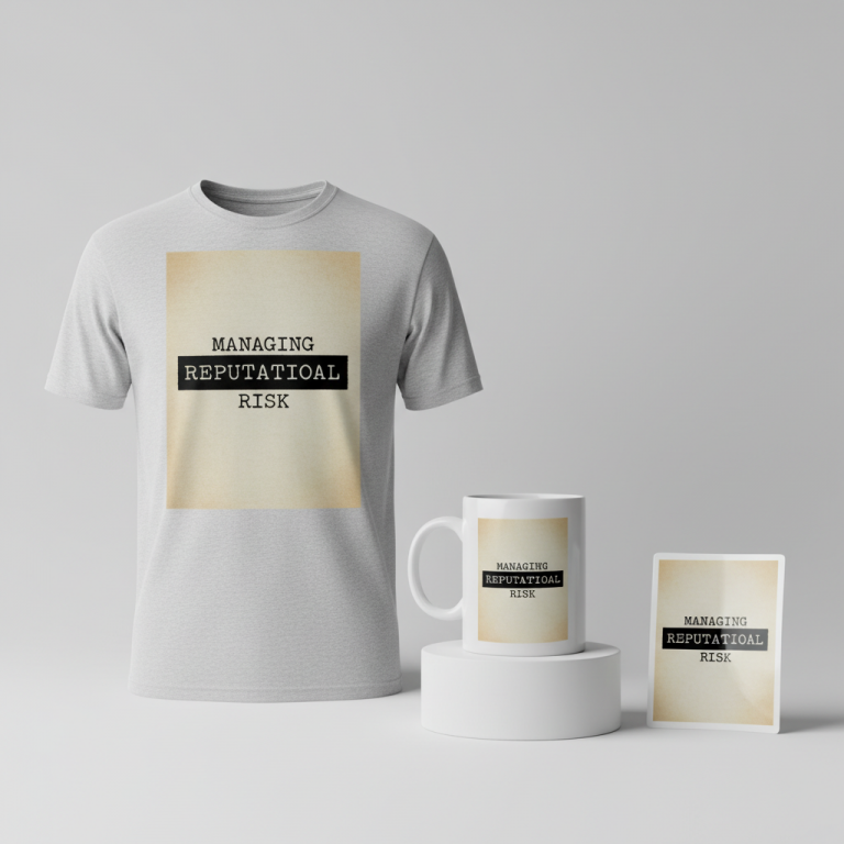
A fun, groovy typography-focused design, prominently featuring the text 'La mia Benzina è il Caffè' rendered in a custom, bubbly, rounded, highly stylized retro 70s font. The letters are arranged in an elegant, gentle wave, creating a dynamic yet balanced composition. A simple, iconic, and highly stylized graphic illustration of a vintage Italian Moka pot is cleverly integrated into the design, specifically replacing the dot of the 'i' in 'mia', rendered with geometric precision and smooth curves. The color scheme is directly inspired by classic vintage Italian poster art: a warm, creamy off-white for the background text elements, vibrant burnt orange for highlight details, and a deep, rich espresso brown for the primary text and Moka pot outline. This design is presented as an impeccably clean vector illustration, isolated on a solid, bright, and pristine light background. The art style emphasizes flat graphic design, bold, confident linework, and perfectly solid, untextured color fills. Edges are razor-sharp and crisp, demonstrating a high degree of digital precision, with no pixelation, blur, or hand-drawn imperfections. The rendering is smooth and polished, devoid of any visible brushstrokes, grain, or vintage distressing. The lighting is perfectly even and bright, resembling professional studio illumination, ensuring the design pops with clarity and vibrancy. The aesthetic is clean, modern retro, playful, and undeniably chic, ideal for high-quality t-shirt printing. The ONLY text allowed in the image is exactly 'La mia Benzina è il Caffè'. Absolutely NO other names, words, or random letters. --ar 3:4 --v 6.0
☕ Drinkware / Mug Prompt
A duplicated side-by-side layout showing the exact same vibrant graphic on the left and right, designed perfectly for a panoramic mug wrap. The central graphic is a fun, groovy typography design, showcasing the phrase 'La mia Benzina è il Caffè' rendered in a custom, bubbly, rounded, retro 70s-inspired font. The lettering flows gracefully in a subtle, elegant wave composition. An iconic, highly stylized graphic of a vintage Italian Moka pot is cleverly integrated, replacing the 'i' in 'mia', rendered with clean lines and smooth, simplified shapes. The color palette is directly inspired by vintage Italian poster art: a dominant creamy off-white, accented with warm burnt orange, and grounded by a rich espresso brown. This design is executed in a flawless vector graphic style, ensuring crispness and scalability for print. The rendering is perfectly smooth, vibrant, and high-resolution, suitable for a glossy ceramic mug surface, with no texture or distressed effects within the artwork itself. The art style is flat, graphic, and pop-art inspired, utilizing solid color fills and precise outlines. Lighting is bright, even, and consistent across both duplicated graphics, ensuring maximum legibility and color fidelity when wrapped around a cylindrical object. The mood is cheerful, nostalgic, and energizing, perfect for a coffee-related product. The background behind the design should be clean and unobtrusive, allowing the graphic to stand out. The ONLY text allowed in the image is exactly 'La mia Benzina è il Caffè'. Absolutely NO other names, words, or random letters. --ar 3:1 --v 6.0
✨ Die-Cut Sticker Prompt
A fun, groovy typography-focused design, prominently featuring the text 'La mia Benzina è il Caffè' in a custom-designed, bubbly, rounded, retro 70s-inspired font. The text is arranged in an elegant, flowing wave pattern. A simple, highly stylized graphic of a vintage Italian Moka pot is cleverly integrated, specifically replacing the 'i' in 'mia', rendered with bold, simplified forms suitable for a clear, impactful graphic. The color palette is inspired by vintage Italian posters: vibrant creamy off-white, warm burnt orange, and rich espresso brown, applied as solid, block colors. This design is rendered in a dynamic, 2D flat pop-art style, characterized by strong, confident black outlines and highly saturated, untextured color fills, reminiscent of classic graphic novels or Lichtenstein art. Critically, there is a thick, clean white outline border encapsulating the entire design, explicitly indicating its shape for a perfectly die-cut sticker. The art is graphic, iconic, and immediately recognizable, with simplified shapes and a minimalist approach to detail. The rendering is extremely crisp, sharp, and smooth, suggesting a high-quality, glossy vinyl finish. Lighting is completely flat and uniform, ensuring no internal shadows or gradients, preserving its two-dimensional, graphic quality. The texture is perceived as smooth, plastic-like, and flawless, ideal for a durable sticker. The overall mood is energetic, playful, and visually striking, designed for maximum visibility and appeal as a standalone collectible. The ONLY text allowed in the image is exactly 'La mia Benzina è il Caffè'. Absolutely NO other names, words, or random letters. --ar 1:1 --v 6.0
Frequently Asked Questions
How does this design resonate with the Italian target audience’s current mood?
The design taps directly into a widespread sentiment of frustration over rising fuel costs, a topic that’s constantly on everyone’s mind. By pivoting with humor and a beloved cultural symbol like coffee, it offers a lighthearted, relatable way for Italians to express their feelings without being overtly political or negative. It’s an “I get it, we’re all in this together” message, celebrated through a universally shared love for a good espresso.
What makes the proposed color palette and typography effective for this particular trend?
The cream, orange, and espresso brown colors, inspired by vintage Italian posters, evoke nostalgia, authenticity, and a classic Italian aesthetic that is immediately recognizable and appealing. Coupled with a groovy, bubbly 70s-style font, the design creates a retro-chic vibe that is both playful and stylish. This combination helps to transform a potentially negative topic into something charming, humorous, and visually engaging, making the merchandise feel like a piece of wearable art with a deeper cultural message.
Could this concept be adapted for other products beyond apparel, maintaining its impact?
Absolutely. The core concept of “My Fuel is Coffee” with its vintage Italian aesthetic and Moka pot graphic is incredibly versatile. It could translate beautifully to items like ceramic mugs (perfect for a morning coffee ritual!), tote bags for market trips, phone cases, or even decorative wall prints for a kitchen or café setting. The key is maintaining the visual integrity of the groovy typography and the stylized Moka pot, ensuring the message and aesthetic remain clear and charming across different mediums.
Final Thoughts
Navigating the currents of pop culture and consumer sentiment requires a keen eye for what truly resonates. The “prezzo petrolio” trend in Italy presents a unique opportunity to create merchandise that speaks directly to a shared experience, offering a blend of humor, cultural pride, and undeniable relatability. By focusing on smart design choices and understanding the subtle psychological triggers, brands can transform a common frustration into a beloved statement piece. The success of any creative endeavor ultimately hinges on thoughtful execution and a genuine connection to the audience, turning a simple phrase into a powerful cultural touchstone.
💬 What’s Your Take?
Art is subjective, and this is just one angle! How would you spin this “Prezzo Petrolio (oil price)” trend? Drop your design ideas and let’s brainstorm in the comments below!
⚖️ Disclaimer, Copyright & Earnings Notice
This article provides insights, design concepts, and strategies for educational and informational purposes only. By utilizing this information, you acknowledge and agree to the following:
- No Legal Advice: The content provided does not constitute legal counsel. Intellectual property laws are complex and constantly evolving.
- Independent Verification Required: There is no guarantee that the suggested niches, keywords, or AI-generated design concepts are free from trademarks, copyrights, or IP claims. You are solely responsible for conducting independent due diligence using official databases (e.g., USPTO, Trademarkia) before listing any product.
- Platform Compliance: You are entirely responsible for ensuring your final designs, keywords, and descriptions comply with the Terms of Service of your chosen Print-on-Demand platforms.
- No Earnings Guarantee: Mentions of “trending” topics or “buyer intent” do not guarantee sales, profits, or financial success. Your results depend on your individual execution and market conditions.
By acting on any information in this article, you accept full responsibility for your business operations and any resulting commercial or legal consequences.