L’Amore È Amore – Love Is Love
Italy, a nation celebrated for its timeless art, passionate culture, and profound history, is currently experiencing a profound societal dialogue. Recent events have put the spotlight firmly on conversations surrounding acceptance, diversity, and the enduring power of love. While specific incidents often spark these discussions, the underlying sentiment in the air points to a collective desire for a more inclusive future, underscoring the universal truth that love, in all its forms, deserves respect and celebration.
The Cultural Significance
The Italian public, known for its strong opinions and deep emotional connections, has recently been highly engaged in discussions concerning LGBTQ+ rights and the broader spectrum of personal freedoms. Moments of intolerance, regrettably, often serve as catalysts, prompting communities and allies to stand up more vocally for what is right. This isn’t just about a single news cycle; it’s a reflection of an ongoing cultural shift, a desire to move towards a society where identity and affection are honored, not denigrated. It highlights a burgeoning solidarity within the Italian LGBTQ+ community and among its growing network of allies, eager to express their support and champion positive change.
Design Brainstorm: Capturing the Aesthetic
Translating powerful cultural moments into meaningful merchandise requires thoughtful artistic direction. For this particular sentiment, the design concept aims for universal positivity, offering a vibrant, timeless expression of support.
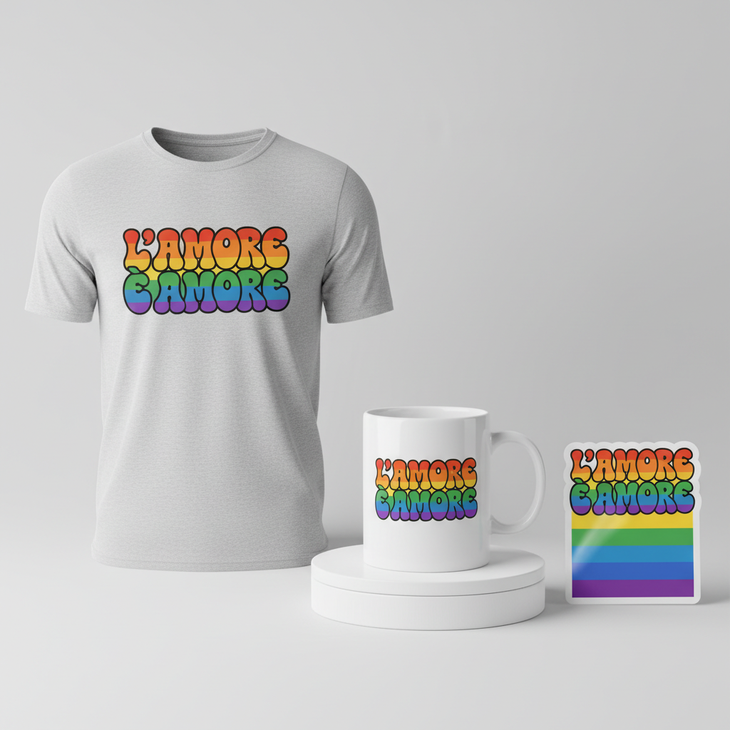
- 🎨 Visual Concept: One compelling angle is to embrace a truly unique, retro-inspired aesthetic. Imagine a vibrant, 70s-inspired ‘Groovy’ typography. The letters would be thick, beautifully rounded, and flow together with a playful energy. A delightful detail could involve filling these words with a dynamic rainbow gradient effect. This subtly references the Pride flag’s spectrum of colors, evoking joy and inclusivity without being a literal, overt flag, allowing for broader appeal and artistic interpretation.
- ✍️ Typography Ideas: The chosen text, “L’Amore È Amore” (Love Is Love), is universally understood and incredibly powerful in its simplicity, especially resonating within the Italian context. Paired with a groovy, retro font, the phrase takes on an additional layer of joy and freedom, harking back to an era of self-expression and cultural shifts. It’s a statement that transcends barriers, embodying a message of unconditional acceptance.
- 👕 Product Canvas: For a design this vibrant and uplifting, light apparel seems like an ideal canvas. Think classic white t-shirts, soft pastel hoodies, or even light heather gray crewnecks. The brightness of the fabric would allow the retro color palette and rainbow gradient to truly pop, making the design a cheerful and eye-catching statement piece.
Strategic Market Insight
Targeting the Italian LGBTQ+ community and its allies with a design like “L’Amore È Amore” is a strategic move that taps into genuine emotional resonance. The psychological triggers behind such a purchase are strong: it’s not just about buying an item of clothing, but about wearing a statement, a badge of solidarity, and a personal commitment to acceptance. For many, it’s a way to peacefully protest intolerance, express identity, and show support for loved ones. The evergreen nature of the phrase “Love Is Love,” coupled with a stylish, non-controversial aesthetic, makes it a safe yet powerful purchase that aligns with personal values and the broader movement for equality, ensuring compliance while fostering community connection.
⚖️ Estimated Copyright Risk: LOW
Our Findings: The phrase ‘Love Is Love’ (L’Amore è Amore) is a widely used global slogan for LGBTQ+ rights and is not subject to trademark for apparel use. It is considered a statement of public domain. The design is a general message of support and does not use any specific, protected IP.
Always verify intellectual property rights before listing.
Check EU Trademark Search for “Rocco Casalino” ➔
AI Image Generation Prompts
The following prompts are optimized for leading generators to produce production-ready assets:
👕 Apparel / T-Shirt Prompt
A highly detailed, vibrant, 70s-inspired 'Groovy' typography design, perfect for a t-shirt print. The text reads "L'Amore È Amore". The letters are exquisitely thick, voluptuously rounded, and expressively flowing, embodying a quintessential psychedelic aesthetic from the disco era. Each character features smooth, organic curves, balloon-like shapes, and a distinct playful, bubbly quality reminiscent of liquid typography. The entire wordmark is rendered in a rich, authentic retro color palette, meticulously chosen from the 1970s era: think warm, earthy oranges, sunny golden yellows, electric fuchsia, harmonious sky blues, lush avocado greens, and deep lavender purples. Within each individual letter, a meticulously crafted, seamless rainbow gradient effect transitions with buttery smoothness from one vibrant hue to another, subtly referencing the Pride flag's spectrum of colors without ever depicting an actual flag. This gradient possesses a luminous, glowing quality, creating a stunning sense of depth and dynamic visual movement within the flat graphic. The design is presented in a pristine, clean vector illustration style, characterized by impeccably sharp, crisp edges, mathematically precise Bezier curves, and immaculate, uniform color fills. There are no pixilation, rasterization artifacts, brushstrokes, or rough textures; every line is laser-precise and infinitely scalable, ensuring premium print quality. The colors are bold, highly saturated, and vibrant, yet maintain a vintage warmth and nostalgic charm. The overall mood is one of overwhelming joy, profound positivity, energetic whimsy, and universal love. Isolated on a solid Light background (e.g., pale cream, soft off-white, very light grey), ensuring maximum visibility, clarity, and versatility for apparel printing. The typography has a subtle implied 3D volume, giving the letters a substantial presence while remaining a crisp 2D graphic. High resolution, professional print-ready quality. The ONLY text allowed in the image is exactly 'L'Amore È Amore'. Absolutely NO other names, words, or random letters. --ar 3:4 --v 6.0
🔍 Search this niche on:
☕ Drinkware / Mug Prompt
An exceptionally detailed, vibrant, 70s-inspired 'Groovy' typography design, meticulously optimized for a coffee mug wrap layout. The central text is "L'Amore È Amore". This prompt demands a duplicated side-by-side layout showing the exact identical graphic on the left and right, designed perfectly for a panoramic mug wrap, creating a seamless, repeating visual flow. The typography features luxuriously thick, exaggeratedly rounded, and organically flowing letters, embodying a definitive psychedelic aesthetic of the 1970s. Each character boasts smooth, continuous curves and a playful, bubbly, almost liquid-like form, creating a sense of dynamic movement. The design is rendered in an authentic, high-impact retro color palette: think sun-baked oranges, vibrant mustard yellows, rich avocado greens, bold teal, electric magentas, and deep indigo blues. Inside each letter, a meticulously crafted, smooth rainbow gradient effect transitions with flawless subtlety, referencing the inclusive spectrum of the Pride flag without depicting a literal flag. The gradient is bright, clean, and has a slight internal luminosity, giving the letters a vibrant pop. The art style is bold, graphic, and exudes positive energy. Imagine the design printed with a glossy, durable finish onto a high-quality white ceramic mug. The edges of the typography are crisp, and the colors are deeply saturated and consistent across the wrap. The duplicated graphics are perfectly aligned horizontally, creating a continuous pattern suitable for wrapping around a cylindrical object. High resolution, vector-quality illustration with a slight textural feel of a ceramic print. The overall mood is joyful, expressive, and radiates love. The graphic design fills the entire horizontal space of the layout, ensuring maximum impact for the mug wrap. The ONLY text allowed in the image is exactly 'L'Amore È Amore'. Absolutely NO other names, words, or random letters. --ar 3:1 --v 6.0
🔍 Search this niche on:
✨ Die-Cut Sticker Prompt
An exceptionally detailed, vibrant, 70s-inspired 'Groovy' typography design for "L'Amore È Amore", meticulously optimized for a die-cut sticker. The letters are luxuriously thick, exaggeratedly rounded, and dynamically flowing, embodying a quintessential psychedelic aesthetic with a touch of playful whimsy. Each character features smooth, uninterrupted organic curves and a distinct bubbly, balloon-like quality. The entire wordmark is rendered in a vivid, authentic retro color palette, reminiscent of vintage 70s posters: think electric fuchsia, sun-kissed orange, bright lemon yellow, vibrant grass green, cool sky blue, and deep grape purple. Within each letter, a meticulously crafted, smooth rainbow gradient effect transitions seamlessly from one bold hue to another, subtly referencing the Pride flag's diverse spectrum of colors without ever depicting a literal flag. This gradient is characterized by its brilliant saturation and internal glow, creating a striking visual depth within the flat design. The art style is a pure 2D flat pop-art illustration: bold, graphic, high-contrast, and immediately eye-catching. The colors are uniformly flat, highly saturated, and vivid, with no complex shading or subtle textures, emphasizing clean, impactful visual communication. The design features impeccably crisp edges and precise, strong vector lines, ensuring a clean and sharp appearance. A prominent, thick white outline border encapsulates the entire design, providing a clear visual separation and defining the perfect contour for die-cutting, giving it a classic sticker aesthetic. The sticker itself has a desirable glossy, smooth vinyl finish. The overall mood is cheerful, exuberant, profoundly positive, and expressively loving, perfectly capturing the free spirit of the 70s. High resolution, print-ready vector art for optimal production. The graphic is centered within the square canvas. The ONLY text allowed in the image is exactly 'L'Amore È Amore'. Absolutely NO other names, words, or random letters. --ar 1:1 --v 6.0
🔍 Search this niche on:
Frequently Asked Questions
Why choose a ’70s groovy style for such a contemporary message?
The ’70s style, with its emphasis on peace, love, and freedom of expression, offers a beautiful historical parallel to today’s conversations around acceptance. A groovy aesthetic provides a lighthearted, optimistic, and visually appealing way to convey a powerful, timeless message, suggesting that love and acceptance are always in vogue.
What makes “L’Amore È Amore” particularly impactful for the Italian market?
While “Love Is Love” is a universal sentiment, expressing it in Italian directly speaks to the target audience, forging a stronger, more immediate connection. It grounds the message in the local culture, making it not just a statement of global solidarity but also a proud declaration of values within Italy itself.
How does this design strategy navigate sensitive news topics while remaining impactful?
The strategy smartly pivots from any specific, potentially controversial news event to the universally positive, underlying theme it represents: LGBTQ+ pride and support. By focusing solely on “L’Amore È Amore” and a joyful, inclusive design, it allows individuals to express solidarity and positivity without engaging in specific conflicts or mentioning individuals, making it compliant and broadly appealing.
Final Thoughts
The convergence of cultural conversations and accessible design presents a fertile ground for e-commerce entrepreneurs. This concept demonstrates how to skillfully transform a trending moment into meaningful, marketable products that resonate deeply with a specific audience. The true art lies in thoughtful execution—from the vibrancy of the print on light apparel to the clear, positive message it conveys. By focusing on universal themes of love and acceptance, designers can create merchandise that not only looks great but also contributes positively to the ongoing cultural dialogue.
💬 What’s Your Take?
Art is subjective, and this is just one angle! How would you spin this “Rocco Casalino” trend? Did we miss the mark, or is there a better inside joke to use here? Drop your design ideas and let’s brainstorm in the comments below!