Legende im Ruhestand – Legend in Retirement
📅 Published: May 28, 2026
📍 Target Market: Germany
🔥 Trend: Rentner (Retiree / Pensioner) ↗
From the bustling streets of Berlin to the tranquil villages dotting the Rhine, a poignant and pervasive conversation is currently unfolding across Germany. The nation’s beloved retirees, or “Rentner,” find themselves at the heart of a significant public discourse, making this a culturally resonant theme ripe for thoughtful design.
The Cultural Significance
The spotlight on Germany’s senior population isn’t merely a passing trend; it stems from a deeply felt social and political debate. At its core is the complex issue of pension payment disparities, particularly between those who retired in the former East and West Germany. This historical nuance has brought the topic of “Rentner” into sharp focus, sparking discussions about fairness, societal value, and the legacy of a divided nation. While the underlying issues are serious, the widespread conversation itself highlights the profound respect and attention given to this demographic within German society, creating an emotional connection that resonates with a broad audience.
Design Brainstorm: Capturing the Aesthetic
Translating a nuanced cultural moment into compelling merchandise requires a careful balance. One effective approach to capture the spirit of this trend, while offering a positive spin, could be through a design that exudes pride and warmth, rather than engaging directly with political sensitivities.
- 🎨 Visual Concept: Imagine a clean, impactful layout centered around typography. The core message could be presented in a bold, slightly distressed sans-serif font, giving it an authentic, lived-in feel, almost like a cherished vintage stamp or an official seal. Above this central phrase, a smaller line of text in a crisp, simple font could add a touch of elegant contrast. This combination evokes both authority and nostalgia, speaking to the wisdom and experience of retirees.
- ✍️ Typography Ideas: The German phrase “Legende im Ruhestand” (Legend in Retirement) offers a wonderfully celebratory and humorous angle. This widely recognized and beloved saying instantly elevates the status of the retiree, recognizing their contributions and embracing their new chapter. The choice of a strong, grounding font for “Legende im Ruhestand” could underscore the concept of a storied past, while the slight distress adds character, suggesting a life well-lived.
- 👕 Product Canvas: For such a design, dark apparel serves as an ideal backdrop. Black, navy, or charcoal shirts would allow the typography to truly pop, enhancing the vintage, stamped aesthetic. The contrast of lighter text against a dark fabric can also lend an air of timeless sophistication, making the garment a stylish and meaningful gift.
Strategic Market Insight
This design concept targets German retirees themselves, offering a personal badge of honor, and perhaps even more significantly, those looking to purchase thoughtful and celebratory retirement gifts. The brilliance of pivoting to “Legende im Ruhestand” lies in its ability to circumvent the sensitive political debate around pension inequality. Instead of treading into contentious territory, the design embraces a universally positive, proud, and humorous aspect of retirement. This ‘Diplomatic Pivot’ makes the merchandise broadly appealing, transforming it into a cherished item rather than a political statement. The phrase itself is a popular, commonly used celebratory saying in Germany, ensuring high relatability and instant connection with the target demographic. This evergreen niche — retirement gifts — combined with a timely cultural spotlight, positions this concept for consistent appeal.
AI Image Generation Prompts
The following prompts are optimized for leading generators to produce production-ready assets:
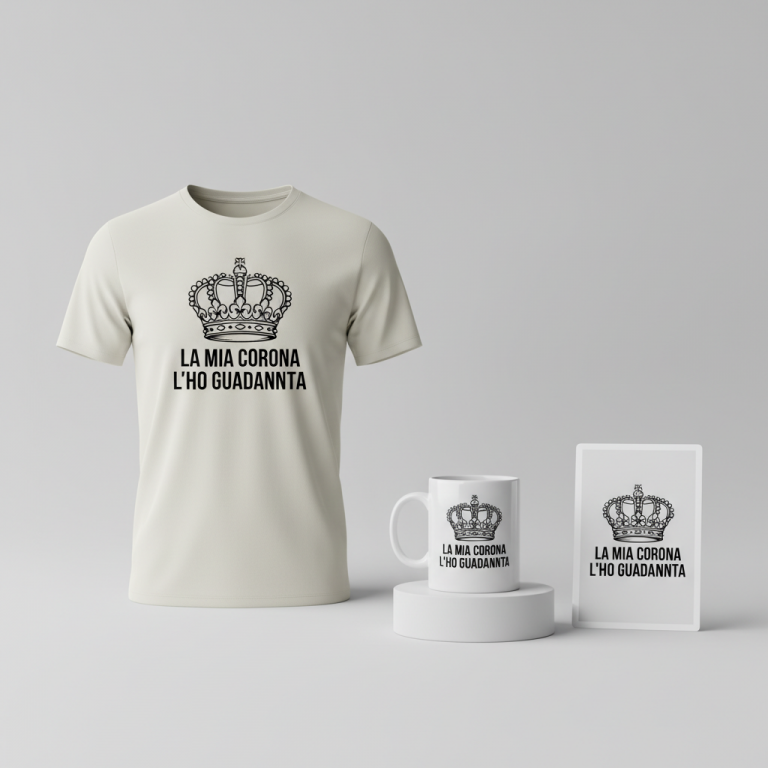
👕 Apparel / T-Shirt Prompt
A clean, typography-focused design optimized for a t-shirt print. The central graphic features the main text "Legende im Ruhestand" in a robust, condensed, impactful sans-serif typeface, similar to Anton or Impact, rendered with a meticulously crafted, subtle yet visible, irregular grunge distress texture, giving it a weathered, slightly worn rubber stamp aesthetic without losing legibility. This distress involves fine cracks, ink flecks, and softened edges, simulating an authentic vintage printing press impression. Above this main text, a smaller line of text in a contrasting clean, elegant monoline sans-serif font, like Montserrat Light, perfectly aligned and equally legible. The overall design exudes a slightly nostalgic, authentic, and understated vintage mood. The rendering is a clean vector illustration style, characterized by sharp foundational lines where the distress is an integrated graphic element, not a blur. The illustration employs flat graphic design principles, with a minimalist yet detailed approach to texture. Lighting is flat, even, and shadowless, designed to emphasize the textual texture and clarity. The texture itself is composed of subtle grit, fine grain, and simulated ink bleed at the letter edges, creating a tactile, worn effect without appearing muddy. This entire graphic is isolated on a solid Dark background, such as deep charcoal or dark navy, providing strong contrast and making the design pop. The design is presented as a high-resolution, print-ready graphic. The ONLY text allowed in the image is exactly 'Legende im Ruhestand'. Absolutely NO other names, words, or random letters. --ar 3:4 --v 6.0
☕ Drinkware / Mug Prompt
A duplicated side-by-side layout showing the exact same graphic on the left and right, designed perfectly for a panoramic coffee mug wrap. The design prominently features "Legende im Ruhestand" as the main text, rendered in a bold, sturdy, slightly condensed sans-serif font, such as Bebas Neue or League Spartan. This main text is meticulously adorned with an organic, fine-grain distress texture, mimicking the imperfect ink transfer of an antique letterpress or rubber stamp, ensuring a distinct weathered appearance that is sophisticated, not crude. Above the main text, a secondary line of text in a clean, elegant, and highly legible monoline sans-serif font like Lato or Open Sans. The entire composition has a strong vintage, stamped look, evoking authenticity and a classic aesthetic. The art style is high-resolution graphic design with a retro print influence, characterized by strong, clear typography that supports the integrated textural details. The rendering is sharp and crisp where the letters are defined, while the internal distress is precise and intentional, appearing as part of the font's character, not an overlay. Flat, even studio lighting ensures the design is perfectly visible across the mug's curvature, with no distracting glare or shadows. Textures include simulated ink imperfections, subtle worn areas, and a slight bleeding effect at the edges of the distressed elements, creating a tactile depth. The mood is classic, robust, and authentically vintage. The ONLY text allowed in the image is exactly 'Legende im Ruhestand'. Absolutely NO other names, words, or random letters. --ar 3:1 --v 6.0
✨ Die-Cut Sticker Prompt
A vibrant, clean die-cut sticker design featuring the core typography "Legende im Ruhestand". The main text "Legende im Ruhestand" is rendered in a heavy, impactful, slightly condensed sans-serif font, like Gotham Black or Akzidenz-Grotesk, incorporating a distinct, integrated, subtly irregular distress pattern that emulates a retro, tactile stamp effect – clean cuts and defined imperfections, not blurry or pixelated. Above this, a smaller line of text in a crisp, ultra-clean, simple sans-serif font, such as Poppins or Fira Sans, providing excellent contrast and legibility. The design radiates a slightly vintage, bold, and collectible mood. The art style is a striking 2D flat pop-art style, emphasizing graphic clarity, bold lines, and solid, opaque color fields. The rendering is incredibly crisp and clean, with vector-like precision for all edges, including the internal distress which is treated as a sharp graphic element. Flat, shadowless lighting emphasizes the graphic nature and bold colors. Textures are primarily simulated ink imperfections and fine, controlled grit embedded within the letters to achieve the vintage stamp look, while the overall sticker surface and outline remain perfectly smooth and glossy. The defining feature is a thick white outline border, approximately 10-15% of the design's overall width, cleanly separating the design from any background, creating a distinct, prominent die-cut edge, perfect for a collectible sticker. The graphic itself is perfectly centered within this border. The ONLY text allowed in the image is exactly 'Legende im Ruhestand'. Absolutely NO other names, words, or random letters. --ar 1:1 --v 6.0
Frequently Asked Questions
Why choose a celebratory phrase like “Legende im Ruhestand” instead of something more direct about the pension debate?
The strategic choice of “Legende im Ruhestand” offers a diplomatic and widely appealing angle. While the pension debate is a significant cultural talking point, directly addressing it on merchandise could be polarizing. By focusing on a positive, universally understood sentiment of pride and achievement in retirement, the design broadens its market significantly. It transforms a potentially sensitive topic into a beloved, humorous gift suitable for any retiree, regardless of their specific pension situation, making it an inclusive and joyous expression.
Beyond t-shirts, what other products could this “Legende im Ruhestand” design translate well onto?
The clean, typography-focused, vintage-stamped aesthetic of this design makes it incredibly versatile. It would look fantastic on ceramic mugs, perfect for morning coffee or tea. High-quality tote bags could offer a stylish accessory, while wall art or framed prints could serve as a commemorative piece for an office or home. Even subtle applications on baseball caps or keychains could capture the essence, making it a proud statement across a range of everyday items.
How important is cultural nuance when designing for the German market, especially with phrases like this?
Cultural nuance is absolutely critical for authenticity and market resonance. Using a phrase like “Legende im Ruhestand” demonstrates a deep understanding of German colloquialisms and celebratory expressions. Direct translations or culturally inappropriate phrasing can fall flat or even offend. For designers targeting specific countries, collaborating with native speakers or conducting thorough cultural checks ensures that the language, tone, and visual cues are genuinely relatable and impactful within that specific market.
Final Thoughts
The current cultural conversation around “Rentner” in Germany presents a fascinating opportunity for Print-on-Demand creators. By thoughtfully navigating the underlying social currents and choosing a universally positive and celebratory approach, designs like “Legende im Ruhestand” can tap into a significant and appreciative market. The e-commerce potential here lies in offering items that resonate emotionally, creating connections through humor, pride, and cultural recognition. Remember, while the concept is strong, careful execution and a touch of personal flair are always key to standing out in a bustling marketplace.
💬 What’s Your Take?
Art is subjective, and this is just one angle! How would you spin this “Rentner (Retiree / Pensioner)” trend? Drop your design ideas and let’s brainstorm in the comments below!
⚖️ Disclaimer, Copyright & Earnings Notice
This article provides insights, design concepts, and strategies for educational and informational purposes only. By utilizing this information, you acknowledge and agree to the following:
- No Legal Advice: The content provided does not constitute legal counsel. Intellectual property laws are complex and constantly evolving.
- Independent Verification Required: There is no guarantee that the suggested niches, keywords, or AI-generated design concepts are free from trademarks, copyrights, or IP claims. You are solely responsible for conducting independent due diligence using official databases (e.g., USPTO, Trademarkia) before listing any product.
- Platform Compliance: You are entirely responsible for ensuring your final designs, keywords, and descriptions comply with the Terms of Service of your chosen Print-on-Demand platforms.
- No Earnings Guarantee: Mentions of “trending” topics or “buyer intent” do not guarantee sales, profits, or financial success. Your results depend on your individual execution and market conditions.
By acting on any information in this article, you accept full responsibility for your business operations and any resulting commercial or legal consequences.