
LIVING FOR THE LIVE MUSIC
A wave of vibrant energy is currently sweeping across the United Kingdom! As the highly anticipated tickets for one of the summer’s premier annual music festivals hit the market, a tangible buzz has ignited among music enthusiasts, eager to secure their spot at what promises to be an unforgettable event.
The Cultural Significance
Across the United Kingdom, the recent release of tickets for BBC Radio 1’s Big Weekend has ignited a fervent wave of discussion and anticipation. This isn’t merely about attending another concert; for many young music lovers, it’s an unofficial kick-off to the summer festival season. The allure of top-tier headliners performing across various stages creates a unique cultural moment, where friendships are forged, memories are made, and the collective energy of thousands converges. For a significant segment of the youth demographic, securing a ticket is a rite of passage, a declaration of their passion for live music, cementing this topic as a significant annual marker in the UK’s cultural calendar.
Design Brainstorm: Capturing the Aesthetic
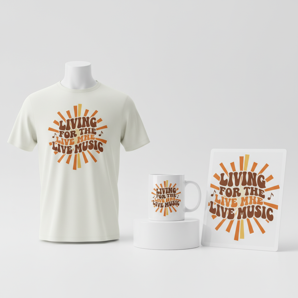
When approaching merchandise for such a vibrant cultural moment, one exciting avenue to explore is a design that captures the enduring spirit of music festivals without being tied to specific branding. A 1970s-inspired ‘groovy’ aesthetic offers a timeless, free-spirited vibe that resonates with festival culture across generations.
- 🎨 Visual Concept: Imagine letters with a distinct wavy, slightly psychedelic feel. The color palette could lean into warm, retro tones like burnt orange, deep brown, and creamy off-white, evoking a sense of nostalgia. Stylized, simple sun rays might playfully emanate from the text, perhaps even with subtle musical notes integrated into the overall composition, adding a whimsical touch. This approach taps into a broadly appealing vintage aesthetic.
- ✍️ Typography Ideas: The core of this concept revolves around the phrase “LIVING FOR THE LIVE MUSIC.” Presenting this text in a ‘groovy’ 70s-inspired font gives it immediate character and aligns perfectly with the visual theme. The wavy, flowing nature of the letters enhances the relaxed, free-spirited atmosphere of a music festival, creating a design that feels both current and nostalgic.
- 👕 Product Canvas: For a festival vibe, light apparel would likely be a fantastic choice. Think soft-style t-shirts, breezy tank tops, or even lightweight hoodies perfect for cooler evenings. The retro color palette would pop beautifully on light backgrounds, allowing the design to stand out clearly and appeal to the target audience looking for comfort and style.
Strategic Market Insight
Targeting young UK music festival attendees with this concept holds significant potential. The phrase ‘Living for the Live Music’ speaks directly to the core passion of this demographic, offering a universal sentiment that transcends any single event. It acts as an identifier, allowing wearers to express their deep-seated love for the festival experience itself. The groovy, 70s typography is not just a passing fad; it’s a trending aesthetic in broader fashion and print-on-demand circles, appealing to those who appreciate vintage style. Crucially, this strategy completely sidesteps intellectual property infringement concerns by focusing on the generic, evergreen culture of music festivals rather than leveraging specific, branded event names or artist likenesses. This approach opens up a wider, safer market opportunity for designers.
⚖️ Estimated Copyright Risk: LOW
Our Findings: This design avoids all copyrighted event titles and artist names. The quote is a common, generic phrase expressing a love for live music and is not subject to trademark. The visual style is an aesthetic and not a protected entity.
Always verify intellectual property rights before listing.
Check UK Trademark Search for “Radio 1 Big Weekend” ➔
AI Image Generation Prompts
The following prompts are optimized for leading generators to produce production-ready assets:
👕 Apparel / T-Shirt Prompt
A vibrant 1970s psychedelic typographic design featuring the text "LIVING FOR THE LIVE MUSIC". The letters are bold, plump, and display exaggerated wavy, fluid forms, reminiscent of melting retro fonts, with soft, rounded edges and a slightly inflated appearance. The typography is rendered in a clean, professional vector illustration style, with crisp, precise lines and smooth, unbroken curves. The color palette is rich with warm, nostalgic tones: dominant shades of burnt orange and deep terracotta, complemented by creamy ivory for highlights and outlines, and accents of warm chocolate brown and goldenrod yellow. Simple, stylized sun rays emanate subtly from behind or around key letters, depicted as thin, curved lines or solid geometric arcs. Playful, minimalist musical notes (such as eighth notes and quarter notes) are subtly integrated into the negative space or float organically around the text, matching the groovy aesthetic. The entire design is isolated on a solid, clean light cream background, emphasizing its graphic appeal for apparel. No complex textures or shadows, just pure, flat color and smooth gradients where appropriate to define the wavy forms. High-resolution digital artwork, perfect for screen printing. The ONLY text allowed in the image is exactly 'LIVING FOR THE LIVE MUSIC'. Absolutely NO other names, words, or random letters. --ar 3:4 --v 6.0
🔍 Search this niche on:
☕ Drinkware / Mug Prompt
A panoramic coffee mug wrap layout featuring a vibrant 1970s 'groovy' typographic design. The central text "LIVING FOR THE LIVE MUSIC" is rendered in bold, undulating letterforms with exaggerated curves and a psychedelic, almost fluid appearance, capturing the essence of vintage hand-drawn fonts. The color scheme is a warm, inviting retro palette of rich burnt orange, deep chocolate brown, creamy beige, and sun-kissed golden yellow. Stylized, simplified sun rays, depicted as sweeping arcs or radiating lines, are gracefully incorporated around the text, along with minimalist musical notes (such as treble clefs and eighth notes) floating playfully within the composition. The overall aesthetic is a clean, sharp graphic design with flat colors, smooth gradients defining the wavy letter contours, and crisp outlines, perfect for high-resolution print. This design is presented in a duplicated side-by-side layout, showing the exact same graphic on the left and right, ensuring a seamless, panoramic wrap around a mug. The background is a solid, clean, slightly off-white cream that complements the retro colors, allowing the design to pop. Studio lighting, digital illustration, high-fidelity colors, smooth vector quality. The ONLY text allowed in the image is exactly 'LIVING FOR THE LIVE MUSIC'. Absolutely NO other names, words, or random letters. --ar 3:1 --v 6.0
🔍 Search this niche on:
✨ Die-Cut Sticker Prompt
A vibrant, 2D flat pop-art style die-cut sticker design featuring the groovy 1970s typography "LIVING FOR THE LIVE MUSIC". The letters are bold, chunky, and possess a distinctly wavy, flowing, and slightly psychedelic character, rendered with smooth, cartoon-like curves and strong outlines, reminiscent of vintage bubble letters infused with retro flair. The color palette is intensely saturated, employing a classic warm 70s scheme: bright tangerine orange, rich chocolate brown, creamy vanilla, and sunny golden yellow. Stylized, simplified sun rays, depicted as radiating flat shapes or solid arcs, are integrated harmoniously into the composition, alongside playful, minimalist musical notes that appear to dance around the text. The entire graphic boasts a clean, hard-edged vector art aesthetic with no textures or gradients, designed for maximum visual impact as a collectible sticker. Critically, the entire design is encased by a thick, clean white outline border, perfectly suited for a die-cut sticker, giving it a prominent, eye-catching separation from any background. High contrast, sharp details, smooth digital illustration, vibrant and graphic. The ONLY text allowed in the image is exactly 'LIVING FOR THE LIVE MUSIC'. Absolutely NO other names, words, or random letters. --ar 1:1 --v 6.0
🔍 Search this niche on:
Frequently Asked Questions
How does this design concept avoid intellectual property issues given the trend’s origin?
This design ingeniously pivots from the heavily trademarked “Radio 1 Big Weekend” event by focusing on the universal *experience* of attending any live music festival. The phrase “LIVING FOR THE LIVE MUSIC” and the 70s groovy aesthetic celebrate the broader culture and passion for music, rather than referencing specific brand names, logos, or performers associated with a particular festival. This allows creators to tap into the general excitement without infringing on intellectual property rights.
What makes a 70s-inspired design appealing to today’s young festival-goers?
The 70s aesthetic is experiencing a significant resurgence in fashion and pop culture, often associated with a sense of freedom, individuality, and counter-culture cool. For young festival attendees, this retro vibe offers a distinct style that stands out, connecting them to a timeless era of music and self-expression. It’s seen as authentic and effortlessly cool, making it a powerful choice for festival merchandise that resonates with current trends while maintaining classic appeal.
Beyond apparel, what other products could this ‘Living for the Live Music’ theme work on?
The versatility of this ‘groovy’ design means it could extend beautifully beyond just light apparel. Consider accessories like tote bags for carrying festival essentials, enamel pins, phone cases, or even vibrant posters for a bedroom wall. Drinkware such as insulated tumblers or water bottles for staying hydrated at events could also be a fantastic fit, carrying the “LIVING FOR THE LIVE MUSIC” mantra into other everyday items for dedicated fans.
Final Thoughts
The energy surrounding major events like Radio 1’s Big Weekend presents a fantastic opportunity for creators to tap into a deeply passionate market. By honing in on the universal love for live music and blending it with a perennially popular retro aesthetic, designers can craft merchandise that resonates deeply with its audience. Remember, while trending topics provide the initial spark, unique execution, a keen eye for design, and a personal spin are what truly differentiate successful creations in the bustling world of e-commerce. Embrace the vibe, celebrate the culture, and let your creativity illuminate the passion for live music.
💬 What’s Your Take?
Art is subjective, and this is just one angle! How would you spin this “Radio 1 Big Weekend” trend? Did we miss the mark, or is there a better inside joke to use here? Drop your design ideas and let’s brainstorm in the comments below!
