
Mare Fuori 6 (The Sea Outside 6) Merch Design
From the sun-drenched, yet somber, streets of Naples’ juvenile detention center to screens across Italy, ‘Mare Fuori’ has once again cast its irresistible spell. The recent release of Season 6 on the RaiPlay streaming service has ignited a cultural phenomenon, pulling millions back into its gripping narrative and raw emotional landscape. This isn’t just another TV show; it’s a national obsession, creating a powerful wave of engagement that presents a unique opportunity for print-on-demand creators.
The Cultural Significance
The enduring appeal of ‘Mare Fuori’ lies in its unflinching portrayal of youth navigating the harsh realities of confinement, juxtaposed with the eternal longing for freedom. Set against the evocative backdrop of Naples, the series masterfully weaves tales of friendship, betrayal, love, and redemption among its young protagonists. Each season deepens the connection viewers feel to its complex characters, making it more than just a drama—it’s a shared emotional journey that reflects universal themes of adolescence, aspiration, and the search for identity against formidable odds. The show’s raw authenticity and compelling storytelling have cemented its place as a cornerstone of contemporary Italian popular culture.
Design Brainstorm: Capturing the Aesthetic
Translating the profound emotional depth of a cultural phenomenon like ‘Mare Fuori’ into merchandise requires a thoughtful, nuanced approach. The goal is to evoke recognition and feeling without relying on overt branding.
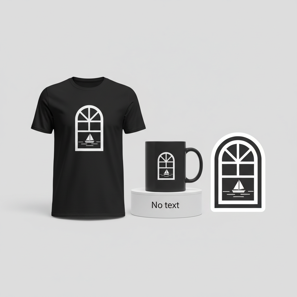
- 🎨 Visual Concept: One angle to consider for capturing the show’s essence is a highly stylized, minimalist graphic. Imagine an arched window, typical of an old building or prison, with thick, unyielding bars. Peeking through these bars, a simple, serene view of a calm sea with the faint silhouette of a small boat is visible. This single-color design, perhaps in white or a light hue on a dark background, creates a dramatic, high-contrast effect. It’s a powerful visual metaphor that instantly conveys both confinement and the persistent glimmer of hope represented by the sea – a core theme for anyone familiar with the series.
- ✍️ Typography Ideas: For this specific concept, a striking choice could be to forgo text entirely. This isn’t merely an omission; it’s a strategic design decision. By relying solely on the symbolic visual, the design becomes an ‘insider’ reference that is instantly recognizable to the fanbase. This approach cleverly navigates potential copyright issues by avoiding trademarked names or phrases, making the item evergreen and bot-check-friendly. It allows the visual metaphor to speak volumes, creating a deeper, more subtle connection with the wearer.
- 👕 Product Canvas: To truly make this minimalist graphic pop and convey its intended drama, dark apparel is an ideal canvas. Envision a deep navy, charcoal grey, or classic black t-shirt, hoodie, or even a tote bag. The contrast of a light, singular graphic against a dark background enhances the feeling of light breaking through darkness, amplifying the design’s emotional impact and visual appeal.
Strategic Market Insight
Tapping into the ‘Mare Fuori’ phenomenon requires more than just acknowledging its popularity; it demands an understanding of its dedicated fanbase. These aren’t just casual viewers; they are deeply invested in the show’s universe and its characters. The psychological trigger here is twofold: instant recognition and belonging. A design that subtly references the show’s core themes allows fans to express their passion without overtly displaying trademarked elements. It becomes an ‘if you know, you know’ statement, fostering a sense of community among those who ‘get it.’ This clever approach bypasses typical copyright pitfalls, making the merchandise evergreen and appealing to true connoisseurs of the series who appreciate subtle nods over blatant branding.
⚖️ Estimated Copyright Risk: LOW
Risk Assessment: The design uses the ‘broad trope’ workaround by focusing on the universal concept of desiring freedom from confinement, symbolized by a view of the sea. It contains no text, logos, character likenesses, or specific scenes from the TV show. The imagery of bars and a sea view is generic and not protected intellectual property.
Always verify intellectual property rights before listing.
Check EU Trademark Search for “Mare Fuori 6” ➔
AI Image Generation Prompts
The following prompts are optimized for leading generators to produce production-ready assets:
👕 Apparel / T-Shirt Prompt
A highly stylized, minimalist graphic design for a t-shirt, isolated on a solid Dark background, specifically deep charcoal black or rich midnight navy. The central motif is a small, elegant arched window, rendered with thick, bold, and perfectly geometric bars that convey a strong sense of deliberate, structured confinement. Through the precise negative space created by the bars, a serene, simplified vista of a calm sea is clearly visible. The sea is depicted with subtle, stylized waves using clean, flowing, horizontal lines or a single, smooth, slightly curved band of color, transitioning into a perfectly flat horizon line. A tiny, poignant silhouette of a lone boat, depicted as a simple, iconic sailboat with a single mast and sail, or a solitary, archetypal rowboat, is positioned on the sea, hinting at distant freedom, resilience, and possibility. The entire illustration is monochromatic, rendered exclusively in a single, bright, clean white color, creating an extremely high-contrast and dramatic visual impact against the deep, dark background. The art style is a crisp vector illustration, characterized by precise, razor-sharp edges, perfect geometric shapes for the window and bars, and smooth, digitally rendered forms for the sea and boat. There are no gradients, textures, or complex shading within the white elements; only solid, flat fills, emphasizing graphic purity, iconic representation, and scalability. The composition masterfully utilizes negative space to effectively convey both the restrictive nature of the bars and the expansive hope of the view beyond. The aesthetic is clean, modern, symbolic, and profoundly evocative, designed for maximum legibility and impactful visual communication as an apparel print, suggesting themes of resilience, longing, and quiet optimism within constraint. The illustration techniques reflect a sophisticated blend of modern graphic design and simplified icon design, ensuring perfect scalability and print fidelity across various garment sizes. The overall mood is contemplative, quietly hopeful, yet dramatically stark and powerful. The ONLY text allowed in the image is exactly 'No text'. Absolutely NO other names, words, or random letters. --ar 3:4 --v 6.0
🔍 Search this niche on:
☕ Drinkware / Mug Prompt
A highly stylized, minimalist graphic design, presented in a duplicated side-by-side layout showing the exact same graphic on the left and right, designed perfectly for a panoramic mug wrap. The core image depicts a small, elegantly arched window with thick, imposing, yet clean and geometrically precise bars. Through the starkly rendered bars, a simple, serene view of a calm sea stretches out to a flat horizon, indicated by smooth, consistent horizontal lines or a subtle, single, flat curve representing the water's surface. A small, distinct silhouette of a single, simple boat, rendered as an iconic shape like a small fishing boat or a generic, classic vessel profile, is perfectly centered on the sea, serving as a powerful symbol of distant possibility and adventure. The entire design is rendered in a single, luminous white or light grey color, standing in bold, dramatic contrast against an implied deep, dark background (like a rich black or dark navy mug surface). The art style is characterized by graphic simplicity, sharp lines, and strong visual impact, meticulously optimized for legibility and aesthetic appeal on a curved surface. Rendering is clean, with solid color fills and no complex textures, emphasizing the purity of form and the clarity of the message. The mood is contemplative and subtly inspiring, evoking a poignant blend of enclosure and burgeoning hope, making it perfect for a moment of quiet reflection while sipping coffee or tea. The illustration deliberately avoids intricate details, relying instead on strong, recognizable shapes and effective use of negative space to convey its profound meaning. The duplication ensures seamless wrapping around a standard coffee mug, with the design elements perfectly aligned for a continuous, uninterrupted visual experience. High-resolution digital rendering with crisp edges and uniform color application across all elements. The ONLY text allowed in the image is exactly 'No text'. Absolutely NO other names, words, or random letters. --ar 3:1 --v 6.0
🔍 Search this niche on:
✨ Die-Cut Sticker Prompt
A vibrant, highly stylized, minimalist graphic design for a die-cut sticker, rendered in a bold 2D flat pop-art style with maximal visual impact. The central image features a small, arch-shaped window defined by robust, clean, and perfectly geometric bars. Through the starkly delineated bars, a simplified, graphic representation of a calm sea is visible, rendered with precise, horizontal lines or a single, smooth, flat curve that defines the water's surface. A small, distinct silhouette of a boat, rendered as an iconic, easily recognizable shape (e.g., a tiny sailboat with a single triangular sail or a classic, simplified rowboat profile), floats serenely on the sea. The entire internal graphic (window, bars, sea, boat) is presented in a single, luminous white or light monochromatic color, creating striking, high-contrast visual drama against a deep, dark implied internal background (e.g., a rich black or midnight blue fill that forms the internal shape of the sticker itself). Encircling the entire detailed graphic is a distinct, thick white outline border, clearly separating the design from its surroundings and providing a strong visual 'pop,' characteristic of a premium die-cut sticker. The art style emphasizes clean lines, solid color fills, and highly simplified forms, reminiscent of classic pop art and modern iconography, ensuring immediate recognition and appeal. Rendering is ultra-crisp, digitally precise, with sharp edges and no gradients, textures, or complex shading within the main elements, guaranteeing a bold, eye-catching appearance. The mood conveyed is one of quiet determination, hope, and unwavering resilience, making it a compelling piece of portable art. The graphic relies on strong silhouettes and minimal detail for maximum impact and immediate recognition. The thick white border provides a strong visual 'pop' and defines the sticker's unique, custom shape. The ONLY text allowed in the image is exactly 'No text'. Absolutely NO other names, words, or random letters. --ar 1:1 --v 6.0
🔍 Search this niche on:
Frequently Asked Questions
How does this design capture the essence of ‘Mare Fuori’ without using any direct show elements or text?
The proposed design concept brilliantly encapsulates the show’s core metaphors: the juvenile prison as a place of confinement (represented by the barred window) and the yearning for freedom and a better future (symbolized by the calm sea and distant boat). For dedicated fans, these powerful visual cues immediately resonate with the series’ central themes, allowing them to express their fandom through subtle, artistic means rather than direct branding.
Given the strong Italian context, is this merchandise relevant only to an Italian audience?
While ‘Mare Fuori’ is an Italian phenomenon, its themes of youth, struggle, hope, and freedom are universal. The symbolic nature of this particular design means it has the potential to appeal to international fans who discover the show, as well as anyone who appreciates minimalist art conveying deep emotional concepts. However, the primary and most passionate audience will undoubtedly remain within Italy.
What makes this particular design concept ‘evergreen’ and legally safe for Print-on-Demand?
The design’s strength lies in its complete independence from copyrighted material. By avoiding the show’s title, character names, or specific imagery, it sidesteps trademark and copyright infringement concerns. Its symbolic nature ensures it remains relevant long after Season 6 has aired, as the themes it represents are foundational to the series and resonate universally, making it a safe and sustainable choice for print-on-demand.
Final Thoughts
The fervor surrounding ‘Mare Fuori 6’ presents a vibrant opportunity for designers to connect with a passionate audience in Italy. By focusing on symbolic, evocative designs that resonate deeply with the show’s core themes, creators can offer fans a unique way to celebrate their beloved series. Remember, while these ideas provide a strong foundation, the magic truly happens in the execution – attention to detail, quality of print, and a genuine understanding of what makes a fan tick will ultimately define success in this exciting niche.
💬 What’s Your Take?
Art is subjective, and this is just one angle! How would you spin this “Mare Fuori 6 (The Sea Outside 6)” trend? Did we miss the mark, or is there a better inside joke to use here? Drop your design ideas and let’s brainstorm in the comments below!