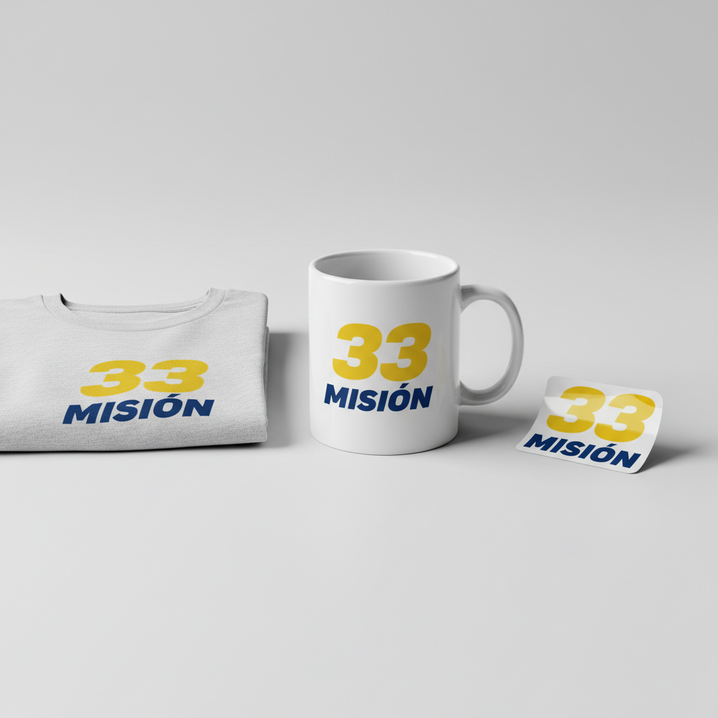
MISIÓN 33 – MISSION 33
A surge of excitement is gripping Spain’s digital landscape, with the term “carrera f1” generating massive online engagement, attracting hundreds of thousands of searches daily across major sports news outlets and social media platforms. The buzz comes ahead of the upcoming Formula 1 race in Australia, signaling the relentless passion of Spanish motorsport enthusiasts as discussions intensify around the sport’s future, including radical new car designs and regulations slated for the highly anticipated 2026 season. This isn’t just about racing; it’s a cultural phenomenon captivating a nation.
The Cultural Significance
At the heart of this trending topic lies the fervent devotion of Fernando Alonso’s Spanish fanbase, affectionately known as the ‘Marea Azul’ or ‘Blue Tide’. For these supporters, “carrera f1” isn’t merely a search query; it’s an affirmation of their collective dream: ‘Misión 33’. This deeply specific, insider reference embodies the hope and fierce anticipation for Alonso’s 33rd career victory in Formula 1. It’s a rallying cry, a shared secret that binds this community, fostering a powerful sense of unity and shared purpose. This anticipation is fueled by every twist and turn of the F1 season, making every race and regulation discussion a moment of collective national engagement.
Design Analysis: Capturing the Aesthetic
To tap into this unique cultural wave, merchandise needs to be more than just visually appealing; it must resonate deeply with the ‘Marea Azul’ ethos. The proposed design concept does exactly that, translating the high-speed drama of F1 and the specific ‘Misión 33’ sentiment into a wearable statement.
- 🎨 Visual Style: The core of this design is its sleek, minimalist approach. The number ’33’ takes center stage, rendered boldly and cleanly, instantly recognizable to the target audience. It is accompanied by a deep blue and vibrant yellow color scheme, deliberately chosen to echo the Asturian flag – a subtle yet powerful nod to Fernando Alonso’s home region and a symbol of regional pride. The overall aesthetic is one of speed and elegance, without being overly aggressive or cluttered.
- ✍️ Typography: The text “MISIÓN 33” is positioned neatly beneath the prominent number. It utilizes a modern, sans-serif font, chosen for its clean lines and readability. A subtle, slight italicization is incorporated, lending a dynamic feel that evokes the rapid motion and thrill of Formula 1 racing, reinforcing the theme of speed and forward momentum.
- 👕 Product Selection: Given the vibrant color palette and the desire for a clean, impactful display, this design is ideally suited for light-colored apparel. Think crisp white, light grey, or even a pale yellow t-shirts, hoodies, and polo shirts. The lighter background allows the deep blue and vibrant yellow to pop, ensuring maximum visibility and appeal for fans wanting to proudly display their ‘Misión 33’ allegiance.
Strategic Market Insight
The brilliance of the ‘Misión 33’ concept lies in its exclusive appeal to Fernando Alonso’s dedicated Spanish fanbase. This isn’t a broad, generic F1 design; it’s a laser-focused homage that speaks directly to an insider audience. The psychological triggers behind a purchase here are multifaceted: it’s about belonging, identity, shared hope, and collective pride. Wearing ‘Misión 33’ merchandise isn’t just supporting a driver; it’s signifying membership in a passionate, like-minded community. It leverages the power of an inside joke, a secret handshake, making the wearer feel part of something special and exclusive. This strong sense of community and shared purpose creates a powerful incentive to purchase, transforming apparel into a statement of allegiance.
Frequently Asked Questions
What is the deeper meaning behind “Misión 33” for Spanish F1 fans?
“Misión 33” is the fervent aspiration of Fernando Alonso’s fanbase for him to achieve his 33rd career victory in Formula 1. It’s a symbolic rallying cry, an expression of collective hope and anticipation that unites his supporters, transforming a statistical goal into a powerful shared dream.
How does the Asturian flag’s color scheme connect to the design’s appeal?
The deep blue and vibrant yellow color scheme is a direct reference to the Asturian flag, the home region of Fernando Alonso. This subtle incorporation of regional pride creates an additional layer of emotional connection for Spanish fans, linking their support for Alonso not just to motorsport, but also to their cultural and regional identity.
What marketing channels would best reach the ‘Marea Azul’ for this specific merchandise?
To effectively reach the ‘Marea Azul’, focus on Spanish-language social media platforms, particularly during F1 race weekends. Engaging with fan communities on platforms like X (formerly Twitter), Instagram, and Facebook, and utilizing hashtags related to Fernando Alonso, F1 Spain, and ‘Misión 33’ would be crucial. Collaborations with Spanish F1 fan accounts or influencers could also amplify reach significantly.
💬 Seller Strategy Discussion
Considering the highly specific and passionate target audience for ‘Misión 33’ merchandise, what unique marketing angles or community engagement strategies would you implement to truly connect with the ‘Marea Azul’ beyond just showing the product? How would you navigate the fine line of celebrating a driver’s legacy while maintaining a unique brand identity?
⚖️ Estimated Copyright Risk: LOW
Our Findings: This is a fan-generated slogan and hashtag, not an official trademark of the driver, his team, or the F1 organization. It’s a phrase from within the fan culture, making it safe to use.
Always verify intellectual property rights before listing.
Check EU Trademark Search for “MISIÓN 33” ➔
AI Image Generation Prompts
The following prompts are optimized for leading generators to produce production-ready assets:
👕 Apparel / T-Shirt Prompt
A highly stylized, minimalist vector illustration for a t-shirt print. The design features the large, dominant number '33' as the central focus, rendered in a vibrant, energetic yellow (like a goldenrod or electric lemon). Directly underneath and perfectly centered, the text 'MISIÓN' appears, rendered in a sophisticated, deep navy blue. Both the number and text are in a modern, geometric sans-serif font, meticulously kerned, with a clean, subtle italicized lean (approximately 5-10 degrees) to convey a sense of speed, motion, and dynamic precision. The lines are extremely crisp, hard-edged, and optically perfect, characteristic of premium digital graphic design. The color palette is strictly limited to deep blue and vibrant yellow, reminiscent of the Asturian flag, creating a strong contrast and bold visual statement. The overall aesthetic is sleek, athletic, and aspirational, devoid of any gradients, shadows, or textures within the design itself, embracing a flat, two-dimensional art style. This clean vector illustration is isolated on a solid light background, ensuring maximum print clarity and versatility. The mood is modern, high-performance, and boldly iconic. --ar 3:4 --v 6.0 The ONLY text allowed in the image is exactly 'MISIÓN 33'. Absolutely NO other names, words, or random letters.
🔍 Search this niche on:
☕ Drinkware / Mug Prompt
A panoramic mug wrap graphic featuring a duplicated side-by-side layout of the exact same graphic on the left and right. Each instance of the graphic is a sleek, minimalist design: the large, dominant number '33' is the main focus, rendered in a vibrant, energetic yellow (like a goldenrod or electric lemon). Directly underneath and perfectly centered, the text 'MISIÓN' appears, rendered in a sophisticated, deep navy blue. Both the number and text are in a modern, geometric sans-serif font, meticulously kerned, with a clean, subtle italicized lean (approximately 5-10 degrees) to convey speed and dynamic motion. The lines are extremely crisp, hard-edged, and optically perfect, typical of high-resolution digital vector art, designed for flawless print application on a cylindrical surface. The color palette is strictly deep blue and vibrant yellow, reminiscent of the Asturian flag, ensuring high contrast and immediate visual impact. The design is flat, untextured, and visually impactful, intended to wrap seamlessly around a coffee mug. The overall mood is modern, professional, and aspirational. The two identical graphics are horizontally aligned and centered, creating a continuous branding statement. --ar 3:1 --v 6.0 The ONLY text allowed in the image is exactly 'MISIÓN 33'. Absolutely NO other names, words, or random letters.
🔍 Search this niche on:
✨ Die-Cut Sticker Prompt
A vibrant, die-cut sticker design in a bold, 2D flat pop-art style. The central element is the large, dominant number '33', rendered in a vibrant, energetic yellow (like a goldenrod or electric lemon). Directly underneath and perfectly centered, the text 'MISIÓN' is rendered in a sophisticated, deep navy blue. Both the number and text utilize a modern, geometric sans-serif font, precisely kerned, with a clean, subtle italicized lean (approximately 5-10 degrees) to evoke speed and dynamism. The design features strong, clean lines and sharp, graphic shapes with no internal gradients, shadows, or textures, creating a striking, high-contrast visual. The color scheme is exclusively deep blue and vibrant yellow, echoing the Asturian flag, for maximum punch and recognition. A distinct, thick white outline border encircles the entire integrated design of '33' and 'MISIÓN', creating a clear, impactful silhouette suitable for a die-cut sticker. The overall aesthetic is graphic, iconic, energetic, and collectible, with a glossy finish implied for the sticker material. --ar 1:1 --v 6.0 The ONLY text allowed in the image is exactly 'MISIÓN 33'. Absolutely NO other names, words, or random letters.
🔍 Search this niche on: