Mon état d’esprit: Vigilance Orange – My state of mind: Orange Alert

Across France, a unique linguistic phenomenon has taken root, turning official meteorological warnings into a surprising source of cultural commentary. It’s not just about tracking storms anymore; the very language of Météo-France, particularly its ‘vigilance’ alerts, has permeated daily conversation, giving rise to an unexpected blend of public service and personal expression.
The Cultural Significance
The Météo-France ‘vigilance’ system, with its color-coded warnings, is an integral part of French life. When regions are placed under ‘Vigilance Orange’ for storms or other severe weather, it’s a serious call to awareness, broadcast across media and discussed in homes and workplaces. This constant exposure has transformed these official terms into common parlance, creating a shared understanding and even a collective inside joke. The humor lies in taking a formal, urgent public advisory and playfully applying it to the often turbulent, unpredictable landscape of one’s own emotional state. It’s a relatable, subtle nod to the daily grind and the rollercoaster of modern feelings, all wrapped up in a phrase instantly recognizable to anyone living in France.
Design Brainstorm: Capturing the Aesthetic
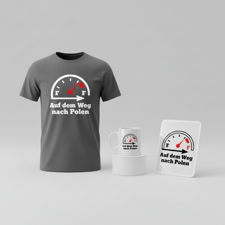
Translating this cultural moment into merchandise offers a fantastic creative challenge. The key is to embrace the playful subversion while maintaining a clean, modern aesthetic.
- 🎨 Visual Concept: One compelling approach could involve a contemporary, text-heavy design. Imagine a bold phrase front and center, perhaps accented by a subtle, stylized icon like a small lightning bolt or a minimalist storm cloud. The color palette is crucial here: a vibrant orange, directly echoing the official ‘Vigilance Orange’ alert, contrasted with crisp white text, would immediately resonate with the target audience. This color choice isn’t just aesthetic; it’s a direct, clever reference that grounds the humor in shared cultural knowledge.
- ✍️ Typography Ideas: The text itself is the star of this concept. “Mon état d’esprit: Vigilance Orange” is a statement that perfectly captures the trend. To convey both the modern appeal and the underlying playfulness, a groovy or wavy font, currently popular in contemporary design, could be highly effective. This style offers a touch of retro-chic while feeling fresh and current, giving the serious-sounding phrase a lighthearted, approachable vibe. The typography should be legible and impactful, making the statement immediately clear and engaging.
- 👕 Product Canvas: For apparel, dark colors would serve as an excellent backdrop. A deep charcoal, navy blue, or classic black t-shirt, hoodie, or even a baseball cap would allow the orange and white design to truly pop. The contrast would not only enhance visibility but also add to the overall sleek and trendy aesthetic, making the garment a versatile addition to any wardrobe.
Strategic Market Insight
Targeting French residents with this design is a strategic move rooted in deep cultural understanding. The humor embedded in “Mon état d’esprit: Vigilance Orange” is a genuine ‘if you know, you know’ moment. It appeals to a demographic that understands the daily experience of these alerts and can appreciate the witty reappropriation of a public service term for personal expression. The psychological trigger here is twofold: connection and humor. Buyers aren’t just purchasing an item; they’re acquiring a piece of shared cultural identity, a wearable inside joke that fosters a sense of belonging and lighthearted rebellion. Crucially, by adapting a common phrase rather than directly using official logos, the concept remains entirely unique and safe from any intellectual property concerns, making it a clever and unencumbered niche.
⚖️ Estimated Copyright Risk: LOW
Our Findings: ‘Vigilance Orange’ is a functional term from a public body (Météo-France). Using it in a metaphorical, humorous context for a t-shirt is transformative and falls under parody/commentary, making the copyright risk negligible. The phrase itself is not trademarked for apparel.
Always verify intellectual property rights before listing.
Check EU Trademark Search for “Météo” ➔
AI Image Generation Prompts
The following prompts are optimized for leading generators to produce production-ready assets:
👕 Apparel / T-Shirt Prompt
A stunning, highly detailed vector illustration for a t-shirt print, isolated on a solid dark charcoal background. The design features the exact text 'Mon état d'esprit: Vigilance Orange' rendered in a modern, trendy, and fluid groovy typeface, characterized by smooth, organic curves and a distinct wavy aesthetic that exudes contemporary style. The typography is the primary element, bold and impactful, colored in a vibrant, saturated 'Vigilance Orange' (hex #FF4500 equivalent) with pure, crisp white accents or subtle outlines to enhance readability and visual pop. Integrated within or subtly adjacent to the text, a small, highly stylized lightning bolt or abstract storm cloud icon, matching the groovy art style, adds a dynamic visual cue. This icon should feel like an organic part of the typography, perhaps replacing a letter 'i' dot or an accent. The overall style is clean, sharp, precise vector art, with perfectly smooth Bezier curves, crisp edges, and immaculate, flat color fills, reminiscent of high-quality screen printing or digital direct-to-garment (DTG) artwork. The rendering should emphasize scalability and clarity, with no blurry edges, subtle gradients, or complex textures; instead, focus on a graphic, almost minimalist aesthetic. The mood is energetic, confident, and fashion-forward. This is a master-level graphic design, optimized for apparel, showcasing impeccable craftsmanship and a strong visual identity. The lighting implies a perfectly even distribution, allowing the colors to shine without glare or shadow, making the orange utterly vibrant against the dark void. The ONLY text allowed in the image is exactly 'Mon état d'esprit: Vigilance Orange'. Absolutely NO other names, words, or random letters.
🔍 Search this niche on:
☕ Drinkware / Mug Prompt
A captivating, high-resolution graphic design for a panoramic coffee mug wrap layout. The central design features the exact text 'Mon état d'esprit: Vigilance Orange' meticulously crafted in a modern, highly stylized groovy font with distinct wavy, flowing letterforms, reflecting current print-on-demand trends. The primary color of the text is a brilliant, official 'Vigilance Orange' (approximated by hex #FF4500), contrasted and outlined with crisp, clean white for maximum visual impact and legibility. A small, artfully integrated stylized lightning bolt or abstract storm cloud icon, harmonizing perfectly with the groovy typographic style, is placed thoughtfully within or near the text, acting as a powerful visual accent. This icon should share the same orange and white color scheme and flowing characteristics as the font. The entire graphic maintains a 2D flat design aesthetic, characterized by smooth, vector-like precision, sharp edges, and vibrant, unblemished color fills, ensuring perfect print quality. CRITICAL: A duplicated side-by-side layout showing the exact same graphic on the left and right, designed perfectly for a panoramic mug wrap. Each graphic should be identically rendered, creating a seamless, continuous visual experience. The overall presentation is clean, bold, and modern, implying a durable, high-fidelity ceramic print. The graphic should appear ready for application, with no visible mug distortion or context, just the pure design for the wrap. The mood is consistent, sophisticated, and distinctly branded. The ONLY text allowed in the image is exactly 'Mon état d'esprit: Vigilance Orange'. Absolutely NO other names, words, or random letters.
🔍 Search this niche on:
✨ Die-Cut Sticker Prompt
A striking, highly detailed die-cut sticker design, presented in a vibrant 2D flat pop-art style. The central element is the exact text 'Mon état d'esprit: Vigilance Orange', rendered in a dynamic, trendy, and distinctly groovy font, featuring bold, wavy letterforms that are expressive and modern. The typography is colored in an intense, brilliant 'Vigilance Orange' (similar to hex #FF4500) and sharply contrasted with pure, pristine white details and outlines for exceptional clarity and graphic punch. A small, iconic stylized lightning bolt or abstract storm cloud emblem is cleverly integrated into the design, perhaps replacing a dot or an apostrophe, or appearing as a standalone accent near the text. This icon mirrors the groovy aesthetic and orange/white palette. CRITICAL: The entire design is encased within a thick, clean white outline border, creating a classic die-cut sticker aesthetic, clearly separating the graphic from its imagined background. The pop-art style emphasizes strong, graphic lines, simplified forms, and unshaded, flat color fields, giving it a bold, impactful, and collectible quality. The rendering is crisp, with no blurred edges or fuzzy details, perfect for a high-quality vinyl sticker. The texture is implied as glossy and smooth, characteristic of premium vinyl. The composition is centered, balanced, and visually compelling. The mood is playful, assertive, and visually arresting, embodying a contemporary retro vibe. The ONLY text allowed in the image is exactly 'Mon état d'esprit: Vigilance Orange'. Absolutely NO other names, words, or random letters.
🔍 Search this niche on:
Frequently Asked Questions
How does this design resonate with French culture specifically?
The design taps into a very specific, shared experience in France: the constant presence and public awareness of Météo-France’s weather vigilance system. The phrase “Vigilance Orange” is instantly recognizable and carries a certain gravitas, making its humorous reapplication to one’s mood a relatable and distinctly French form of self-deprecating wit. It’s an inside joke that only those familiar with the cultural context truly appreciate.
What makes “Vigilance Orange” a unique phrase for merchandise?
“Vigilance Orange” is unique because it’s a public safety term repurposed for personal, humorous expression. It cleverly references a serious, everyday phenomenon and transforms it into a metaphorical statement about an emotional state, without being overtly political or controversial. This double meaning creates an intelligent, witty appeal that stands out from generic mood-based apparel.
Are there any seasonal limitations for a weather-inspired design like this?
While rooted in weather alerts, the design’s strength lies in its metaphorical twist. “Mon état d’esprit: Vigilance Orange” transcends seasonal weather patterns by focusing on an internal state. People have ‘orange alert’ moods year-round, making this an evergreen concept that can be popular regardless of the current season. The humor isn’t tied to a specific storm but to the human condition, making it relevant any time.
Final Thoughts
This exploration into the cultural phenomenon of Météo-France alerts highlights the incredible potential for print-on-demand designs that leverage specific, localized cultural insights. By transforming a familiar public service term into a humorous, relatable expression of mood, there’s an opportunity to create merchandise that genuinely connects with a targeted audience. The success of such a concept lies in its authentic understanding of the cultural nuance and the creative execution of the design, proving that sometimes, the most unique ideas are found in the everyday language around us.
💬 What’s Your Take?
Art is subjective, and this is just one angle! How would you spin this “Météo (weather)” trend? Did we miss the mark, or is there a better inside joke to use here? Drop your design ideas and let’s brainstorm in the comments below!