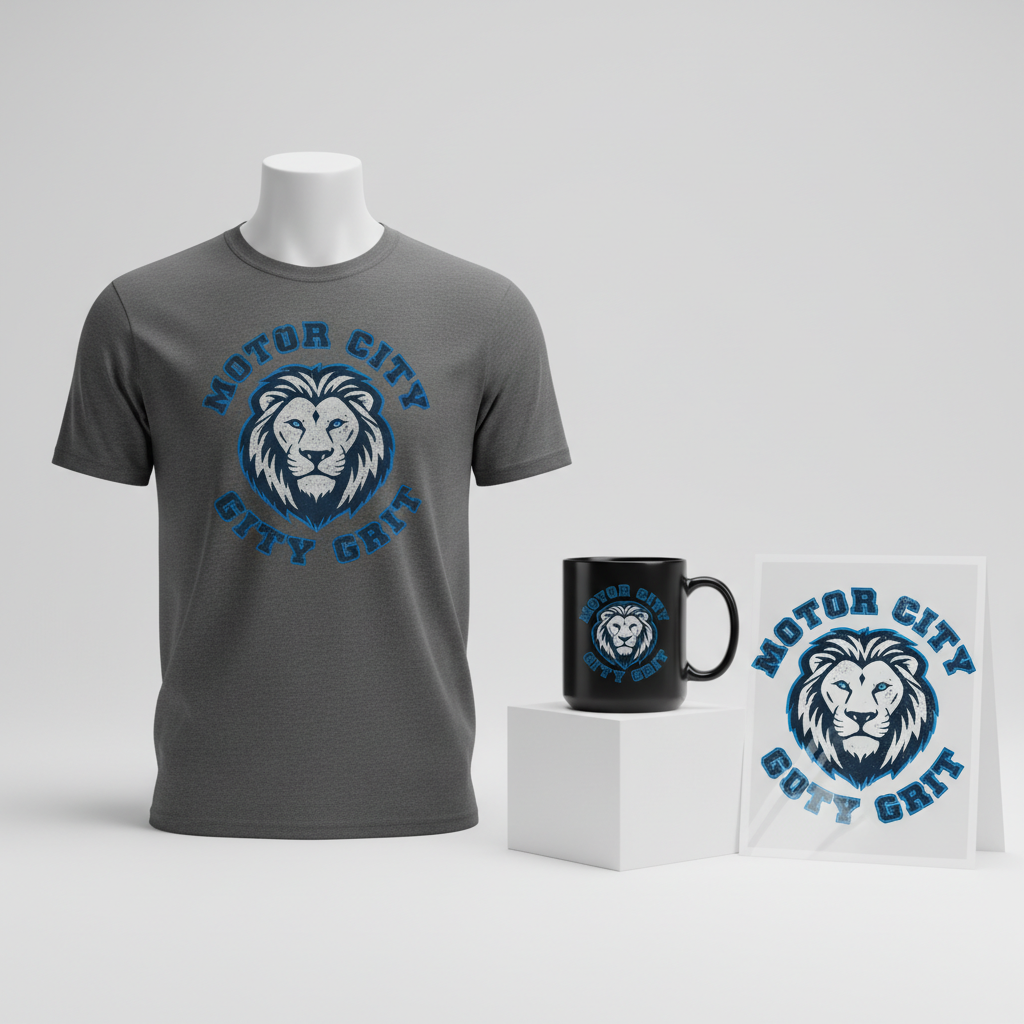
MOTOR CITY GRIT
The offseason rumor mill in the NFL is churning, and few cities are buzzing quite like Detroit. Speculation around star running back Isiah Pacheco potentially heading to the Motor City has ignited a passionate conversation among fans across the United States, creating a palpable excitement that extends far beyond just football statistics. This kind of movement, or even just the whispers of it, taps directly into the heart of a city’s identity and its fervent sports culture.
The Cultural Significance
Detroit isn’t just a city; it’s an ethos. Known globally as the Motor City, it carries a legacy of industry, innovation, and an unyielding spirit. Its football team, the Detroit Lions, embodies much of this narrative. For decades, Lions fans have been celebrated for their unwavering loyalty through challenging times, and in recent years, under a new coaching philosophy, the team has cultivated a powerful identity centered on “grit.” When a high-profile player like Isiah Pacheco, known for his hard-nosed running style, is even rumored to be joining such a team, it’s more than just a transaction; it’s a potential alignment of cultures. It sparks dreams of renewed glory and reinforces the city’s collective determination, making it a hot topic in sports bars, online forums, and casual conversations alike.
Design Brainstorm: Capturing the Aesthetic
Translating this cultural moment into compelling merchandise requires a design that speaks volumes without uttering a single, trademarked word. One exciting creative direction could draw heavily on Detroit’s rich heritage, blending it with the modern “grit” of its beloved football team.
- 🎨 Visual Concept: Imagine a design infused with the timeless cool of vintage 1960s automotive logos and classic racing posters. At the heart of it, a stylized, powerful lion’s head could emerge, rendered in a thick, distressed line-art style. The lion might be outlined in a bold shade of Honolulu blue, subtly nodding to the team’s colors without directly copying them. The entire graphic could then be treated with a gritty, worn texture, giving it that authentic retro, weathered feel – a testament to endurance and history.
- ✍️ Typography Ideas: Surrounding this potent lion emblem, circular text, perhaps in a heavy, slab-serif font, reminiscent of old car emblems, could declare “MOTOR CITY GRIT.” This choice of typography isn’t just aesthetic; it’s a direct link to Detroit’s industrial past and the team’s adopted battle cry. The boldness and weight of the letters would convey strength and an unshakeable resolve.
- 👕 Product Canvas: This kind of robust, vintage-inspired design would likely pop best on dark apparel. Think deep charcoal, classic black, or even a dark navy. The contrast would allow the Honolulu blue outline and the distressed textures to stand out vividly, enhancing the overall retro aesthetic and making the design feel substantial and enduring.
Strategic Market Insight
Targeting the passionate Detroit Lions fanbase with this specific design concept could be incredibly effective. The brilliance lies in its clever avoidance of direct IP infringement while still resonating deeply with the core demographic. By utilizing “Motor City,” a widely recognized public domain nickname for Detroit, and “Grit,” a slogan heavily associated with the team’s current culture, the design taps directly into local pride and fan identity. This strategic pivot ensures broad appeal to fans eager to show their allegiance and anticipation, without triggering automated rejections from platforms sensitive to trademarked names or likenesses. It’s a celebration of city identity and team ethos, making the purchase a declaration of pride, resilience, and hope for the future of Detroit football.
⚖️ Estimated Copyright Risk: LOW
Copyright Evaluation: The design avoids all trademarked material including the team name, player name, and city name paired with a sport. It instead uses a public domain city nickname (‘Motor City’) and a widely used team culture slogan (‘Grit’) to appeal to the target fanbase in a compliant manner.
Always verify intellectual property rights before listing.
Check US Trademark Database (Justia) for “Isiah Pacheco” ➔
AI Image Generation Prompts
The following prompts are optimized for leading generators to produce production-ready assets:
👕 Apparel / T-Shirt Prompt
An isolated vector illustration for an apparel design, clean and sharp, presented on a solid dark charcoal background. The central element is a highly stylized, powerful lion's head, rendered in a thick, distressed line-art style reminiscent of vintage 1960s automotive emblems and classic racing posters. The lion's form is simplified yet dynamic, conveying strength and speed, with sharp angles and robust curves. Its entire outline is defined by a bold, vibrant Honolulu blue (#007FFF or similar hex for specific blue), which pops against the darker tones. Inside the blue outline, the lion's internal features (eyes, nose, mane details) are depicted with thick, distressed black or dark grey line-work, creating a gritty, aged appearance through deliberate, subtle imperfections, flecks, and worn edges, simulating an old, screen-printed graphic. Surrounding the lion's head in a perfect circle is the text "MOTOR CITY GRIT," rendered in a heavy, condensed slab-serif font, similar to vintage car badges like Rockwell or Clarendon, with a slightly irregular, distressed texture applied to the lettering itself. The text color is a muted off-white or light grey, also with subtle grunge effects. The overall design features a high level of intentional, simulated wear and tear – subtle cracks, faded patches, rough edges, and a gritty halftone noise effect integrated into the vector elements, giving it an authentic, weathered, retro print feel, as if a well-loved graphic from decades past. The graphic design is symmetrical and balanced, with a strong, iconic presence. The lighting is flat and even, typical of a graphic logo, highlighting the clean yet intentionally distressed lines and shapes. The mood is powerful, nostalgic, and authentically vintage, suitable for a classic racing or automotive brand. The ONLY text allowed in the image is exactly 'MOTOR CITY GRIT'. Absolutely NO other names, words, or random letters. --ar 3:4 --v 6.0
🔍 Search this niche on:
☕ Drinkware / Mug Prompt
A panoramic graphic design layout, specifically tailored for a coffee mug wrap. The canvas displays two identical, highly detailed instances of the core design, positioned side-by-side with minimal spacing in between, creating a seamless, wraparound visual effect. Each instance features a central, powerful lion's head, rendered in a bold, thick, and intentionally distressed line-art style, evoking the rugged aesthetic of vintage 1960s automotive logos and racing posters. The lion's silhouette is stark and iconic, outlined with a vibrant, deep Honolulu blue (#007FFF), giving it an immediate visual impact. Inside this blue outline, the lion's features are defined by rough, black or deep grey distressed lines, appearing as if screen-printed with a slight, charming imperfection – subtle grit, speckles, and worn edges. Circularly enclosing the lion is the bold text "MOTOR CITY GRIT," set in a heavy, commanding slab-serif font, meticulously crafted to mimic old-school car emblems and industrial typography. The lettering is a muted, aged off-white or light tan, heavily textured with fine cracks, scuffs, and a general impression of weathered ink, suggesting years of use. The entire design, in both instances, exhibits a pervasive gritty, worn texture: simulated ink bleeds, subtle halftone noise, faded patches, and general graphic attrition, all integrated within the illustration to achieve an authentic, retro, weathered print feel. The background behind the two identical graphics is a clean, neutral off-white or light grey, allowing the vibrant Honolulu blue and distressed details to stand out. The graphic's presentation is flat and two-dimensional, ensuring clarity for print application. The lighting is even and shadowless, focusing solely on the intricate design details and their aged character. The mood is robust, nostalgic, and embodies a strong sense of mechanical heritage. The ONLY text allowed in the image is exactly 'MOTOR CITY GRIT'. Absolutely NO other names, words, or random letters. --ar 3:1 --v 6.0
🔍 Search this niche on:
✨ Die-Cut Sticker Prompt
A vibrant, eye-catching die-cut sticker design, presented in a crisp 2D flat pop-art illustration style, suitable for a physical sticker. The central design features a powerful, stylized lion's head, rendered with thick, impactful, and intentionally distressed black line-art, capturing the raw energy of vintage 1960s automotive emblems and racing posters. The lion's form is simplified and iconic, with strong graphic appeal. A bold, electric Honolulu blue (#007FFF) meticulously outlines the entire lion's head, creating a striking contrast and visual punch. Circularly embracing the lion is the text "MOTOR CITY GRIT," set in a heavy, commanding slab-serif font, meticulously crafted to emulate classic car badges. The lettering is a sturdy, off-white color, and like the lion, it incorporates subtle distress – simulated cracks, worn edges, and fine speckles, giving it an authentic aged, screen-printed character while maintaining a clean, graphic aesthetic. The entire combined design of the lion and text is sharply contained within a distinct, thick white outline border, preparing it perfectly for a die-cut finish. This white border is uniform and clean, contrasting beautifully with the internal distressed artwork. The graphic is presented as if floating on a neutral, light background to emphasize the sticker's edges. The overall aesthetic is flat, bold, and graphic-novel like, with internal textures of fine grit, slight ink imperfections, and subtle fading integrated into the design, giving it a weathered, retro feel without compromising its clean, sticker-ready edges. The lighting is entirely flat and even, characteristic of a vector illustration, ensuring clarity and vibrancy. The mood is powerful, nostalgic, and collectible. The ONLY text allowed in the image is exactly 'MOTOR CITY GRIT'. Absolutely NO other names, words, or random letters. --ar 1:1 --v 6.0
🔍 Search this niche on:
Frequently Asked Questions
How does this design avoid IP infringement while still appealing directly to Detroit Lions fans?
The design cleverly sidesteps intellectual property issues by focusing on public domain elements and widely adopted cultural identifiers. “Motor City” is a historical nickname for Detroit, freely usable, and “Grit” has become a popular, non-trademarked descriptor for the team’s ethos under its current leadership. By combining a lion motif (a common animal, not a direct team logo) with these concepts, the merchandise speaks directly to fan sentiment and city pride without infringing on team logos, player likenesses, or trademarked names.
Why choose a vintage 1960s automotive style for a modern football trend?
The vintage 1960s automotive style is a deliberate nod to Detroit’s profound historical identity as the heart of the American auto industry. It provides a unique, timeless aesthetic that differentiates the merchandise from typical sports apparel. This retro approach taps into nostalgia, evokes a sense of enduring strength and legacy, and creates a more versatile piece that celebrates the city’s spirit alongside its football passion.
Who is the ideal buyer for this “MOTOR CITY GRIT” design?
The ideal buyer for this design is a passionate Detroit Lions fan who appreciates the team’s current identity and the city’s rich history. They are likely someone who values unique, well-designed apparel that subtly expresses their allegiance, rather than overt, brand-heavy merchandise. This customer understands the implicit message of “Motor City Grit” as a badge of honor, representing both their team’s fighting spirit and their city’s enduring legacy, making it a perfect fit for a fan who cherishes both heritage and future promise.
Final Thoughts
The interplay of pop culture, sports speculation, and local identity presents fertile ground for creative e-commerce. This exploration into the “Motor City Grit” concept demonstrates how thoughtfully designed merchandise, rooted in cultural understanding and strategic compliance, can resonate deeply with a passionate audience. By tapping into the energy surrounding current events and weaving it into a timeless aesthetic that celebrates a city’s soul, there’s significant potential to create compelling, long-lasting products that fans will be proud to wear. Ultimately, success lies in the execution and the unique spin an individual designer brings to these rich cultural narratives.
💬 What’s Your Take?
Art is subjective, and this is just one angle! How would you spin this “Isiah Pacheco” trend? Did we miss the mark, or is there a better inside joke to use here? Drop your design ideas and let’s brainstorm in the comments below!