Necesito un café y la hora que me robaron – I need a coffee and the hour they stole from me
As Spain gears up for its 2026 daylight saving time change, a familiar murmur is already rippling through the nation. News headlines are abuzz not just with the impending date, but with a renewed focus on the often-debated, frequently-lamented health effects of “el cambio de hora.” This isn’t just a ticking clock; it’s a cultural moment, a collective sigh, and an opportunity for design that truly speaks to the heart of a universal, albeit Spanish-accented, groggy experience.
The Cultural Significance
The annual shift in daylight saving time is more than a simple adjustment to the clock; it’s a recurring event that profoundly impacts daily life and conversation across Spain. The topic trends consistently each spring, fueled by public discourse, scientific reports detailing the negative health implications from disrupted sleep patterns, and the ever-present grumbling over losing that precious hour. It’s a shared experience of collective drowsiness, a national acknowledgment of the struggle to recalibrate internal body clocks. This common bond of mild exasperation creates fertile ground for relatable humor and commentary, making it a genuinely resonant theme for merchandise.
Design Brainstorm: Capturing the Aesthetic
Translating this collective sentiment into a visual concept requires a blend of humor, nostalgia, and a touch of the everyday struggle. One angle to consider focuses on the universal need for a morning pick-me-up after the time shift.
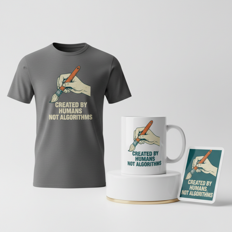
- 🎨 Visual Concept: Imagine a design that immediately evokes a feeling of timeless weariness mixed with a comforting solution. A distressed, retro-style aesthetic could lend a familiar, almost classic feel to the message. The layout might be thoughtfully split, with a prominent graphic of a steaming coffee mug centrally placed, acting as a visual anchor and a symbol of that much-needed morning ritual. This visual not only breaks the design but also ties the message together.
- ✍️ Typography Ideas: The chosen text, “Necesito un café” positioned above the mug and “y la hora que me robaron” below, is where the design truly shines. The distressed, retro font would enhance the nostalgic or even slightly weary mood. The Spanish phrasing is key here; it’s not just a translation, but a culturally specific, humorous lament that resonates deeply with the target audience. It captures the essence of feeling “robbed” of time, a sentiment perfectly balanced by the universal craving for coffee to cope.
- 👕 Product Canvas: Given the design’s retro feel and the somewhat somber yet humorous subject matter, dark apparel would likely serve as an ideal canvas. Darker shades like charcoal, navy, or deep forest green can make the distressed text and steaming coffee graphic pop, adding to the overall aesthetic appeal and providing a versatile backdrop for a design that conveys both a mood and a solution.
Strategic Market Insight
This design concept cleverly cross-niches two incredibly popular and evergreen themes: the annual daylight saving time change and the enduring love for coffee. The target audience is precisely that passionate demographic who actively dislikes losing an hour of sleep and, quite possibly, relies on caffeine to navigate the day. By marrying the specific, humorous Spanish phrasing—”Necesito un café y la hora que me robaron”—with a relatable visual, this concept taps into a shared cultural experience and a daily necessity. It’s a safe yet engaging proposition, offering a genuinely evergreen design that can be successfully marketed every spring as the clock change approaches, providing a consistent opportunity to connect with a broad, empathetic audience.
⚖️ Estimated Copyright Risk: LOW
Risk Assessment: My search concluded that this phrase is an original creation and not a pre-existing trademarked slogan. Its uniqueness makes it a low-risk choice for a POD design.
Always verify intellectual property rights before listing.
Check EU Trademark Search for “Necesito un café y la hora que me robaron” ➔
AI Image Generation Prompts
The following prompts are optimized for leading generators to produce production-ready assets:
👕 Apparel / T-Shirt Prompt
A sophisticated, clean vector illustration for a t-shirt design, isolated on a solid dark charcoal background. The central graphic features a stylized, retro diner-style ceramic coffee mug, dark and rich coffee inside, with elegant, wispy white steam rising in a classic S-curve silhouette. Above the mug, the text 'Necesito un café' is rendered in a distressed, bold sans-serif typeface, reminiscent of vintage sign painting, with subtle imperfect edges and a faded ink texture overlay. Below the mug, the text 'y la hora que me robaron' complements the style with the same distressed typeface, creating a balanced, two-part layout around the central graphic. The color palette is limited to muted vintage tones: creamy off-white for the text, a warm terracotta for secondary accents, a deep espresso for the mug, and a soft, ethereal white for the steam. The overall aesthetic is a blend of mid-century graphic design and classic screen print art, featuring crisp vector lines, minimal gradients, and a very subtle, fine-grain halftone texture applied thoughtfully to the design elements for an aged feel. The rendering is exceptionally sharp and precise, ensuring perfect readability and visual impact. No background elements or distractions. The ONLY text allowed in the image is exactly 'Necesito un café y la hora que me robaron'. Absolutely NO other names, words, or random letters. --ar 3:4 --v 6.0
☕ Drinkware / Mug Prompt
A duplicated side-by-side layout showing the exact same graphic on the left and right, designed perfectly for a panoramic mug wrap. The central graphic for each instance features a robust, illustrative steaming coffee mug, rendered in a vintage Americana diner style, with a rich dark brew and dynamically swirling, white steam plumes that extend slightly past the mug's rim. Above this detailed mug, the phrase 'Necesito un café' is presented in a bold, distressed retro-serif typeface with a subtle offset shadow, giving it a three-dimensional, hand-painted sign aesthetic. Below the mug, 'y la hora que me robaron' continues the same typographic style, maintaining perfect balance. The artwork utilizes a warm, inviting vintage color palette: deep coffee browns, creamy beige, faded teal accents, and muted burnt orange for an authentic retro feel. The overall rendering combines sharp vector-like outlines with subtle textural overlays, such as a fine halftone dot pattern and a light grunge effect applied to the text and graphic elements, simulating a classic screen-printed look on ceramic. The composition ensures full legibility and visual impact when wrapped around a mug, with no critical elements disappearing around the curve. The ONLY text allowed in the image is exactly 'Necesito un café y la hora que me robaron'. Absolutely NO other names, words, or random letters. --ar 3:1 --v 6.0
✨ Die-Cut Sticker Prompt
A vibrant 2D flat pop-art style die-cut sticker design featuring bold, graphic elements. The central focus is a highly stylized, iconic cartoon coffee mug, rendered in solid blocks of color with thick, clean black outlines, from which prominent, graphic white steam lines ascend dynamically. Above the mug, 'Necesito un café' is displayed in a chunky, distressed retro sans-serif font, characterized by slightly uneven edges and an impactful, bold presence. Below the mug, 'y la hora que me robaron' continues this distinctive typographic style. The entire design is encased in a strong, uniformly thick white outline border, creating a clean die-cut edge. The color palette is bright and punchy, utilizing a limited range of complementary colors such as deep teal, mustard yellow, off-white, and a rich espresso brown, all rendered with flat, unshaded surfaces for maximum graphic impact. The overall aesthetic is clean, modern pop-art with a vintage edge, ensuring immediate visual recognition and a crisp, high-quality sticker appearance. The ONLY text allowed in the image is exactly 'Necesito un café y la hora que me robaron'. Absolutely NO other names, words, or random letters. --ar 1:1 --v 6.0
Frequently Asked Questions
How does this design specifically resonate with Spanish culture beyond just the language?
The phrase “Necesito un café y la hora que me robaron” isn’t just a literal translation; it captures a specific nuance of Spanish conversational humor and shared experience. Coffee culture in Spain is deeply ingrained, often marking the start of the day or a mid-morning break. Pairing this with the feeling of having time “robbed” — a common, slightly dramatic, but widely understood lament around the daylight saving change — creates an authentic connection that goes beyond mere words. It taps into a collective sigh of exasperation, made relatable through a beloved daily ritual.
Is this a truly evergreen trend, or just a seasonal flash in the pan?
While the “cambio de hora” itself is a seasonal event occurring annually, the core sentiment of disliking the time change and needing coffee to cope is a perennial human experience. By cross-niching with the “coffee lover” theme, which is perpetually popular, this design transcends a fleeting trend. It becomes an evergreen concept that designers can confidently reintroduce every spring, year after year, knowing that the frustration of lost sleep and the comfort of coffee will always strike a chord with a broad audience.
What complementary products could work well with this apparel design?
Leveraging the strong coffee theme, this design could effortlessly extend beyond apparel. Mugs, naturally, would be a perfect fit, allowing buyers to literally enjoy their “café” in style while expressing their solidarity against the time change. Other ideas include tote bags for coffee runs, coasters, or even humorous sleep masks – though apparel remains a strong starting point, the coffee element opens up many possibilities for a cohesive product line.
Final Thoughts
The “cambio de hora” in Spain offers a rich vein of cultural commentary and shared experience that translates exceptionally well into e-commerce opportunities. By tapping into a universally relatable feeling of grogginess and pairing it with the beloved ritual of coffee, designers have a chance to create merchandise that genuinely resonates. The success of any concept ultimately hinges on thoughtful execution and a unique spin, ensuring that designs don’t just state a trend, but truly capture its spirit and humor. For those looking to connect with a Spanish audience, this particular blend of wit and weariness presents a compelling canvas.
💬 What’s Your Take?
Art is subjective, and this is just one angle! How would you spin this “Cambio De Hora (daylight saving time)” trend? Drop your design ideas and let’s brainstorm in the comments below!