Partido a Partido – Game by Game
In the vibrant heart of Spain, a roar echoes louder than usual, transcending the stadium to permeate the cultural fabric. The recent Champions League clash, featuring Spain’s indomitable Atletico Madrid against England’s Tottenham Hotspur, has ignited a particular fervor. With Atletico’s commanding presence on the pitch, the nation’s attention, particularly that of the passionate ‘Rojiblancos’ faithful, is firmly fixated on every strategic play and hard-fought victory. This isn’t just about a single game; it’s about the enduring spirit of a club and the philosophy that fuels its legions of supporters.
The Cultural Significance
Football in Spain is more than a sport; it’s a religion, a shared identity, and a profound source of national pride. For Atletico Madrid fans, this sentiment runs especially deep. The club embodies a resilient, underdog spirit, often fighting against giants with unwavering determination. This ethos is perfectly encapsulated by the motto “Partido a Partido” – “Game by Game” or “Match by Match.” It’s a phrase famously championed by their long-time manager, Diego Simeone, and has become a powerful mantra for the club and its global fanbase. It speaks to a philosophy of relentless effort, focused ambition, and an enduring belief in hard work over flashy spectacle. When Atletico performs strongly in a prestigious tournament like the Champions League, this core message resonates even more profoundly, becoming a rallying cry for an entire nation’s hopes and dreams.
Design Brainstorm: Capturing the Aesthetic
Translating such a powerful cultural motto into a compelling design requires an aesthetic that mirrors its inherent grit and determination. One approach could be to lean into a tough, no-nonsense visual style that feels both authentic and impactful.
- 🎨 Visual Concept: Imagine a design with a raw, almost industrial feel. A gritty, grunge-style aesthetic could effectively convey the relentless effort and hard-working spirit associated with the ‘Partido a Partido’ philosophy. Think distressed textures, subtle imperfections, and an overall appearance that suggests something earned through sweat and perseverance. This could translate well to a design that feels less about polished victory and more about the arduous journey.
- ✍️ Typography Ideas: The text “Partido a Partido” itself is a cornerstone of this concept. Utilizing a stenciled, stamp-like font would perfectly complement the grunge aesthetic, giving the impression of something official yet worn, like a mark of hard-earned experience. Arranging the text dynamically, perhaps slightly off-kilter or with varying baseline shifts, could further amplify a sense of energy and continuous motion, reflecting the constant push, match after match.
- 👕 Product Canvas: Given the tough, hard-working aesthetic and the serious passion it represents, darker apparel would be an ideal canvas. Black, charcoal grey, or deep navy t-shirts, hoodies, and sweatshirts would allow the gritty design elements to truly pop while maintaining a sophisticated, impactful look that appeals to a dedicated fanbase.
Strategic Market Insight
This design concept offers a truly clever approach to market engagement. By leveraging “Partido a Partido,” an ‘insider’ motto inextricably linked to the Madrid-based club’s philosophy, it immediately connects with a highly passionate and informed target audience. This strategy brilliantly pivots away from direct mentions of team names, league names, or specific match outcomes, thus navigating potential trademark pitfalls and avoiding common “Location + Sport” bot traps on marketplaces. Instead, it taps into the evergreen identity and core values of the club, making the design relevant beyond any single season or match. It’s not just buying merchandise; it’s buying into a shared philosophy, a declaration of loyalty and understanding that only true fans will recognize and appreciate. This psychological trigger—the feeling of being part of an exclusive group that ‘gets it’—is a powerful driver for purchase.
⚖️ Estimated Copyright Risk: LOW
Risk Assessment: The phrase ‘Partido a Partido’ is a widely known football philosophy, not a registered trademark for apparel. By focusing on this broad trope of the club’s culture instead of its official branding, the design avoids infringement.
Always verify intellectual property rights before listing.
Check EU Trademark Search for “Champions” ➔
AI Image Generation Prompts
The following prompts are optimized for leading generators to produce production-ready assets:
👕 Apparel / T-Shirt Prompt
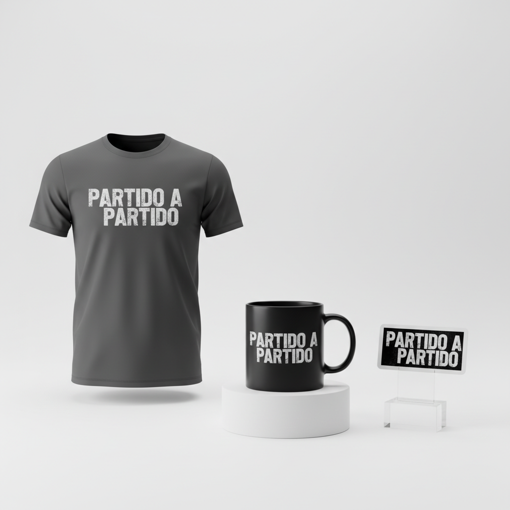
A powerful and gritty grunge-style vector illustration for a t-shirt print, featuring the text 'Partido a Partido'. The design utilizes a robust, stenciled, stamp-like font with distressed textures, conveying a sense of relentless energy and hard-working determination. The typography is arranged dynamically, slightly staggered and overlapping, with an upward visual flow, suggesting momentum and an unyielding spirit. The letters themselves exhibit fine details of faux distressed ink, subtle smudges, rough edges, and a grainy overlay, reminiscent of worn silkscreen prints or imperfect linocut art. The overall aesthetic is tough, industrial, and raw, with a strong street art influence. Rendered in a clean vector illustration style with high contrast, the design features a minimal color palette primarily consisting of dark grey or off-black text with integrated texture, isolated perfectly on a solid, deep charcoal or true black background. The lighting is flat and even, characteristic of a graphic-driven design, ensuring maximum visibility and print-readiness without any 3D effects or complex shading. The texture is simulated within the vector art, giving an authentic worn-out appearance without losing the crispness of a digital illustration. The mood is one of resolute perseverance, strength, and an indomitable work ethic. The ONLY text allowed in the image is exactly 'Partido a Partido'. Absolutely NO other names, words, or random letters. --ar 3:4 --v 6.0
🔍 Search this niche on:
☕ Drinkware / Mug Prompt
A striking and aggressive grunge typography design for a coffee mug wrap, featuring the text 'Partido a Partido'. The design presents a weathered stencil look using bold, impactful block lettering, infused with the aesthetic of concrete textures and industrial decay. The text 'Partido a Partido' is dynamically arranged, condensed and slightly fragmented, creating an energetic horizontal burst that suggests powerful forward motion and an unwavering commitment. The graphic is explicitly designed for a panoramic mug wrap, displayed as a duplicated side-by-side layout showing the exact same graphic on the left and right, ensuring a seamless visual flow around the mug. Each letter is heavily distressed, incorporating simulated scratches, ink splatters, a subtle rusted metal effect, and chipped paint textures. A grainy overlay and sparse halftone dots add depth and a gritty noise effect without compromising readability. The rendering is high-resolution digital art, maintaining a flat graphic appearance with stark contrast, primarily in monochrome with subtle tonal variations (e.g., deep charcoal and dark grey) against a matching textured dark background that complements the grunge aesthetic. The lighting is flat and graphic, emphasizing the robust texture and form of the letters. The mood conveyed is one of indomitable spirit, unwavering resolve, and the daily grind of hard work. The design should appear perfectly aligned for a panoramic wrap, with no cut-off elements at the edges. The ONLY text allowed in the image is exactly 'Partido a Partido'. Absolutely NO other names, words, or random letters. --ar 3:1 --v 6.0
🔍 Search this niche on:
✨ Die-Cut Sticker Prompt
A bold and impactful die-cut sticker design featuring the text 'Partido a Partido', rendered in a dynamic, gritty grunge-pop-art style. The text is presented in a stenciled, stamp-like font, arranged with powerful, condensed energy, slightly rotated to give a sense of burst and explosive impact, with a strong center focus. This 2D flat pop-art style is characterized by crisp lines, clean edges, and solid color fills (e.g., stark black or deep charcoal for the text). The grunge element is stylized and integrated, with simulated texture within the flat design, such as speckled patterns, subtle halftone dots, and distressed edges that appear as part of the solid graphic rather than photographic overlays. The overall aesthetic is graphic novel-influenced, iconic, and visually striking, designed for maximum impact as a standalone graphic. The illustration is a high-resolution vector art piece, simplified forms for clarity, and has a clear, dominant presence. A thick, clean, opaque white outline border surrounds the entire irregular shape of the design, creating a distinct and uniform die-cut contour. The lighting is flat, even, and illustrative, emphasizing the graphic's form without external shadows or highlights. The mood is energetic, determined, defiant, and memorable. The ONLY text allowed in the image is exactly 'Partido a Partido'. Absolutely NO other names, words, or random letters. --ar 1:1 --v 6.0
🔍 Search this niche on:
Frequently Asked Questions
How does “Partido a Partido” resonate with fans beyond just football?
“Partido a Partido” transcends the football pitch, embodying a universal philosophy of persistence, focus, and taking things one step at a time. For fans, it’s not just a chant; it’s a life motto that applies to personal challenges, work ethic, and any endeavor requiring sustained effort. This makes the design appealing on a deeper, more personal level, connecting with a broader sense of resilience and determination that goes beyond mere sports fandom.
What makes this design ‘safe’ for marketplaces despite its strong club association?
The genius of this approach lies in its use of a philosophical motto rather than proprietary names or logos. “Partido a Partido” is a widely recognized phrase within the football community, but it is not a trademarked club name, logo, or league identifier. By focusing on a cultural phrase rather than direct intellectual property, the design avoids common infringement issues, making it safe for sale on most print-on-demand marketplaces while still resonating profoundly with its target audience.
Are there other design elements that could complement the gritty style?
To enhance the gritty aesthetic, one could consider subtle background textures reminiscent of concrete, worn leather, or even a faded pitch. Small, distressed graphic elements like faint, abstract splashes or rough borders could add to the hard-working vibe. Additionally, a minimalist color palette, primarily using shades of black, grey, and white with perhaps a single accent color (like a deep red), would maintain the tough, focused feel.
Final Thoughts
The potential for designs that tap into the core philosophy of passionate fanbases, rather than just superficial branding, is immense within the e-commerce landscape. This “Partido a Partido” concept for the Spanish market exemplifies how deep cultural insight, combined with smart design choices and strategic keyword avoidance, can yield highly resonant and commercially viable merchandise. Success, as always, hinges on careful execution and the unique creative spin each designer brings to the table, ensuring the final product truly speaks to the heart of the devoted fan.
💬 What’s Your Take?
Art is subjective, and this is just one angle! How would you spin this “Champions” trend? Did we miss the mark, or is there a better inside joke to use here? Drop your design ideas and let’s brainstorm in the comments below!