PNW Cozy Season
As a significant blizzard warning grips the Cascade mountains, casting a dramatic shadow over travel and daily life in Western Washington, a unique cultural conversation is unfolding. While the immediate focus is on safety and severe weather, there’s an intriguing undercurrent bubbling up in the Pacific Northwest – one that transforms challenging conditions into an opportunity for regional pride and cozy comfort. It’s a testament to the PNW spirit, a resilience that finds warmth even in the fiercest winter storm.
The Cultural Significance
The Pacific Northwest has a long-standing, almost romantic, relationship with its weather. From persistent rain to dramatic mountain snowfalls, these conditions aren’t just an inconvenience; they’re an intrinsic part of the region’s identity. This latest blizzard warning, while serious, isn’t just about harsh winds and hazardous passes; for many locals, it’s also a cue to lean into the ‘cozy season.’ There’s a profound sense of local pride in navigating and embracing this challenging environment, often paired with the region’s equally strong coffee culture. It’s this particular blend – local stoicism meeting a penchant for warm beverages and comforting vibes – that creates a rich vein for merchandise that resonates deeply with residents.
Design Brainstorm: Capturing the Aesthetic
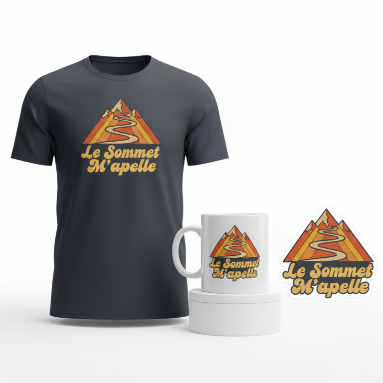
Translating this nuanced cultural moment into a compelling visual requires a thoughtful approach. The goal is to evoke the feeling, not just illustrate the weather event. One angle to consider is a design that celebrates the enduring spirit of the PNW, pivoting from the immediate warning to an evergreen concept of regional pride and comfort.
- 🎨 Visual Concept: Imagine a retro-style, slightly distressed circular emblem that feels both classic and authentic. Inside this emblem, a stylized illustration of a snow-covered mountain peak, unmistakably reminiscent of the majestic Cascades, could take center stage, flanked by iconic evergreen trees. In the foreground, or perhaps gently rising above the mountain, an inviting curl of steam from a coffee mug adds a touch of warmth and the quintessential PNW coffee-lover vibe. The color palette could be muted and earthy, utilizing shades of forest green, dark blue, a soft off-white for the snow, and a warm brown for the coffee steam – colors that speak to the natural beauty and comforting feel of the region.
- ✍️ Typography Ideas: Complementing the retro emblem, the text “PNW Cozy Season” offers a perfectly aligned sentiment. The font choice here could lean into a slightly vintage, perhaps sans-serif style that feels both sturdy and welcoming, mirroring the resilience and warmth of the local culture. The phrase itself cleverly sidesteps any negative connotations of a “blizzard warning,” instead highlighting the positive, local experience of winter.
- 👕 Product Canvas: For this particular aesthetic and color scheme, dark apparel provides an ideal canvas. Think deep charcoal, forest green, or navy blue t-shirts, hoodies, or even mugs. The muted colors of the design would pop beautifully against a darker background, enhancing the retro feel and allowing the warm brown of the coffee steam to truly stand out.
Strategic Market Insight
Targeting residents of the Pacific Northwest with this design concept is a shrewd move. This demographic possesses a robust sense of local pride and an almost innate appreciation for their region’s distinctive, often challenging, weather patterns. The design taps into a powerful psychological trigger: turning an external challenge (a blizzard warning) into an internal badge of honor and comfort. By pivoting to “PNW Cozy Season,” the concept smartly avoids any perception of profiting from a disaster, which is crucial for ethical marketing and platform compliance. Instead, it cross-niches local pride with the universally beloved coffee-lover niche – a cultural cornerstone in the PNW. This approach offers a powerful, positive affirmation of identity, making the merchandise not just a garment, but a statement of belonging and a celebration of regional spirit.
⚖️ Estimated Copyright Risk: LOW
Copyright Evaluation: The design uses generic concepts (mountains, coffee) and a common regional acronym (PNW). The phrase ‘PNW Cozy Season’ is a descriptive term, not a specific trademarked brand or quote. The visual elements are stylized and do not represent any specific copyrighted image.
Always verify intellectual property rights before listing.
Check US Trademark Database (Justia) for “Blizzard Warning” ➔
AI Image Generation Prompts
The following prompts are optimized for leading generators to produce production-ready assets:
👕 Apparel / T-Shirt Prompt
A retro-style, slightly distressed circular emblem illustration, meticulously optimized for a t-shirt print. The design is isolated on a solid, deep charcoal gray background, presenting a clean vector illustration style with graphic precision. Inside the perfectly circular frame, which features a subtle, organically roughened edge suggesting a vintage screen-print imperfection, is a stylized, majestic snow-covered mountain peak. This peak, reminiscent of the rugged grandeur of the Pacific Northwest Cascades, is rendered with bold, crisp lines defining its sharp contours and a clean, flat off-white for the snow caps, contrasted against dark blue mountain rock faces. Below the towering peaks, a dense forest of iconic evergreen trees is depicted in layered, simplified graphic silhouettes, utilizing varying shades of forest green to convey depth without complex gradients. In the immediate foreground, a classic, sturdy coffee mug is subtly integrated into the base of the scene, from which a soft, inviting curl of warm, ethereal steam gracefully rises, rendered in a comforting warm brown hue with delicate, wispy graphic lines, symbolizing coziness. The overall aesthetic is clean, flat, and graphic, evoking a classic national park poster or vintage travel badge, yet with a modern sensibility. The color palette is strictly muted: rich forest green, deep twilight blue, creamy off-white, and a warm, earthy brown for the steam. Text 'PNW Cozy Season' is integrated cleanly within the emblem, using a classic, slightly rounded sans-serif typeface, adhering perfectly to the circular curve of the emblem or positioned boldly at its base. The final image should possess a high-contrast, bold graphic presence, ideal for textile printing. The ONLY text allowed in the image is exactly 'PNW Cozy Season'. Absolutely NO other names, words, or random letters. --ar 3:4 --v 6.0
☕ Drinkware / Mug Prompt
A panoramic coffee mug wrap layout featuring a duplicated side-by-side display of the exact identical graphic on the left and right, designed perfectly for seamless wrapping. The central graphic is a retro-style, slightly distressed circular emblem illustration. Within the circular frame, a stylized illustration depicts a majestic, snow-covered mountain peak, drawing inspiration from the dramatic forms of the Pacific Northwest Cascades. This mountain is rendered with strong, simplified geometric shapes for its rocky blue faces and crisp off-white for the snowy caps. Beneath the peaks, a series of iconic evergreen trees are illustrated in layered, clean graphic silhouettes, utilizing various tones of forest green to suggest depth. In the foreground, a classic, sturdy coffee mug is subtly integrated, from which a soft, inviting curl of warm, comforting steam gracefully ascends, rendered in a warm, inviting brown with delicate, flowing lines. The circular emblem itself has a subtle, integrated distressed texture, appearing as a fine, organic speckle pattern or a gentle, faded ink effect, giving it a charming vintage appearance without hindering print clarity for ceramic. The text 'PNW Cozy Season' is prominently yet elegantly integrated into the emblem, possibly along its lower curve or across the mountain base, using a legible retro-inspired font. The entire color palette is muted: deep forest green, dark twilight blue, creamy off-white, and a comforting warm brown for the steam. The two identical emblems are displayed side-by-side, maintaining high resolution, sharp detail, and vibrant color consistency, ready for panoramic mug printing. The ONLY text allowed in the image is exactly 'PNW Cozy Season'. Absolutely NO other names, words, or random letters. --ar 3:1 --v 6.0
✨ Die-Cut Sticker Prompt
A vibrant, bold 2D flat pop-art style circular emblem illustration designed as a die-cut sticker. The entire design is encircled by a distinct, thick, crisp white outline border, ensuring clear definition for the die-cut. Inside this retro-style emblem, a stylized illustration features a majestic, snow-covered mountain peak, drawing strong inspiration from the striking silhouettes of the Pacific Northwest Cascades. The mountain is rendered with stark, simplified geometric shapes, using solid dark blue for the rock and flat off-white for the snow caps, with absolutely no complex gradients or shading. Below the peaks, a series of iconic evergreen trees are depicted as solid, flat forest green silhouettes, layered for visual interest. In the immediate foreground, a classic coffee mug is integrated, from which a soft, inviting curl of warm, comforting steam gracefully rises, rendered in a flat, warm brown hue with bold, graphic lines. The 'slightly distressed' effect is achieved through a subtle, uniform halftone dot pattern or very fine, integrated speckles applied over the flat color areas, giving a vintage comic-book or screen-print texture that enhances the pop-art aesthetic without compromising clarity. The color palette is muted yet visually impactful for a flat graphic style: rich forest green, deep twilight blue, creamy off-white, and a comforting warm brown for the steam. The text 'PNW Cozy Season' is integrated boldly within the emblem, using a strong, legible, slightly chunky retro-inspired sans-serif font, perfectly suited for the graphic style. The final image should be clean, punchy, and highly collectible, presented on a pure white background. The ONLY text allowed in the image is exactly 'PNW Cozy Season'. Absolutely NO other names, words, or random letters. --ar 1:1 --v 6.0
Frequently Asked Questions
How does this design avoid profiting from a sensitive weather event like a blizzard warning?
The design intelligently pivots away from the direct, often negative, framing of a “blizzard warning.” Instead of focusing on the hazard, it celebrates the cultural response to such events in the Pacific Northwest: embracing the “cozy season.” By using phrases like “PNW Cozy Season” and integrating elements like coffee and stylized regional landscapes, it focuses on local pride, resilience, and comfort, rather than the immediate severity or potential tragedy of the weather event itself. This creative reframe transforms a sensitive topic into a positive, evergreen regional identity.
Why is the coffee mug a critical element in this particular design?
The coffee mug isn’t just an arbitrary element; it’s a powerful symbol deeply embedded in PNW culture. The region is synonymous with coffee, from its bustling cafes to the ritual of a warm cup on a chilly day. Including it in the design cross-niches with the popular coffee-lover demographic, while also adding a visual element of warmth, comfort, and routine that perfectly complements the “Cozy Season” theme, especially when contrasted with a snow-covered mountain. It instantly communicates a familiar, cherished experience for the target audience.
Could this design concept resonate beyond the immediate blizzard warning event?
Absolutely. While the initial inspiration stems from a current weather event, the “PNW Cozy Season” concept is inherently evergreen for the region. The Pacific Northwest experiences long, often wet and cold, seasons, making “cozy” a year-round aspiration and identity for many residents. The stylized mountain, evergreen trees, and coffee elements are timeless symbols of the PNW. This means the merchandise isn’t just a fleeting trend item; it could become a staple for locals who want to express their regional pride and love for their specific winter (or even fall and spring) aesthetic at any time.
Final Thoughts
The intersection of local pride, unique regional weather, and beloved cultural touchstones like coffee offers a fertile ground for engaging merchandise. This “PNW Cozy Season” concept exemplifies how a sensitive trending topic can be thoughtfully reinterpreted into a positive, marketable design that resonates deeply with a specific audience. The key lies in understanding the cultural nuances and pivoting creatively, ensuring the message is one of celebration and identity rather than capitalization on hardship. With a strong design, the right platform, and a connection to the passionate PNW community, the e-commerce potential here is significant for those ready to explore it.
💬 What’s Your Take?
Art is subjective, and this is just one angle! How would you spin this “Blizzard Warning” trend? Drop your design ideas and let’s brainstorm in the comments below!