Proud Basketball Dad
The energy in the United States this March Madness season is absolutely electric, not just for the slam dunks and buzzer-beaters, but for the heartwarming stories unfolding on the sidelines. Few narratives have captured the public’s imagination quite like that of former NBA star Carlos Boozer, whose presence in the stands, beaming with fatherly pride as his twin sons, Cameron and Cayden, make their Duke University debut, has become a trending sensation. It’s a powerful reminder that beyond the professional glory, the deepest pride often comes from watching your children chase their own dreams, making this moment a golden opportunity for thoughtful merchandise design.
The Cultural Significance
The phenomenon of sports legacies isn’t new, but seeing a celebrated athlete like Carlos Boozer transition from court legend to proud spectator adds a deeply relatable human element to the high-stakes world of college basketball. As his sons, Cameron and Cayden, command attention on one of March Madness’s biggest stages, the cameras naturally pan to their famous father. This narrative resonates profoundly with a vast segment of the population – parents everywhere who invest their time, passion, and hopes into their children’s athletic pursuits. It’s a story of inherited talent, hard work, and unconditional support, tapping into universal themes of family, dedication, and the joy of witnessing a child’s success. This confluence of celebrity, sentiment, and a major sporting event creates a powerful, albeit fleeting, cultural moment.
Design Brainstorm: Capturing the Aesthetic
Translating a trending cultural moment into evergreen apparel means distilling its essence into a broadly appealing and legally safe design. For this particular trend, one compelling direction could involve a nostalgic, athletics-inspired aesthetic that celebrates paternal pride without relying on specific team or individual intellectual property.
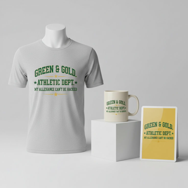
- 🎨 Visual Concept: Imagine a design with a retro, slightly distressed feel that evokes classic sporting aesthetics. A fun way to spin this might be to integrate a stylized silhouette of a basketball, perhaps with subtle motion lines, directly into the text layout. The goal is to convey movement and the spirit of the game in a dynamic yet understated way. Classic varsity color combinations, such as navy and orange or a sophisticated forest green and cream, could lend a timeless, collegiate vibe.
- ✍️ Typography Ideas: The message “Proud Basketball Dad” lends itself perfectly to a bold, vintage athletic script for the main words, giving it a classic, established feel. For any accompanying accent text, a simpler, clean sans-serif font could offer readability and balance, ensuring the design feels robust and well-composed without being overwhelming. This mix creates a harmonious, visually appealing statement.
- 👕 Product Canvas: Given the proposed color palettes and distressed aesthetic, this design could translate exceptionally well onto dark apparel. Think rich navy blue, deep charcoal grey, classic black, or even a heathered forest green. These darker canvases allow the lighter, vintage-inspired colors of the design to truly pop, creating a striking contrast that is both stylish and appealing to a broad demographic.
Strategic Market Insight
The true genius behind a design concept like “Proud Basketball Dad” lies in its strategic pivot away from high-risk, time-sensitive intellectual property. While the immediate trend centers on Carlos Boozer and March Madness, the design intelligently bypasses direct association with Duke, specific player names, or event branding. This approach expertly navigates potential combinatorial bot traps and IP infringement concerns. Instead, it taps into the evergreen and incredibly potent niche of ‘Sports Parent Pride’. Fathers of young basketball players represent a dedicated and emotionally invested demographic, constantly seeking ways to express their support and identity. The retro style further broadens its appeal, offering a timeless look that transcends seasonal trends, making it a viable, year-round product for anyone who identifies with the pride of being a basketball dad. The purchase isn’t just about the design; it’s about validating an identity and celebrating a deeply personal connection.
⚖️ Estimated Copyright Risk: LOW
Our Findings: The design uses the generic, non-trademarked phrase ‘Proud Basketball Dad’ and avoids all specific names, team logos, and event titles associated with the trend. The visual elements described are generic sports symbols.
Always verify intellectual property rights before listing.
Check US Trademark Database (Justia) for “Proud Basketball Dad” ➔
AI Image Generation Prompts
The following prompts are optimized for leading generators to produce production-ready assets:
👕 Apparel / T-Shirt Prompt
A clean vector illustration style graphic for a t-shirt, isolated on a solid dark background. The design features the phrase 'Proud Basketball Dad'. 'Proud' and 'Dad' are rendered in a bold, vintage athletic script font with thick serifs, reminiscent of classic collegiate sportswear. 'Basketball' is in a slightly simpler, sturdy sans-serif font, slightly smaller, positioned to complement the main script. A stylized silhouette of a basketball, depicted mid-flight with subtle motion lines trailing it, is elegantly integrated into the text layout, possibly replacing the 'O' in 'Proud' or 'Basketball', or positioned dynamically behind the text. The overall aesthetic is retro, with a subtle, distressed grunge texture overlay applied evenly across all elements, giving it a weathered, screen-printed feel without compromising clarity. Colors are a classic varsity combination: a deep, rich navy blue for the dark background (though the graphic itself is isolated, this sets the intended apparel color), a vibrant, warm basketball orange as the primary color for the typography and basketball silhouette, with crisp white or a muted cream for outlines, secondary accents, and the distress effect. The illustration is composed of flat, defined shapes with sharp, precise edges, mimicking a high-quality screen print. The mood is nostalgic, proud, and sporty. Rendering is hyper-detailed vector art, showcasing precise curves and lines, with a matte finish. Lighting is even and bright, highlighting the graphic's details. The ONLY text allowed in the image is exactly 'Proud Basketball Dad'. Absolutely NO other names, words, or random letters. --ar 3:4 --v 6.0
☕ Drinkware / Mug Prompt
A duplicated side-by-side layout showing the exact same graphic on the left and right, designed perfectly for a panoramic mug wrap. The design features the text 'Proud Basketball Dad' rendered in a retro, slightly distressed style. The words 'Proud' and 'Dad' are in a dominant, bold vintage athletic script font, evoking classic sports jerseys and university logos. The word 'Basketball' is set in a cleaner, more understated sans-serif font, subtly integrated within or around the main script. A stylized basketball silhouette, complete with dynamic motion lines indicating movement, is thoughtfully placed to interact with the typography, enhancing the sporty theme. The color palette is a classic varsity combination of deep forest green for the primary text and basketball silhouette, contrasted with a warm, creamy off-white for outlines, accent details, and the background of the design element (implying it's printed on a cream base, or has a cream fill). A fine, subtle grunge texture or halftone distress is applied across all colored elements, giving it an authentic, worn-in, vintage feel, typical of screen-printed apparel from the 70s or 80s. The rendering is a high-resolution flat vector illustration with clean lines and strong visual impact, ensuring clarity when wrapped around a mug. The mood is proud, nostalgic, and athletic. Lighting is bright and even, accentuating the design's retro charm. The graphic on the left is an exact duplicate of the graphic on the right, perfectly mirrored for a continuous wrap. The ONLY text allowed in the image is exactly 'Proud Basketball Dad'. Absolutely NO other names, words, or random letters. --ar 3:1 --v 6.0
✨ Die-Cut Sticker Prompt
A die-cut sticker design featuring the text 'Proud Basketball Dad' in a bold, 2D flat pop-art style, with a thick white outline border around the entire design. The typography for 'Proud' and 'Dad' uses a striking, vintage athletic script font, reminiscent of classic sports team logos, characterized by strong serifs and a robust presence. 'Basketball' is rendered in a clean, impactful sans-serif font, providing a clear visual break and accent. A stylized, dynamic silhouette of a basketball, complete with bold, simplified motion lines, is creatively integrated with the text, perhaps appearing to burst through or around it. The color scheme employs a classic varsity combination: a dominant, rich navy blue for the main text and basketball elements, contrasted by a bright, energetic orange for accent details, inner outlines, or distress textures. A subtle, distressed grunge effect is applied as a texture overlay, giving the otherwise flat design a tactile, aged appearance without losing its pop-art vibrancy. The entire graphic is designed with exaggerated, clean lines and distinct color blocking, typical of modern pop art, making it highly visible and graphic. The thick white border ensures it stands out clearly against any background once cut. Rendering is a crisp, high-definition vector illustration, emphasizing sharp edges, geometric precision, and a smooth, untextured finish (except for the intentional grunge overlay). The mood is energetic, proud, and timelessly cool. The ONLY text allowed in the image is exactly 'Proud Basketball Dad'. Absolutely NO other names, words, or random letters. --ar 1:1 --v 6.0
Frequently Asked Questions
How does this design concept avoid intellectual property issues despite being inspired by a trending topic?
The core strategy here is to pivot from the specific, high-risk elements (like player names, team logos, or event branding such as “March Madness”) to a generic, universally relatable identity: “Proud Basketball Dad.” While Carlos Boozer’s story provides the initial inspiration and cultural relevance, the design itself focuses on the broad, evergreen concept of parental pride in sports. This makes the design legally safe, as it doesn’t infringe on any copyrighted names, logos, or trademarks, allowing for year-round marketability.
Beyond March Madness, what makes the “Proud Basketball Dad” niche a sustainable market?
The “Proud Basketball Dad” niche is inherently evergreen because the emotional connection parents have to their children’s sports journeys is constant, not seasonal. Basketball is played year-round in various leagues, from youth and high school to recreational adult leagues. Fathers are always looking for ways to express their pride and support. This design appeals to that continuous desire, offering a timeless piece of apparel that celebrates their role regardless of specific tournaments or seasons.
What other product types could effectively carry this “Proud Basketball Dad” design beyond t-shirts?
This versatile design, with its retro aesthetic and strong message, could translate beautifully across a range of products. Hoodies and sweatshirts would be a natural fit, offering comfort and style for cooler weather or game nights. Consider also integrating it onto hats or beanies, offering subtle branding for dads on the go. Even mugs and tumblers could resonate, providing a daily reminder of their paternal pride during coffee breaks or while watching games. The key is to select products that align with a father’s lifestyle and preferences.
Final Thoughts
The buzz around Carlos Boozer’s proud fatherly presence at March Madness highlights the immense potential in connecting with universal emotions through thoughtful design. The “Proud Basketball Dad” concept offers a compelling blend of timely inspiration and evergreen market appeal, strategically sidestepping IP challenges while tapping into a deeply resonant demographic. Success in print-on-demand often hinges on identifying these cultural undercurrents and translating them into designs that speak to a broad audience, offering both style and sentiment. Remember, while the ideas are here, your unique execution and personal spin on this concept will be the ultimate differentiator in the marketplace.
💬 What’s Your Take?
Art is subjective, and this is just one angle! How would you spin this “Carlos Boozer” trend? Drop your design ideas and let’s brainstorm in the comments below!