
Rey de Europa – King of Europe
The roar of the crowd, the electric tension, the clash of titans – when Real Madrid meets Manchester City in the UEFA Champions League, it’s not just a game; it’s a global spectacle that reverberates deeply across Spain. This monumental football event isn’t merely trending; it’s a cultural phenomenon, fueling passionate debates, analyses, and an insatiable desire for all things related to Europe’s most coveted club competition.
The Cultural Significance
In Spain, football is more than a sport; it’s woven into the national fabric, a source of immense pride and communal identity. Real Madrid, with its storied history and unparalleled record in the Champions League, holds a special place in the hearts of millions. The anticipation surrounding a clash with a powerhouse like Manchester City transcends typical sports fandom. It taps into a deep-seated legacy, a fierce loyalty, and the expectation that their beloved club will once again assert its dominance on the continent’s grandest stage. This isn’t just about winning a single match; it’s about affirming an identity, a status, and a legend. The collective effervescence, the passionate discussions in cafes, and the widespread media coverage illustrate just how profoundly this event captures the public imagination.
Design Brainstorm: Capturing the Aesthetic
Translating such intense passion into a timeless, wearable design requires a thoughtful approach. For this moment, a minimalist yet potent visual can often speak volumes, echoing the club’s regal stature without infringing on official branding. The goal is to evoke the feeling, the history, and the pride in a sophisticated manner.
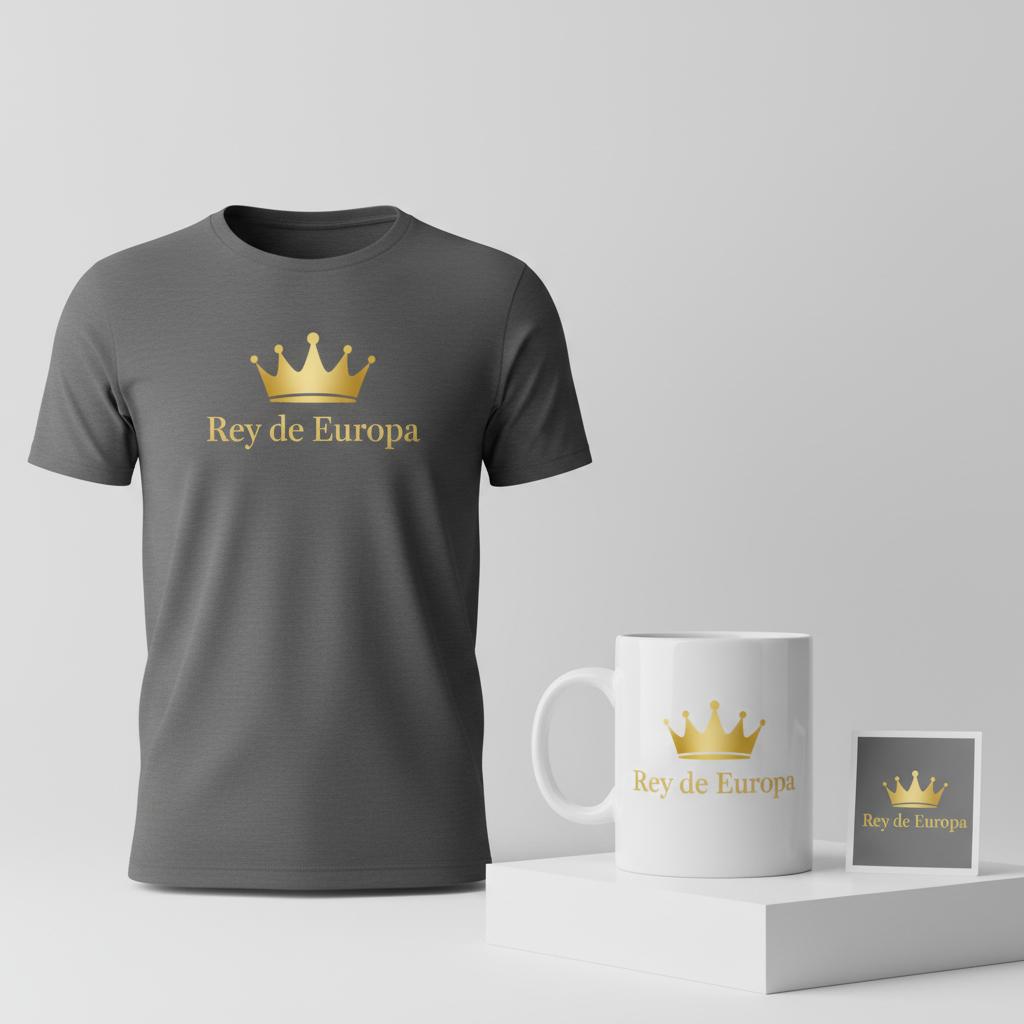
- 🎨 Visual Concept: One compelling angle might involve a stylized, minimalist crown graphic. Imagined in a single, striking color like gold or a vibrant yellow, this element subtly nods to the “Real” (Royal) in Real Madrid’s name and their historical claim as the “King of Europe.” Its simplicity allows it to be instantly recognizable yet elegantly understated, focusing on the essence of majesty and achievement rather than overt, busy imagery.
- ✍️ Typography Ideas: Complementing the crown, the text “Rey de Europa” could be rendered in a classic, elegant serif font. This choice immediately communicates a sense of tradition, heritage, and established prestige. The serif adds a touch of sophistication, making the design feel premium and enduring, much like the club’s own legacy. The Spanish phrasing not only grounds the design culturally but also directly addresses the target audience’s language and emotional connection.
- 👕 Product Canvas: For an aesthetic built on elegance and a premium feel, dark apparel provides an ideal backdrop. Black, charcoal, or deep navy garments would allow the gold/yellow crown and the serif text to truly pop, creating a strong contrast that enhances readability and impact. This choice elevates the design, making it a stylish statement piece rather than just a casual tee.
Strategic Market Insight
Targeting the highly passionate Real Madrid fanbase with a design concept like “Rey de Europa” is a strategic play. The psychological triggers behind a potential purchase are deeply rooted in pride, identity, and a celebration of legacy. Fans are not just buying a piece of apparel; they are acquiring a symbol of their club’s historic dominance and a declaration of their unwavering support. By leveraging the universally understood trope of the “King of Europe” and incorporating the crown motif, the design ingeniously sidesteps trademarked names or slogans. This allows creators to tap into an enormous, loyal demographic with an evergreen concept. The design celebrates the club’s remarkable record number of Champions League titles—a source of immense pride—making it a timeless piece that resonates well beyond any single match day.
⚖️ Estimated Copyright Risk: MEDIUM
Copyright Evaluation: While ‘Rey de Europa’ is a common moniker and not a registered trademark, and the crown is a generic symbol, the combination is strongly and intentionally associated with Real Madrid. This creates a medium risk, as the club could potentially claim that the design is intended to mislead consumers, even without using their official crest or name. It’s a calculated risk based on targeting a very specific fan identity.
Always verify intellectual property rights before listing.
Check EU Trademark Search for “Real Madrid Manchester City” ➔
AI Image Generation Prompts
The following prompts are optimized for leading generators to produce production-ready assets:
👕 Apparel / T-Shirt Prompt
A premium, minimalist graphic design for a t-shirt print, featuring a highly stylized, abstract crown silhouette. The crown is rendered in a deep, lustrous metallic gold, exhibiting clean, sharp lines and perfect symmetrical geometry. Below the crown, the text 'Rey de Europa' is set in a classic, elegant serif font with precise kerning, matching the exact rich gold color. The entire design is presented in a pristine, clean vector illustration style, isolated on a solid Dark background (charcoal grey or black) for maximum contrast. The rendering features extremely subtle internal shading or a slight bevel to suggest a luxurious metallic foil print, while maintaining a perfectly flat, scalable vector aesthetic. No gradients beyond subtle depth suggestion. The overall mood is sophisticated, regal, and established. Focus on clarity, simplicity, and premium feel, devoid of any unnecessary embellishments or textures. The ONLY text allowed in the image is exactly 'Rey de Europa'. Absolutely NO other names, words, or random letters. --ar 3:4 --v 6.0
🔍 Search this niche on:
☕ Drinkware / Mug Prompt
A clean, elegant graphic design optimized for a panoramic coffee mug wrap. The layout features the exact identical design duplicated side-by-side, perfectly spaced for seamless wrapping. The design consists of a minimalist, stylized crown silhouette in a brilliant, metallic gold, paired with the text 'Rey de Europa' in a sophisticated, classic serif font, also in the same radiant gold. The artwork boasts sharp, crisp lines, ideal for a high-quality ceramic print with a subtle glossy finish. The background is pure white or a very light, neutral tone to ensure the gold design pops. The aesthetic is premium, established, and timeless, emphasizing clarity and luxury. Focus on precise duplication and consistent quality across both instances of the graphic, ensuring the text is perfectly legible and the crown maintains its regal elegance. The ONLY text allowed in the image is exactly 'Rey de Europa'. Absolutely NO other names, words, or random letters. --ar 3:1 --v 6.0
🔍 Search this niche on:
✨ Die-Cut Sticker Prompt
A striking die-cut sticker design in a bold, 2D flat pop-art style. The central graphic features a highly simplified, minimalist crown silhouette rendered in a vibrant, opaque yellow-gold color with no gradients or metallic sheen, embodying a classic screen-printed look. Below the crown, the text 'Rey de Europa' is presented in a clean, robust classic serif font, matching the exact same flat yellow-gold. The entire combined design of the crown and text is encapsulated by a prominent, uniformly thick white outline border, creating a sharp, clean die-cut edge. The background outside the white border is transparent or implied as pure white for the sticker sheet. Focus on crisp, strong lines, high contrast, and a clear, impactful graphic presence, perfect for a collectible sticker. The aesthetic is clean, iconic, and direct. The ONLY text allowed in the image is exactly 'Rey de Europa'. Absolutely NO other names, words, or random letters. --ar 1:1 --v 6.0
🔍 Search this niche on:
Frequently Asked Questions
How does this design resonate with fans without using official club branding?
The concept brilliantly leverages universally recognized symbols and tropes associated with Real Madrid’s identity. “Rey de Europa” (King of Europe) directly references their unparalleled Champions League success, a cornerstone of their legacy. The crown subtly alludes to the “Real” (Royal) in their name. Fans instantly connect these elements to their club’s historical dominance and royal status, feeling a sense of pride and ownership without requiring explicit logos or names.
Why choose a minimalist style for such an intense, passionate topic?
A minimalist approach, while seemingly simple, offers several advantages. It conveys elegance, sophistication, and a premium feel, aligning with the prestige of a club like Real Madrid. It also makes the design more versatile and timeless, appealing to a broader audience who might prefer understated declarations of loyalty over overt, busy graphics. The focus remains on the powerful message and the iconic symbolism rather than fleeting trends or specific match details.
What is the specific appeal of “Rey de Europa” for the Spanish market?
In Spain, where Real Madrid holds immense cultural significance, “Rey de Europa” is a direct, powerful declaration in the local language. It resonates deeply because it’s precisely how many fans perceive their club – as the undisputed monarch of European football. The phrase directly triggers feelings of national and club pride, making the merchandise a potent symbol of allegiance and a celebration of their team’s unparalleled achievements on the continent.
Final Thoughts
The fervor surrounding football in Spain, particularly for a club with the legacy of Real Madrid, presents a fertile ground for print-on-demand designers. A concept like “Rey de Europa” demonstrates how thoughtful design, strategic insight into fan psychology, and clever navigation of intellectual property can unlock significant e-commerce potential. Success in this exciting space isn’t just about identifying a trend; it’s about crafting a narrative, designing with empathy, and offering merchandise that resonates deeply with an audience’s passions. The beauty of print-on-demand lies in the agility to explore such nuanced cultural moments, offering unique expressions that truly connect.
💬 What’s Your Take?
Art is subjective, and this is just one angle! How would you spin this “Real Madrid Manchester City” trend? Did we miss the mark, or is there a better inside joke to use here? Drop your design ideas and let’s brainstorm in the comments below!