SCHNÄPPCHENJÄGER – Bargain Hunter
A particular buzz recently swept across Germany, not for a new technological marvel or a groundbreaking cultural event, but for something far more accessible: a highly sought-after traffic alert gadget offered at an irresistible price point. This phenomenon, centered around a popular discount supermarket chain, transcended mere shopping to become a cultural moment, sparking widespread excitement and highlighting a pervasive national pastime.
The Cultural Significance
The sudden surge of interest wasn’t just about a gadget; it tapped into a deeper vein of German consumer culture. The allure of a “Schnäppchen” – a true bargain – holds a powerful sway, transforming routine shopping into an exhilarating hunt. When a major discount retailer offers a desirable item at a significantly reduced cost, it doesn’t just attract customers; it ignites a collective passion for savvy shopping. This event underscored the widespread pride in being a “Schnäppchenjäger,” someone who expertly sniffs out and secures the best deals. It’s a testament to a culture that values thriftiness and smart consumption, turning a simple purchase into a badge of honor and a topic of enthusiastic conversation.
Design Brainstorm: Capturing the Aesthetic
Translating this cultural moment into merchandise requires a design that resonates with the “bargain hunter” identity without infringing on specific brand trademarks. The aim is to evoke the feeling of a great find, the thrill of the deal, through a visually compelling concept.
- 🎨 Visual Concept: One compelling angle is to lean into the nostalgic appeal of classic discount store branding. Imagine a design that mimics a retro price sticker, reminiscent of the bold, eye-catching labels that screamed “SALE!” in days gone by. This could feature a prominent starburst shape or a clean rectangular block, both outlined with high-contrast lines to demand attention. The overall aesthetic could incorporate a slightly distressed texture, lending it a vintage, well-loved, or “found” quality, further emphasizing the idea of a timeless bargain. The color palette could draw inspiration from the iconic hues of discount culture: bright yellow for vibrancy, bold red for urgency and excitement, and stark black for strong readability and graphic punch.
- ✍️ Typography Ideas: For the textual element, a bold, sans-serif, slightly condensed font would capture that classic supermarket deal announcement feel. The chosen text, “SCHNÄPPCHENJÄGER,” acts as the centerpiece, instantly identifying with the target audience and celebrating their identity. The weight and style of the font could evoke a sense of authority and value, much like a store declaring an unbeatable offer. The compactness of a condensed font also allows for strong visual impact within the sticker’s confines.
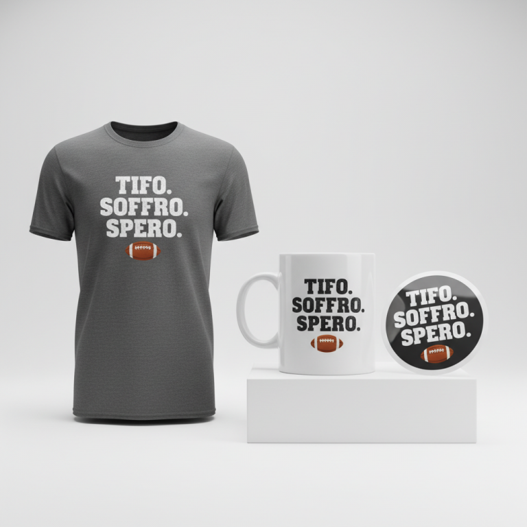
- 👕 Product Canvas: Given the bold, graphic nature of this design concept and its target demographic, ideal apparel choices include comfortable yet stylish items. Classic t-shirts, both short-sleeved and long-sleeved, would serve as excellent canvases, allowing the design to pop. Hoodies and sweatshirts could also work wonderfully, providing a larger surface area for the design to make a statement, especially appealing for casual wear. Accessories like tote bags could also carry this design effectively, reinforcing the idea of a smart shopper carrying their latest “Schnäppchen.”
Strategic Market Insight
The brilliance of this merchandise concept lies in its strategic pivot. By focusing on “SCHNÄPPCHENJÄGER,” the design completely sidesteps any trademark concerns related to specific supermarket chains or products. Instead, it taps directly into the core motivation and identity of the target audience: the proud German bargain hunter. This isn’t just about selling a product; it’s about offering a piece of identity. Consumers don’t just buy a t-shirt; they buy into a community and express a shared value. The retro sticker style further reinforces this by evoking a sense of nostalgia for classic discount culture, adding an emotional layer to the purchase. It’s an astute move that leverages a trending event to celebrate an evergreen cultural phenomenon, creating a highly resonant and marketable product.
⚖️ Estimated Copyright Risk: LOW
Our Findings: The design uses a common, generic German word (‘Schnäppchenjäger’) that is not trademarked for apparel. It does not use any brand names, logos, or copyrighted elements associated with the trending supermarket or the products it sells.
Always verify intellectual property rights before listing.
Check EU Trademark Search for “Lidl” ➔
AI Image Generation Prompts
The following prompts are optimized for leading generators to produce production-ready assets:
👕 Apparel / T-Shirt Prompt
A highly detailed, clean vector illustration of a retro discount price sticker, isolated on a solid background, optimized for a t-shirt print. The design features a prominent starburst shape in bold red and bright yellow, with sharp, clean lines and a high-contrast black outline. Inside the starburst, the text 'SCHNÄPPCHENJÄGER' is rendered in a bold, sans-serif, slightly condensed font. The overall aesthetic includes a carefully applied, subtle distressed texture overlay, mimicking a vintage screen print with faded ink effects, subtle halftone dots, and lightly worn edges. The graphic style is reminiscent of classic advertising and pop art, designed for maximum visual impact with crisp details and a graphic novel aesthetic. The rendering emphasizes solid color fills with a vintage print effect, ensuring a bold, iconic, and punchy appearance suitable for apparel. The background is a minimalist, neutral grey to highlight the design. The mood is nostalgic, energetic, and eye-catching. The ONLY text allowed in the image is exactly 'SCHNÄPPCHENJÄGER'. Absolutely NO other names, words, or random letters. --ar 3:4 --v 6.0
☕ Drinkware / Mug Prompt
A duplicated side-by-side layout showing the exact same graphic on the left and right, designed perfectly for a panoramic mug wrap. The graphic is a highly detailed retro discount price sticker design, featuring a prominent rectangular block with a high-contrast black outline, filled with bright yellow. Overlaid on this yellow block, a bold red starburst shape contains the text 'SCHNÄPPCHENJÄGER' in a bold, sans-serif, slightly condensed font. The entire design incorporates a vintage advertising aesthetic, with a flat graphic style, clean edges, and vibrant, uniform color saturation. A subtle distressed texture overlay, simulating worn edges, faded inks, and a silkscreen print effect, is applied to give it a rustic, vintage charm without compromising legibility. The mood is playful, nostalgic, and makes a bold statement suitable for everyday use. The graphic is sharp, high-impact, and designed for clear visibility on a curved surface. The ONLY text allowed in the image is exactly 'SCHNÄPPCHENJÄGER'. Absolutely NO other names, words, or random letters. --ar 3:1 --v 6.0
✨ Die-Cut Sticker Prompt
A vibrant, 2D flat pop-art style illustration of a retro discount price sticker, optimized for a die-cut sticker, featuring a thick white outline border around the entire design. The core graphic showcases a bright yellow rectangular block with a high-contrast black outline. Within this block, a dynamic bold red starburst shape frames the text 'SCHNÄPPCHENJÄGER', rendered in a bold, slightly condensed sans-serif font. The art style is crisp and clean, with sharp vector edges, smooth color fills, and high saturation, giving it a retro cartoon influence. A subtle, sharp distressed texture is integrated into the design elements, mimicking a vintage print for a worn, authentic look, ensuring the grunge effect is defined and not blurry. The sticker's implied finish is glossy vinyl, with a distinct, smooth cut along the thick white border. The mood is fun, collectible, bold, and expressive, capturing a retro cool vibe. The ONLY text allowed in the image is exactly 'SCHNÄPPCHENJÄGER'. Absolutely NO other names, words, or random letters. --ar 1:1 --v 6.0
Frequently Asked Questions
How does this design avoid trademark infringement, given the initial trend’s origin?
The design concept cleverly pivots from specific brand names to a universally understood and culturally significant term: “SCHNÄPPCHENJÄGER” (bargain hunter). By focusing on the *identity* and *motivation* behind the trend rather than the specific retailer or product, it bypasses trademark issues entirely while still resonating deeply with the audience’s experience and pride in finding great deals.
Who is the ideal customer for this “Schnäppchenjäger” merchandise?
The ideal customer is the proud, savvy German consumer who relishes finding a good deal. They are likely pragmatic, value-conscious, and enjoy sharing their “finds” with others. This merchandise appeals to those who see smart shopping not just as a necessity, but as a skill and a source of satisfaction, making it a fun way to express a core part of their identity.
Beyond basic apparel, what other print-on-demand products could this “retro discount sticker” design suit well?
Given its bold, graphic nature, this design could also translate exceptionally well to accessories like mugs, phone cases, and perhaps even reusable shopping bags, reinforcing the theme of smart consumption. Consider items that fit into everyday life where a little nod to bargain-hunting pride can be displayed.
Final Thoughts
Tapping into a localized cultural phenomenon, especially one centered around a shared experience like the thrill of a great deal, presents a rich vein for print-on-demand success. The “Schnäppchenjäger” concept beautifully encapsulates this, offering a unique blend of cultural relevance, smart design, and strategic market positioning. While this brainstorm provides a solid foundation, remember that the true magic lies in execution – bringing the design to life with quality prints and thoughtful product choices. Embracing cultural nuances and transforming them into relatable, desirable merchandise is a powerful path to building a loyal customer base and a standout brand.
💬 What’s Your Take?
Art is subjective, and this is just one angle! How would you spin this “Lidl” trend? Drop your design ideas and let’s brainstorm in the comments below!