SOCCER IS MY THERAPY
Across the United States, the air is thick with anticipation as the UEFA Champions League reaches its fever pitch. Fans are glued to screens, dissecting every pass and predicting every goal, especially with monumental clashes like Real Madrid versus Manchester City dominating water cooler conversations from coast to coast. This isn’t just a sporting event; it’s a cultural moment igniting passionate debate and a surge of enthusiasm for European football.
The Cultural Significance
The UEFA Champions League isn’t merely a tournament; it’s a global spectacle, a narrative woven with triumph, heartbreak, and pure athletic genius that transcends borders. For American sports enthusiasts, what was once a niche interest has blossomed into a mainstream phenomenon. Matches featuring titans like Real Madrid and Manchester City don’t just attract dedicated soccer fanatics; they pull in casual viewers drawn to the high-stakes drama, world-class talent, and the unique energy of European football. This confluence of sporting excellence and cultural intrigue fuels an immense wave of online discussion, fan engagement, and a passionate desire for merchandise that speaks to that shared experience without infringing on specific team identities.
Design Brainstorm: Capturing the Aesthetic
One compelling approach to capture this fervor is through a nostalgic 90s bootleg rap tee aesthetic, a style currently seeing a massive resurgence. This allows for a timeless, edgy look that celebrates the sport’s universal appeal.
- 🎨 Visual Concept: Imagine three dynamic, generic action shots of soccer players – perhaps one mid-slide tackling, another unleashing a powerful kick, and a third exulting in a goal – all rendered with a gritty, vintage, distressed filter. These aren’t identifiable superstars, but archetypal heroes of the pitch. The backdrop could be a dramatic, stark black, punctuated by abstract, jagged flashes of gold and white, reminiscent of lightning or raw energy. This creates an immediate, edgy visual impact that feels both classic and contemporary.
- ✍️ Typography Ideas: For the central message, “SOCCER IS MY THERAPY,” a metallic chrome effect for the primary text would lend a premium, almost audacious feel, playing into the bold confidence of the 90s era. Any secondary text, if needed, could employ a simple, robust sans-serif font, ensuring legibility and maintaining that classic street-style vibe. The juxtaposition of chrome and stark sans-serif fonts is a hallmark of this genre.
- 👕 Product Canvas: Given the dramatic, high-contrast visuals and the dark, gritty aesthetic, this design concept would truly shine on dark apparel. Think deep black t-shirts, charcoal hoodies, or navy long-sleeves. A dark canvas allows the gold, white, and chrome elements to pop vividly, enhancing the vintage, distressed feel and providing the perfect backdrop for the intensity of the design.
Strategic Market Insight
Tapping into the robust enthusiasm of European football fans in the United States offers a unique market opportunity. This particular design strategy cleverly sidesteps potential intellectual property pitfalls by focusing on the spirit of the game rather than specific teams, players, or tournaments. By utilizing generic, non-identifiable player images and avoiding trademarked names, creators can cater to a broad audience of passionate supporters without legal complications. The phrase “SOCCER IS MY THERAPY” resonates deeply, speaking to the emotional connection and stress relief many fans find in the sport – a powerful psychological trigger for purchase. The current popularity of the 90s bootleg style further amplifies its appeal, making it a trendy, evergreen offering. This approach transforms a transient, event-specific interest into a timeless expression of fan identity.
⚖️ Estimated Copyright Risk: LOW
Risk Assessment: The design uses the broad trope of ‘soccer fan’ and avoids all specific, trademarked entities including team names, player likenesses, league names, and logos. The phrase ‘Soccer is my therapy’ is a common slogan, not a registered trademark for apparel.
Always verify intellectual property rights before listing.
Check US Trademark Database (Justia) for “Real Madrid – Manchester City” ➔
AI Image Generation Prompts
The following prompts are optimized for leading generators to produce production-ready assets:
👕 Apparel / T-Shirt Prompt
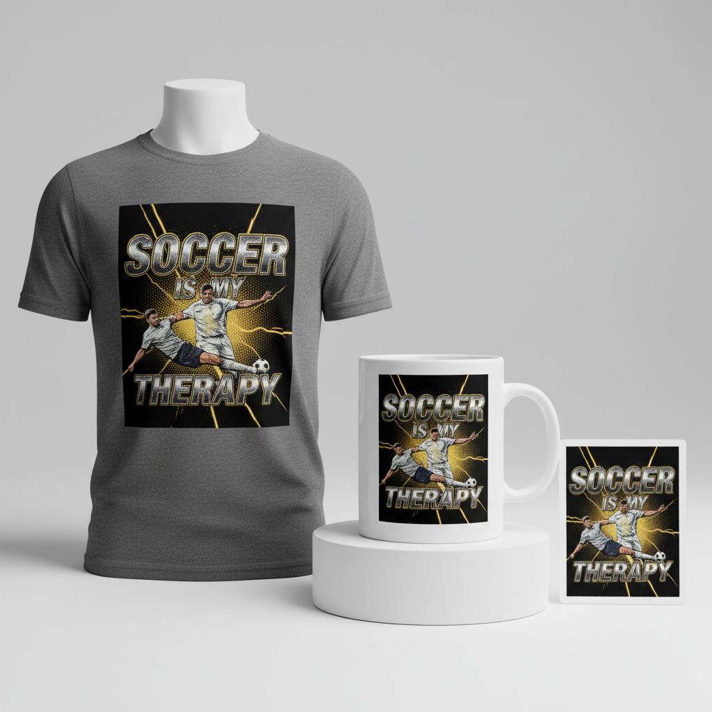
A 90s bootleg rap tee style design, optimized for a t-shirt print. The design features three different generic, non-identifiable male soccer players in dynamic, dramatic action poses, rendered with a gritty, stylized vector illustration aesthetic. One player is captured mid-slide tackle, another mid-powerful kick, and the third in an ecstatic celebration. Each player features strong, bold outlines, simplified forms, and a limited, high-contrast color palette, evoking a vintage screen print look with simulated halftone dots and deliberate registration errors. The players have a distressed, grainy texture overlay, mimicking aged print quality. Isolated on a solid Dark background, behind the players, abstract lightning-like flashes of vivid gold and sharp white burst across the dark backdrop, stylized as raw, dynamic vector graphics rather than photorealistic elements. The primary text 'SOCCER IS MY THERAPY' is rendered with a highly detailed, reflective metallic chrome effect, appearing dimensional, polished, and catching light, a hallmark of 90s design. The text should be prominently placed, rendered in a bold, impactful font. The entire composition is characterized by its high contrast, bold graphic elements, and deliberately imperfect, retro screen-print textures, all while maintaining a crisp vector clarity suitable for apparel, feeling both raw and meticulously crafted, a perfect blend of street art and commercial graphic design. --ar 3:4 --v 6.0 The ONLY text allowed in the image is exactly 'SOCCER IS MY THERAPY'. Absolutely NO other names, words, or random letters.
🔍 Search this niche on:
☕ Drinkware / Mug Prompt
A 90s bootleg rap tee style design, optimized for a coffee mug wrap layout. A duplicated side-by-side layout showing the exact same graphic on the left and right, designed perfectly for a panoramic mug wrap. The graphic features three different generic, non-identifiable male soccer players captured in dramatic, energetic action shots: one sliding intensely, one powerfully kicking a ball, and one celebrating triumphantly. These player images possess a distinct grainy, distressed, vintage photographic filter, reminiscent of aged film or old bootleg concert posters, with a rich, slightly desaturated color palette. They appear as if extracted from old 90s sports magazines, with visible halftone patterns, light leaks, and print imperfections. The background behind the players is a deep, stark black, dramatically punctuated by jagged, abstract lightning-like flashes of vibrant gold and stark white, giving an intense, dynamic energy to the scene. These flashes have a raw, hand-drawn, almost stencil-like quality, erupting dynamically. The main text 'SOCCER IS MY THERAPY' is rendered in a striking metallic chrome effect, highly reflective and three-dimensional, positioned prominently. The lettering has sharp, bold edges and beautifully reflects ambient light, giving it a premium, retro-futuristic feel. The overall aesthetic is gritty, high-energy, and nostalgically 90s, with a strong visual impact designed to seamlessly wrap around a mug. The design should feel cohesive and impactful from all angles. --ar 3:1 --v 6.0 The ONLY text allowed in the image is exactly 'SOCCER IS MY THERAPY'. Absolutely NO other names, words, or random letters.
🔍 Search this niche on:
✨ Die-Cut Sticker Prompt
A 90s bootleg rap tee style design, optimized for a die-cut sticker, featuring a thick white outline border around the design. The central graphic showcases three different generic, non-identifiable male soccer players in dynamic, exaggerated action poses: one sliding aggressively, one launching a powerful kick, and one celebrating exuberantly. These figures are rendered in a vibrant, 2D flat pop-art style, characterized by crisp, clean lines, bold graphic shapes, and a limited but impactful color palette. Each player has a subtle, simulated grainy texture overlay, hinting at a vintage print, but with the overall flatness and sharp definition ideal for a modern sticker. The poses are simplified yet instantly recognizable, with strong visual weight. The background is a stark black, entirely flat, from which abstract, stylized lightning-like flashes of solid gold and bright white erupt. These flashes are graphic and sharp, providing a dynamic contrast without adding depth or photorealism. The entire composition is contained within a precisely cut shape, enveloped by a distinct, thick white outline border, clearly indicating a die-cut sticker design. The primary text 'SOCCER IS MY THERAPY' is rendered with a striking metallic chrome effect, appearing shiny and dimensional against the flat backdrop, giving it a premium, eye-catching feel. The font is bold and impactful, reminiscent of 90s streetwear. This design is optimized for visual clarity, durability, and impact as a collectible sticker. --ar 1:1 --v 6.0 The ONLY text allowed in the image is exactly 'SOCCER IS MY THERAPY'. Absolutely NO other names, words, or random letters.
🔍 Search this niche on:
Frequently Asked Questions
Why choose a generic player design instead of specific team logos for such a big match?
This approach is crucial for navigating intellectual property restrictions while still catering to the massive fan base. By focusing on the universal emotions and actions of soccer, designers can create merchandise that appeals to fans of any team or match, making it a versatile, evergreen product that sidesteps trademark issues and the restrictive ‘Location + Sport’ design trap. It’s about celebrating the sport itself.
How does the “90s bootleg rap tee” style connect with European football fans today?
The 90s bootleg aesthetic has seen a massive resurgence in pop culture, embodying a nostalgic, edgy, and authentic vibe. For football fans, it taps into a certain “cool factor” and street credibility, allowing them to express their passion for the sport in a fashion-forward way that feels vintage and unique, rather than overtly branded. It’s about personal style meeting fan identity in a contemporary context.
What’s the significance of the “SOCCER IS MY THERAPY” text for the target audience?
This sentiment goes beyond simple fandom; it articulates the profound emotional and psychological role soccer plays in many people’s lives. It speaks to the stress relief, excitement, and community the sport provides. For a passionate fan, this phrase isn’t just text; it’s a deeply relatable statement that acknowledges their personal connection, creating a strong emotional pull and sense of belonging.
Final Thoughts
The fervent interest surrounding major football clashes like Real Madrid vs. Manchester City creates a vibrant, engaged audience ripe for unique merchandise. By leaning into trending aesthetics like the 90s bootleg style and universal fan sentiments, designers can carve out a meaningful space in the e-commerce landscape. The real magic, however, lies in the execution – how you interpret these ideas, refine the visuals, and infuse your own creative spark. Ultimately, success in this dynamic market hinges on smart design choices that resonate deeply with fans, offering them not just a product, but a tangible piece of their passion.
💬 What’s Your Take?
Art is subjective, and this is just one angle! How would you spin this “Real Madrid – Manchester City” trend? Did we miss the mark, or is there a better inside joke to use here? Drop your design ideas and let’s brainstorm in the comments below!