
Some Keepers Have A Bad Day. Others Have A Bad 15 Minutes.
Across the United States, a particular moment of sporting infamy has sparked a quiet but potent trend, reminding everyone that even in the high-stakes world of professional football, some days are just disastrous. The internet, ever-ready to immortalize dramatic events, is buzzing with echoes of a recent European match where a specific goalkeeper’s performance became instantly legendary—though perhaps not for the reasons a player hopes. This collective memory, rooted in the universal experience of sports highs and lows, presents a ripe opportunity for unique apparel that speaks to the shared language of fandom and rivalry.
The Cultural Significance
The incident in question involved a Tottenham Hotspur goalkeeper’s remarkably swift exit from a major European game, substituted after a mere 15 minutes following a flurry of conceded goals. Such an immediate and dramatic turn of events isn’t just a football statistic; it’s a moment of pure, unadulterated sports drama that resonates far beyond the pitch. For fans of rival clubs, it’s a golden opportunity for good-natured (or not-so-good-natured) banter, a chance to revel in a competitor’s misfortune, and a memory that fuels the fire of long-standing rivalries. This isn’t about disrespecting a player; it’s about the theater of sport itself, where narratives of triumph and failure are woven into the fabric of fan identity. The humor here lies in the sheer, undeniable brevity of the setback, creating an instantly recognizable touchstone for those in the know.
Design Brainstorm: Capturing the Aesthetic
Translating such a specific, yet universally relatable, sports moment into a marketable design requires a thoughtful approach that balances impact with broad appeal and safety. The goal here is to evoke the incident without direct references, making it a clever inside joke for the target audience.
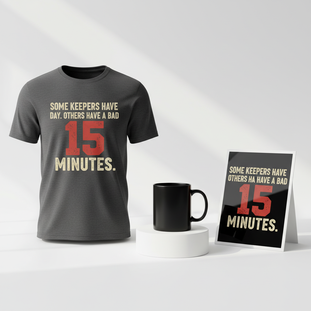
- 🎨 Visual Concept: One compelling angle is a minimalist design built around bold, distressed, sans-serif typography. The number ’15’ stands out as the hero element, made significantly larger than the surrounding text and potentially rendered in a contrasting, impactful color like red to symbolize urgency or a ‘red card’ moment. This visual approach aims for a gritty, vintage sports apparel feel, reminiscent of classic team gear but with a modern, ironic twist. The distressed texture adds character and suggests a battle-hardened, underdog spirit—or perhaps a moment that simply fell apart.
- ✍️ Typography Ideas: The chosen design text, “Some Keepers Have A Bad Day. Others Have A Bad 15 Minutes.”, is a masterclass in clever appropriation. It’s a humorous, generic statement that immediately conjures the specific incident for those in the know, while remaining completely detached from any copyrighted names or team logos. A strong, impactful sans-serif font would lend itself well to the distressed effect, ensuring readability while reinforcing the raw, athletic aesthetic. The emphasis on ’15 Minutes’ visually and textually is key to the design’s success.
- 👕 Product Canvas: Dark apparel serves as the ideal backdrop for this concept. Black, charcoal, or deep navy t-shirts, hoodies, or sweatshirts would allow the distressed typography, especially if featuring a pop of red for the ’15’, to truly stand out. Darker garments inherently carry a certain weight and authenticity, aligning perfectly with the gritty, vintage sports vibe and making the humorous text even more striking.
Strategic Market Insight
The strategic brilliance of this design concept lies in its savvy navigation of the e-commerce landscape. By pivoting from a specific player and team to a generic, humorous trope about poor goalkeeping, it completely sidesteps potential trademark infringements and common ‘Location + Sport’ bot traps. The target audience is keenly defined: fans of rival football clubs who find joy in mocking a competitor’s misfortunes. This taps into a fundamental psychological trigger: schadenfreude, combined with team loyalty and the perennial joy of inter-club banter. The purchase isn’t just about a shirt; it’s about making a statement, being part of an inside joke, and expressing identity within a passionate sports community. Furthermore, the concept is inherently evergreen. Sporting blunders happen, rivalries endure, and the humor of “a bad 15 minutes” will resonate as long as football is played, ensuring long-term appeal beyond the immediate trending moment.
⚖️ Estimated Copyright Risk: LOW
Copyright Evaluation: The design uses a generic phrase and concept. It does not mention any specific player, team, or copyrighted tournament, thus avoiding direct infringement on intellectual property or image rights. It’s a broad trope design.
Always verify intellectual property rights before listing.
Check US Trademark Database (Justia) for “Antonín Kinský” ➔
AI Image Generation Prompts
The following prompts are optimized for leading generators to produce production-ready assets:
👕 Apparel / T-Shirt Prompt
A high-contrast, graphic-centric vector illustration designed specifically for a t-shirt print. The design features bold, impactful sans-serif typography with a meticulously crafted distressed texture overlay, creating an authentic vintage sports apparel aesthetic. The main body of text, 'Some Keepers Have A Bad Day. Others Have A Bad', is rendered in a robust, slightly condensed sans-serif font, utilizing a muted off-white or cream hue to ensure vibrant readability against dark fabrics. The numeric element '15' is significantly larger and more prominent than the surrounding text, acting as a powerful focal point, rendered in a striking, slightly desaturated blood red or deep crimson. The final word, 'Minutes.', completes the phrase in the same primary sans-serif font. Each individual letter and number in the design exhibits subtle irregularities, rough edges, simulated crackling, and faint ink bleed, mimicking the charming imperfections of well-worn screen-printed graphics from the 70s or 80s. The overall composition is minimalist yet dynamic, with the '15' serving as a central, slightly aggressive and visually dominant element. The grunge effect is intricate enough to convey genuine age and character through fine noise, subtle grain, and light scuff marks, while remaining clear and highly legible. The color palette is restricted to a maximum of 2-3 primary colors for a classic athletic, retro feel. The entire graphic is presented as a clean, scalable vector illustration, intentionally isolated on a solid dark charcoal grey background for optimal print preview and compatibility with dark apparel. The rendering style is flat 2D but possesses a perceived tactile quality due to the intricate, textural details. The mood evoked is determined, resilient, and slightly rebellious, reminiscent of iconic old-school athletic team mottos and championship gear. The typography is powerful, impactful, and iconic. The ONLY text allowed in the image is exactly 'Some Keepers Have A Bad Day. Others Have A Bad 15 Minutes.'. Absolutely NO other names, words, or random letters. --ar 3:4 --v 6.0
🔍 Search this niche on:
☕ Drinkware / Mug Prompt
A seamless panoramic graphic design for a coffee mug wrap, featuring a duplicated side-by-side layout showing the exact same, highly detailed design element on both the left and right halves of the canvas. The core design is a minimalist yet powerful typographic statement, centered on bold, distressed sans-serif lettering that meticulously evokes vintage sports apparel aesthetics. The initial part of the phrase, 'Some Keepers Have A Bad Day. Others Have A Bad', is rendered in a robust, slightly condensed sans-serif font, utilizing a muted off-white or cream color with a subtle matte finish, giving it a classic, worn appearance as if from years of use. The number '15' is emphatically larger, significantly scaled up, and stands out prominently as the intense focal point, rendered in a striking, slightly desaturated vermillion or brick red with a faint weathered quality. The concluding word 'Minutes.' is presented in the same primary sans-serif font. Each character, whether letter or number, is imbued with a meticulously applied texture of subtle distressing, including fine, intricate cracks, simulated ink bleed around the edges, and a gentle, nuanced grunge overlay. This detailing precisely replicates the charm and character of aged screen prints from bygone athletic eras. The overall style is a sophisticated blend of clean graphic design and authentic wear-and-tear detailing, providing a gritty yet refined visual presentation. The background for the graphic itself should be transparent or a deep, neutral dark grey, ensuring the distressed details are clearly visible and adaptable to various mug colors. The mood conveyed is determined, resilient, unapologetically retro, and full of character. The two identical instances of this graphic are perfectly aligned and spaced to create a continuous, visually cohesive wrap effect when applied to a standard-sized coffee mug. The resolution is optimized for crisp print on ceramic. The ONLY text allowed in the image is exactly 'Some Keepers Have A Bad Day. Others Have A Bad 15 Minutes.'. Absolutely NO other names, words, or random letters. --ar 3:1 --v 6.0
🔍 Search this niche on:
✨ Die-Cut Sticker Prompt
A vibrant, graphic die-cut sticker design presented in a distinct 2D flat pop-art style, emphasizing bold typography and a gritty, vintage sports aesthetic. The central design features the phrase 'Some Keepers Have A Bad Day. Others Have A Bad' rendered in a strong, slightly condensed sans-serif font, using a clean, impactful off-white or light grey color with high contrast. The number '15' is significantly larger, boldly scaled up, and takes center stage within the composition, rendered in a punchy, slightly muted cherry red or vintage crimson, providing a dynamic visual anchor. The word 'Minutes.' completes the text in the same primary sans-serif font. Despite the inherent flatness of the pop-art style, each letter and number ingeniously incorporates a stylized, subtle distress effect, depicted through clean-edged simulated cracks, graphic halftone patterns, or a simplified, impactful grunge texture, effectively giving it a worn, retro screen-print feel without sacrificing graphic clarity or sharpness. The outer edges of the letters and numbers are sharp and precise, deliberately contrasting with the stylized internal texture. The entire graphic element is cleanly encased by a prominent, uniformly thick white outline border, clearly defining the precise die-cut shape of the sticker. The background within the design itself should be transparent or a deep, neutral dark grey, allowing the white border and text to pop with maximum effect. The overall impression is punchy, direct, and iconic, reminiscent of graphic novel lettering, classic comic book aesthetics, or old athletic team logos, delivering a nostalgic yet undeniably modern appeal. The sticker surface is matte, allowing textures to be subtly visible. The ONLY text allowed in the image is exactly 'Some Keepers Have A Bad Day. Others Have A Bad 15 Minutes.'. Absolutely NO other names, words, or random letters. --ar 1:1 --v 6.0
🔍 Search this niche on:
Frequently Asked Questions
Why is the number ’15’ so significant to this trend?
The number ’15’ directly references the exceptionally brief and unfortunate performance of a goalkeeper who was substituted after only fifteen minutes into a major European match, having conceded three goals. It has become a shorthand for an acutely disastrous sporting moment, making it instantly recognizable to fans without needing explicit team or player names.
How does this design avoid trademark or copyright infringement issues?
This design ingeniously avoids infringement by not mentioning any specific player, team, league, or even the sport itself explicitly. The text “Some Keepers Have A Bad Day. Others Have A Bad 15 Minutes.” is a generic, humorous statement that becomes culturally resonant through context, allowing it to tap into the trending moment without using protected intellectual property.
What makes this design concept ‘evergreen’ for the Print-on-Demand market?
While inspired by a specific event, the design’s core appeal lies in the universal theme of sports blunders and rivalries. “Having a bad day” or “a bad fifteen minutes” is a relatable human experience, and inter-club banter is a constant in sports culture. This generalized humor ensures that the design remains relevant and amusing long after the initial event fades from immediate memory, making it a consistent seller.
Final Thoughts
The buzz surrounding memorable sporting blunders offers a fantastic pathway for creative expression in the e-commerce space. This particular design concept brilliantly showcases how to transform a fleeting viral moment into a safe, engaging, and potentially long-lasting product. By focusing on universal themes of sports humor and rivalry, while meticulously avoiding any intellectual property pitfalls, it carves out a unique niche. Remember, the true magic lies in the execution—the precise distress of the typography, the perfect shade of red for the ’15’, and the overall quality of the product. With a keen eye for detail and a touch of personal flair, designs like these can connect deeply with passionate fan bases and unlock significant sales potential.
💬 What’s Your Take?
Art is subjective, and this is just one angle! How would you spin this “Antonín Kinský” trend? Did we miss the mark, or is there a better inside joke to use here? Drop your design ideas and let’s brainstorm in the comments below!