
TENNIS IS MY THERAPY
Spain is currently gripped by an electrifying surge of passion for tennis, a sport deeply ingrained in the nation’s athletic soul. With courts bustling and matches dominating conversations, a unique opportunity is emerging for merchandise that speaks directly to the heart of this enduring love affair. It’s more than just a game; for many, it’s a lifestyle, a stress reliever, and a powerful expression of dedication, making it a prime moment to tap into this vibrant energy with thoughtful, engaging designs.
The Cultural Significance
The Iberian Peninsula has long been a powerhouse in the world of tennis, producing legendary champions and fostering a fervent fan base. This isn’t a fleeting trend; it’s a deep-seated cultural phenomenon fueled by generations of sporting excellence and intense rivalries that often play out on hallowed clay courts. The recent spotlight on thrilling matches and rising stars, many of whom frequently contend with Spanish favorites, has only amplified this national obsession. This heightened visibility creates a broad, enthusiastic audience not just for watching the pros, but for embracing the sport as a personal pursuit. For countless individuals across Spain, tennis isn’t just entertainment; it’s a commitment, a healthy outlet, and a source of profound joy and discipline. This cultural immersion makes the general “tennis lover” niche incredibly robust and evergreen, perfectly positioned to embrace merchandise that celebrates their shared passion.
Design Brainstorm: Capturing the Aesthetic
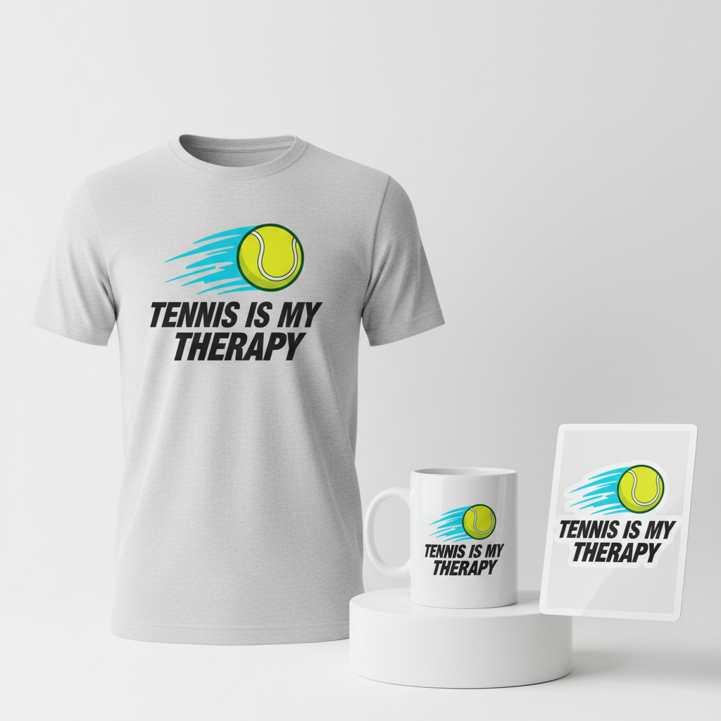
When approaching designs for such a dynamic and passionate community, the aesthetic needs to convey energy, movement, and an underlying message that resonates deeply with the target audience. The goal is to create something that feels both modern and timeless for the discerning Spanish tennis enthusiast.
- 🎨 Visual Concept: Imagine a clean, impactful graphic featuring a tennis ball mid-flight, rendered with subtle but distinct motion trail lines behind it. The ball itself could be a simple, geometric representation, suggesting speed and precision rather than photorealism. The trails would emanate from the ball, illustrating its trajectory and power, giving the impression of rapid, dynamic movement. This visual instantly communicates the core of the sport – action, speed, and precision – without being overly complex.
- ✍️ Typography Ideas: The accompanying text, “TENNIS IS MY THERAPY,” is designed to be the focal point of the message. To complement the visual’s energy, a strong, sans-serif font is ideal for readability and modern appeal. Critically, applying an italicized style to this text would enhance the sense of speed and forward motion, mirroring the graphic. The boldness of the font would also convey the power and conviction behind the statement, making it feel assertive and authentic to someone truly passionate about the sport.
- 👕 Product Canvas: Given the active nature of tennis and the typically warm Spanish climate, light-colored apparel is a natural fit for this design. Think crisp whites, athletic greys, or even soft pastels. These lighter bases not only make the bold graphic and text pop but also offer comfort and breathability, aligning perfectly with the active lifestyle of the target demographic. T-shirts, tank tops, and lightweight hoodies would be excellent choices, suitable for both on-court action and casual wear.
Strategic Market Insight
The brilliance of this particular strategy lies in its evergreen appeal and broad market reach within Spain. While a specific player’s stardom might create fleeting interest, the true longevity and potential lie in connecting with the universal passion for tennis itself. The chosen design pivots away from the inherent risks of intellectual property infringement associated with individual athletes, instead embracing the vast, enduring demographic of “Tennis Lovers” in Spain. This includes those who actively play, avidly watch, or simply appreciate the athleticism and artistry of the sport. The phrase “TENNIS IS MY THERAPY” is a powerful psychological trigger. It taps into the emotional connection people have with their hobbies, positioning tennis not just as a pastime, but as a vital component of their well-being, a stress reliever, and a source of mental and physical release. This message resonates deeply with individuals who see the court as their sanctuary, making the merchandise a statement of identity and a testament to a positive, healthy lifestyle. By focusing on this core emotional benefit, the design cultivates a strong sense of community and personal identification, encouraging purchases driven by passion rather than just fleeting fandom.
⚖️ Estimated Copyright Risk: LOW
Copyright Evaluation: This design is completely generic. It uses a common, non-trademarked phrase and a basic image of a tennis ball. It has no connection to any specific player, team, or brand, making it safe for all POD platforms.
Always verify intellectual property rights before listing.
Check EU Trademark Search for “Sinner” ➔
AI Image Generation Prompts
The following prompts are optimized for leading generators to produce production-ready assets:
👕 Apparel / T-Shirt Prompt
A modern, bold, and dynamic t-shirt graphic design, presented as a clean vector illustration, isolated on a solid light grey background. The central motif is a stylized tennis ball, depicted in a classic vibrant optic yellow with precise, clean dark green seam lines. The ball is rendered in a flat, crisp vector style with a subtle inner glow effect for depth, not gradient. It is shown in mid-flight, conveying immense speed. Behind the tennis ball, a series of sleek, angular motion trail lines extend, composed of multiple parallel lines and subtle shape blurs. These trails transition from an electric blue at their origin points to a lighter cyan towards their endpoints, creating an active, energetic visual effect, reminiscent of speed lines from graphic novels. The lines are sharp, perfectly defined, and have a smooth, anti-aliased finish characteristic of high-quality vector art. Below this dynamic graphic, the phrase 'TENNIS IS MY THERAPY' is prominently displayed. The typography uses a strong, contemporary sans-serif font like 'Anton' or 'Bebas Neue', rendered in a striking, aggressively italicized style to enhance the sense of propulsion and power. The text is a solid, deep charcoal black, with perfectly legible kerning and tracking, maintaining a clean, professional appearance. The entire design is a masterclass in clean lines, bold shapes, and impactful visual communication, with a highly simplified color palette ensuring maximum printability. Art style is flat graphic design, precise vector artwork, no photographic elements or complex textures, just pure graphic impact. Isolated and perfectly centered. The ONLY text allowed in the image is exactly 'TENNIS IS MY THERAPY'. Absolutely NO other names, words, or random letters.
🔍 Search this niche on:
☕ Drinkware / Mug Prompt
A duplicated side-by-side layout showing the exact same high-resolution graphic, designed perfectly for a panoramic mug wrap. Each instance of the design features a modern, bold, and highly dynamic illustration of a tennis ball and text. The central element is a stylized tennis ball, depicted in a vibrant optic yellow with precise, clean dark green seams, rendered in a crisp digital illustration style. It is captured in a moment of rapid motion, with a series of distinct, sharp, parallel motion trail lines extending diagonally behind it. These speed lines are a visually striking gradient from electric blue at the ball's immediate rear to a lighter, almost white-blue at their extended tips, creating an intense optical illusion of speed and energy. Below the moving tennis ball graphic, the phrase 'TENNIS IS MY THERAPY' is prominently displayed. The text uses a strong, commanding sans-serif typeface, like 'Impact' or 'Oswald', rendered in a powerful, aggressively italicized style to mirror the velocity of the tennis ball. The lettering is a solid, deep charcoal black, with perfect legibility and robust character forms. The entire graphic, including the tennis ball, motion trails, and text, is designed with clean, defined edges and saturated colors, ideal for print-on-demand drinkware. The overall mood is energetic, focused, and powerful. The two identical graphics are positioned side-by-side, filling the panoramic frame, ready to be wrapped around a cylindrical surface. The background behind the graphic elements should be neutral and clean to highlight the design itself. The ONLY text allowed in the image is exactly 'TENNIS IS MY THERAPY'. Absolutely NO other names, words, or random letters.
🔍 Search this niche on:
✨ Die-Cut Sticker Prompt
A vibrant and bold die-cut sticker design, characterized by a prominent, uniform thick white outline border that encapsulates the entire combined graphic and text. The art style is pure 2D flat pop-art, emphasizing graphic simplicity, high contrast, and striking visual impact. The central element is a highly stylized tennis ball, rendered in a perfectly flat, saturated optic yellow, with simplified, strong black seam lines. The ball is depicted in dynamic, high-speed motion, indicated by graphic, solid-color motion trail lines extending sharply behind it. These speed lines are distinct, angular shapes in a bold electric blue, with no gradients or subtle shading, perfectly embodying the flat pop-art aesthetic. Below this graphic, the phrase 'TENNIS IS MY THERAPY' is displayed. The typography utilizes a commanding, thick sans-serif font such as 'Impact' or 'DIN Condensed Bold', rendered in an aggressively italicized style to convey maximum speed and power. The text is a solid, opaque black, with sharp, clean edges, ensuring immediate readability. The entire composite design – tennis ball, motion trails, and text – is encircled by the specified thick white border, which is clean, smooth, and evenly spaced, perfectly preparing it for a die-cut vinyl sticker. The design features no shadows, no complex textures, and no photorealistic elements, maintaining a purely flat and graphically powerful appearance, ideal for an eye-catching sticker. The ONLY text allowed in the image is exactly 'TENNIS IS MY THERAPY'. Absolutely NO other names, words, or random letters.
🔍 Search this niche on:
Frequently Asked Questions
Why pivot to a general “Tennis Lovers” niche instead of focusing on a specific trending player?
Shifting focus to the broader “Tennis Lovers” niche is a strategic move to ensure longevity and avoid potential legal pitfalls. While a specific player’s popularity might generate temporary buzz, designing around their image carries significant intellectual property risks. By embracing the general passion for tennis, the merchandise becomes evergreen, appealing to a much larger and more consistent market in Spain. This approach capitalizes on the overall heightened interest in the sport without being tied to the fluctuating fortunes or specific endorsements of any single individual.
How does the phrase “TENNIS IS MY THERAPY” resonate particularly with Spanish tennis enthusiasts?
In a country as passionate about sports as Spain, the phrase “TENNIS IS MY THERAPY” strikes a deep chord. It encapsulates the profound emotional and physical release many active individuals find on the court. For Spanish players, tennis is often more than just exercise; it’s a way to de-stress, challenge oneself, foster camaraderie, and maintain a healthy mental and physical balance. This quote transforms the apparel into a personal declaration, reflecting a lifestyle choice and a genuine, relatable sentiment that transcends age and playing level, making it highly appealing.
What are the ideal color palettes and product types for this “light apparel” design in the Spanish market?
For the Spanish market, especially given its often warm climate and active lifestyle, “light apparel” implies breathable, comfortable, and versatile options. Ideal color palettes would include crisp whites, soft athletic greys, sky blues, and perhaps subtle pastels that evoke freshness and energy. These colors not only keep the wearer cool but also make the dynamic tennis ball graphic and bold text pop. Excellent product types would include performance t-shirts, athletic tank tops, lightweight cotton tees for casual wear, and perhaps even breathable caps or visors, all designed for comfort during play or while enjoying the Spanish sunshine.
Final Thoughts
The enthusiasm for tennis in Spain presents a vibrant canvas for Print-on-Demand entrepreneurs. By leveraging the deep-seated cultural appreciation for the sport and crafting designs that resonate on an emotional level, there’s significant potential to connect with a passionate and engaged audience. The “TENNIS IS MY THERAPY” concept, coupled with dynamic visuals on light apparel, is just one compelling pathway into this market. Remember, success in e-commerce is often about authenticity and connection; a design that speaks to the heart of a community, rather than just a fleeting trend, is always a winning strategy. Personal execution and a keen eye for quality will ultimately transform a good idea into a thriving product.
💬 What’s Your Take?
Art is subjective, and this is just one angle! How would you spin this “Sinner” trend? Did we miss the mark, or is there a better inside joke to use here? Drop your design ideas and let’s brainstorm in the comments below!