
TENNIS SOCIAL CLUB
The Italian air is thick with anticipation and the thwack of felt on strings, as tennis fever grips the nation. While the spotlight shines brightly on rising stars like Carlos Alcaraz, whose exhilarating performances at Indian Wells 2026 are dominating sports headlines, a more enduring affection for the sport itself is quietly flourishing. This isn’t just about a single player; it’s about the timeless elegance and competitive spirit of tennis resonating deeply with fans across Italy, creating a vibrant cultural moment ripe for a unique merchandise exploration.
The Cultural Significance
Alcaraz’s recent triumphs and gripping matches at the ongoing Indian Wells tournament have undeniably fanned the flames of tennis enthusiasm in Italy. His youthful dynamism and powerful play captivate audiences, drawing both seasoned aficionados and new viewers to the sport. This surge in interest isn’t fleeting; it taps into a rich history of Italian appreciation for tennis, from classic rivalries to local club play. When a player of Alcaraz’s caliber performs on such a grand stage, it ignites a collective passion, transforming a sporting event into a shared cultural experience. People aren’t just watching a game; they’re connecting with moments of athletic brilliance, national pride, and the sheer joy of competition.
Design Brainstorm: Capturing the Aesthetic
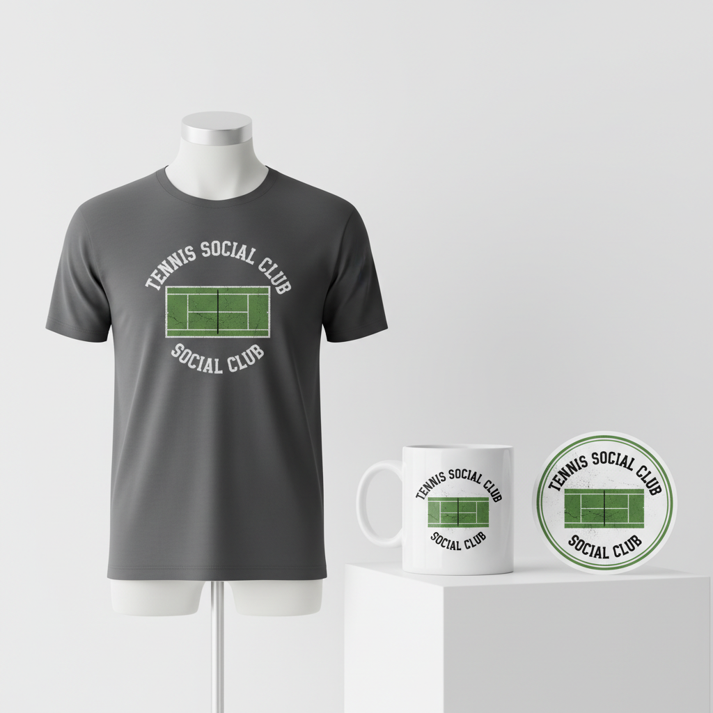
To tap into this energy without infringing on intellectual property, a creative pivot towards an evergreen, community-focused design could be incredibly effective. Imagine a concept that channels the vintage charm of an established tennis institution, evoking nostalgia and a sense of belonging.
- 🎨 Visual Concept: One compelling visual concept draws inspiration from the timeless appeal of an old athletic club logo. This would feature a distressed, almost faded look, perhaps with a slightly cracked texture effect on the graphic itself, suggesting years of storied history. At its heart, a simplified, top-down graphic of a tennis court could serve as the central, iconic element. This minimalistic approach is instantly recognizable and speaks directly to the sport without needing overt branding.
- ✍️ Typography Ideas: For the textual component, “TENNIS SOCIAL CLUB” offers a classic, inviting declaration. Arranged in a graceful curve both above and below the court graphic, this text would ideally utilize a classic, collegiate-style slab serif font. This particular font choice inherently carries a weighty, traditional, and athletic feel, reinforcing the vintage club aesthetic and lending an air of established heritage.
- 👕 Product Canvas: To fully emphasize the sophisticated, retro vibe of this design, apparel in darker hues—think deep navy, charcoal grey, or classic black—could serve as the ideal canvas. These darker tones allow the distressed white or cream graphic to pop with striking contrast, enhancing the aged, authentic feel.
Strategic Market Insight
The beauty of this design approach lies in its strategic subtlety. While the immediate trigger might be the current buzz around Carlos Alcaraz, the actual target audience broadens considerably. This design aims for tennis players and fans of all stripes – those who appreciate the sport’s history, its community aspect, and its classic aesthetic. By carefully avoiding any direct use of Alcaraz’s name, image, or specific tournament branding, the concept safely navigates copyright concerns, making it a “bot-proof” and evergreen offering. The “fictional sports club” theme is a proven seller in the print-on-demand space because it taps into a universal desire for belonging and a love for sport that transcends individual athletes. It offers a piece of stylish apparel that resonates with anyone who loves tennis, whether they wield a racquet or cheer from the stands, fostering a sense of shared identity and timeless appeal.
⚖️ Estimated Copyright Risk: LOW
Our Findings: The phrase ‘Tennis Social Club’ is a generic descriptor and is not trademarked. The design uses common athletic and collegiate design tropes that are in the public domain and avoids any specific, protected intellectual property.
Always verify intellectual property rights before listing.
Check EU Trademark Search for “Carlos Alcaraz” ➔
AI Image Generation Prompts
The following prompts are optimized for leading generators to produce production-ready assets:
👕 Apparel / T-Shirt Prompt
A highly detailed vintage-inspired athletic club logo for a t-shirt print, isolated on a solid Dark background. The design features a simplified graphic of a tennis court viewed from a top-down perspective as the central element. The text "TENNIS SOCIAL CLUB" is arranged in an elegant curve, with "TENNIS SOCIAL" arched above the court and "CLUB" curved below it, rendered in a classic, heavy collegiate-style slab serif font. The overall aesthetic is heavily distressed, showcasing a weathered, aged appearance with a slightly cracked and faded texture effect applied directly to all graphic elements and text, mimicking a well-worn, authentic screen-printed garment from the mid-20th century. This is a clean vector illustration style, where the distressed effects are rendered with sharp, deliberate vectors, not pixelation, ensuring scalability and print quality. The color palette is restricted to two to three muted, retro colors such as deep forest green, faded cream, and a subtle brick red or navy blue, giving a sophisticated yet gritty feel. The lines are crisp where they define the shapes, but the texture within those shapes is rough and organic, creating an authentic vintage emblem. --ar 3:4 --v 6.0 The ONLY text allowed in the image is exactly 'TENNIS SOCIAL CLUB'. Absolutely NO other names, words, or random letters.
🔍 Search this niche on:
☕ Drinkware / Mug Prompt
A duplicated side-by-side layout showing the exact same graphic on the left and right, designed perfectly for a panoramic mug wrap. The graphic is a vintage-inspired design resembling an old athletic club logo. It features a central, simplified graphic of a tennis court viewed from a top-down perspective. The text "TENNIS SOCIAL CLUB" is expertly arranged in a smooth curve, with "TENNIS SOCIAL" arching above the court and "CLUB" curving precisely below it, all rendered in a classic, bold collegiate-style slab serif font. The entire design is imbued with a strong distressed aesthetic, featuring a slightly cracked texture effect and a subtle weathered fade, as if screen-printed onto a ceramic surface decades ago. The colors are rich but muted, a retro palette of deep greens, off-whites, and perhaps a subtle burgundy or navy, designed to pop against a standard white or cream coffee mug. The lines are clean but the texture is gritty, reflecting an authentic screen-printed look optimized for ceramic application, ensuring clarity for a high-quality print. The duplication ensures a seamless visual flow for a wrap-around product. --ar 3:1 --v 6.0 The ONLY text allowed in the image is exactly 'TENNIS SOCIAL CLUB'. Absolutely NO other names, words, or random letters.
🔍 Search this niche on:
✨ Die-Cut Sticker Prompt
A highly stylized die-cut sticker design, presented in a 2D flat pop-art style with a thick white outline border around the entire design. The core graphic is a vintage-inspired athletic club logo, featuring a simplified top-down view of a tennis court as its central motif. The text "TENNIS SOCIAL CLUB" is prominently displayed, with "TENNIS SOCIAL" arcing above the court and "CLUB" curving below, all rendered in a classic, robust collegiate-style slab serif font. Despite the flat pop-art aesthetic, the design maintains its distressed character; the cracked texture effect and worn details are cleverly integrated through flat, graphic shapes and subtle color variations rather than gradients or shadows, giving a bold, graphic interpretation of age. The color palette is vibrant yet retro-muted, utilizing complementary tones like deep teal, mustard yellow, and a muted crimson, ensuring high visibility and graphic impact against the stark white border. The edges of the design and the border are exceptionally crisp and clean, suitable for a precise die-cut. The overall impression is punchy, nostalgic, and immediately recognizable, perfect for a collectible sticker. --ar 1:1 --v 6.0 The ONLY text allowed in the image is exactly 'TENNIS SOCIAL CLUB'. Absolutely NO other names, words, or random letters.
🔍 Search this niche on:
Frequently Asked Questions
Why opt for a fictional “Tennis Social Club” rather than directly referencing a trending player?
This strategy is a clever way to sidestep significant copyright and intellectual property risks associated with using an athlete’s name, image, or tournament branding. By pivoting to a fictional club, the design becomes universally appealing and evergreen, allowing it to sell consistently over time without fear of legal issues or automatic content rejections, reaching a much wider audience of general tennis enthusiasts.
What kind of person is most likely to purchase a vintage-style “Tennis Social Club” design?
This aesthetic is likely to resonate with individuals who appreciate nostalgia, classic sports fashion, and a sense of community around the game. It appeals to both active players and casual fans who enjoy the sport’s culture, history, and timeless elegance, often favoring a more understated and sophisticated look over overt, modern branding.
How does the distressed, cracked texture contribute to the design’s overall appeal?
The distressed and cracked texture is crucial for enhancing the “vintage athletic club” feel. It imparts an authentic, worn-in quality, making the design look like a cherished item with a story, rather than a brand-new graphic. This aged effect evokes a sense of history, tradition, and enduring love for the sport, adding depth and character to the apparel.
Final Thoughts
The confluence of a major tennis event and a popular player like Carlos Alcaraz creates a compelling backdrop for merchandise opportunities in Italy. However, the true genius lies in translating this fleeting moment into a timeless, marketable concept. By embracing a vintage “Tennis Social Club” aesthetic, designers can tap into a broader, enduring passion for the sport, offering high-quality, legally safe, and highly desirable apparel. The success of such a venture ultimately hinges on thoughtful execution, a keen eye for detail in the distressing and typography, and a nuanced understanding of what makes a piece of clothing feel both fresh and historically rich. The court is open for creative interpretations!
💬 What’s Your Take?
Art is subjective, and this is just one angle! How would you spin this “Carlos Alcaraz” trend? Did we miss the mark, or is there a better inside joke to use here? Drop your design ideas and let’s brainstorm in the comments below!