The Ville
The energy in Louisville, Kentucky, is absolutely electric! Following a triumphant victory for the University of Louisville men’s basketball team against SMU in the recent ACC Tournament on March 11, 2026, the city is abuzz. This isn’t just another game; it’s a moment that has ignited local pride, creating a significant ripple across sports media and the hearts of fans across the United States.
The Cultural Significance
Few things unite a city like its beloved sports teams, and Louisville is no exception. The University of Louisville’s basketball program holds a special place in the community’s identity, a source of collective joy, passion, and conversation. A win like the one against SMU isn’t just about advancing in a tournament; it’s a reaffirmation of local spirit and a cause for widespread celebration. This kind of event deepens the bond between residents, giving them a shared experience and an undeniable sense of belonging. For fans, it’s more than just cheering for a team; it’s celebrating their city, their history, and their collective future.
Design Brainstorm: Capturing the Aesthetic
Tapping into this wave of local enthusiasm requires a design that speaks directly to the community’s heart without stepping into common pitfalls. One angle to consider is a concept that subtly celebrates the city itself, allowing fans to express their pride broadly and safely.
- 🎨 Visual Concept: Imagine a stylized, retro-inspired graphic of a fleur-de-lis. As a historic symbol deeply intertwined with Louisville’s identity, the fleur-de-lis immediately resonates. Incorporating a distressed texture could give it an authentic, lived-in feel, suggesting heritage and enduring loyalty. A simple, clean layout ensures the design remains timeless and impactful, avoiding clutter.
- ✍️ Typography Ideas: Complementing this visual, “The Ville” as the primary text offers a powerful, insider nod to Louisville. This common local nickname is instantly recognizable to residents and fans. Paired with a bold, rounded sans-serif font, reminiscent of 1970s athletic wear, the design could evoke a nostalgic, classic sports vibe without being directly tied to a specific team’s branding.
- 👕 Product Canvas: For apparel, a darker base color would allow the proposed muted gold and deep cardinal red color palette to truly pop. These colors subtly align with traditional Louisville aesthetics, creating a cohesive and appealing visual that fans could proudly wear.
Strategic Market Insight
The beauty of targeting this demographic lies in leveraging genuine local pride, strategically sidestepping potential trademark issues. Instead of directly referencing “Louisville Basketball,” which carries high copyright risks, focusing on “The Ville” and the public domain fleur-de-lis allows for a safe yet deeply resonant “Local Pride” design. This approach appeals to the same passionate audience – residents and fans of Louisville, Kentucky – who are eager to display their affiliation. The psychological trigger here is identity; people love to showcase where they come from or what they support. By offering a high-quality, culturally relevant design with low copyright risk, this strategy taps into the current wave of enthusiasm while building an evergreen product that celebrates the city’s spirit year-round, not just during basketball season.
⚖️ Estimated Copyright Risk: LOW
Risk Assessment: The design avoids all university-specific trademarks, names, and logos. ‘The Ville’ is a common nickname for the city of Louisville and is not trademarked for apparel. The fleur-de-lis is a historical symbol of the city and is in the public domain. The design is an original piece of artwork based on public symbols.
Always verify intellectual property rights before listing.
Check US Trademark Database (Justia) for “Louisville Basketball” ➔
AI Image Generation Prompts
The following prompts are optimized for leading generators to produce production-ready assets:
👕 Apparel / T-Shirt Prompt
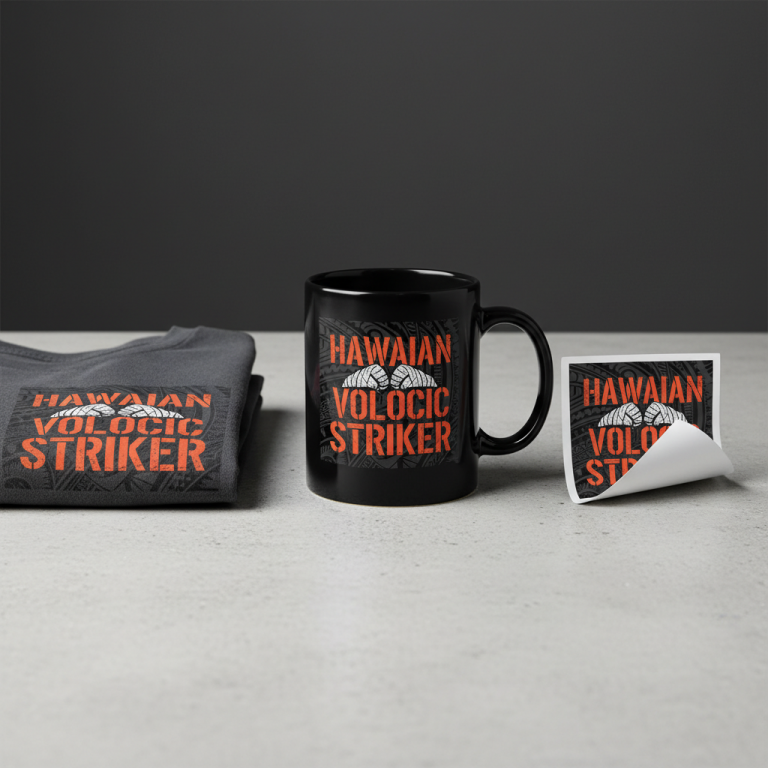
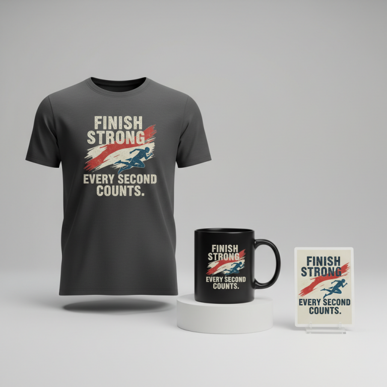
A clean vector illustration of a stylized, retro-inspired fleur-de-lis graphic. This is a bold, iconic representation of the fleur-de-lis, symbol of Louisville, rendered with a simplified, almost geometric elegance indicative of 1970s graphic design. The illustration employs sharp, crisp lines, hard-edged shapes, and a distinctly flat 2D aesthetic, free of gradients or complex shading, designed for ultimate clarity and impact in print. A subtle, integrated distressed grunge texture is applied over the flat colors, mimicking a faded vintage screen-print or worn athletic patch, adding a layer of authenticity and retro charm without obscuring the clean vector foundations. The layout is impeccably simple, perfectly centered, and boasts a strong, balanced graphic composition. The text "The Ville" is incorporated with a robust, rounded sans-serif typeface, directly evoking the bold, friendly, and functional typography seen in 1970s athletic wear and sports branding. The color scheme is a sophisticated blend of a rich, muted antique gold and a deep, commanding cardinal red, offering a vibrant yet classic contrast. The entire design is optimized for a t-shirt print, exhibiting a high-resolution, super crisp rendering that highlights its timeless, nostalgic appeal. Isolated on a solid dark charcoal background, clean vector illustration style. --ar 3:4 --v 6.0 The ONLY text allowed in the image is exactly 'The Ville'. Absolutely NO other names, words, or random letters.
☕ Drinkware / Mug Prompt
A duplicated side-by-side layout showing the exact same graphic on the left and right, designed perfectly for a panoramic mug wrap. The graphic is a stylized, retro-inspired illustration of a fleur-de-lis, embodying the iconic symbol of Louisville. This design features a distinct distressed texture, subtly integrated to suggest a vintage, worn-in quality reminiscent of 1970s print media, while maintaining overall clarity. The layout is clean, simple, and perfectly balanced, ensuring visual harmony across the mug's surface. The text "The Ville" is presented in a bold, rounded sans-serif font, meticulously styled to echo the robust and friendly typography prevalent in 1970s athletic wear. The color palette is composed of a sophisticated muted antique gold and a deep, rich cardinal red, providing a striking yet harmonious contrast. The overall style is flat 2D graphic design, with crisp edges and a screen-print aesthetic, ensuring seamless repetition for a panoramic wrap. The rendering is sharp, vibrant, and perfectly aligned, appearing as a high-quality print-ready asset. --ar 3:1 --v 6.0 The ONLY text allowed in the image is exactly 'The Ville'. Absolutely NO other names, words, or random letters.
✨ Die-Cut Sticker Prompt
A die-cut sticker design featuring a stylized, retro-inspired graphic of a fleur-de-lis, representing the city of Louisville. The core design exhibits a distinct, subtle distressed texture, giving it a vintage, slightly worn appearance consistent with 1970s aesthetic, while remaining clean and legible. The layout is simple, centered, and impactful. The text "The Ville" is prominently displayed in a bold, rounded sans-serif font, directly inspired by the iconic athletic wear typography of the 1970s – clear, strong, and friendly. The color scheme utilizes a rich muted antique gold for the primary elements and a deep cardinal red for accents, creating a classic, eye-catching contrast. The entire graphic is rendered in a vibrant, 2D flat pop-art style, characterized by strong, crisp outlines, bold color blocks, and a simplified yet powerful visual impact. A thick, uniform white outline border surrounds the entire design, providing a clear die-cut edge for the sticker. The rendering is sharp, glossy, and optimized for a high-quality, durable sticker, isolated on a transparent background. --ar 1:1 --v 6.0 The ONLY text allowed in the image is exactly 'The Ville'. Absolutely NO other names, words, or random letters.
Frequently Asked Questions
Why choose “The Ville” instead of directly mentioning “Louisville Basketball”?
The strategic choice of “The Ville” allows designers to tap into the immense local pride surrounding Louisville sports without infringing on university trademarks. It’s an authentic nickname recognized by residents and fans, offering a safe and evergreen way to celebrate the city and its sporting culture. This approach avoids the high-risk ‘Location + Sport’ trap, enabling broader and safer market reach.
What makes the fleur-de-lis such a potent symbol for Louisville pride merchandise?
The fleur-de-lis is more than just an emblem; it’s a deep-rooted symbol of Louisville’s heritage, stemming from its French founders. It’s prominently featured across the city’s iconography and public art. Using it in merchandise instantly connects with a sense of local history and identity, allowing fans to express their civic pride in a sophisticated and widely understood manner, independent of any specific team.
How does a retro-inspired design aesthetic enhance local pride apparel?
A retro, distressed aesthetic, combined with a 1970s athletic-style font, often evokes a sense of nostalgia, heritage, and timelessness. It suggests a long-standing loyalty and pride, rather than a fleeting trend. This classic look can appeal to a broader demographic, from long-time residents to younger fans appreciating vintage style, making the merchandise feel both authentic and stylish.
Final Thoughts
The excitement surrounding Louisville basketball presents a fantastic opportunity for designers to connect with a passionate local audience. By focusing on smart, culturally resonant designs that celebrate “The Ville” and its iconic symbols, creators can produce merchandise that genuinely speaks to the heart of the community. Success in this niche, as with any e-commerce venture, will ultimately come down to thoughtful execution, a keen eye for quality, and the unique personal spin each designer brings to these compelling concepts.
💬 What’s Your Take?
Art is subjective, and this is just one angle! How would you spin this “Louisville Basketball” trend? Drop your design ideas and let’s brainstorm in the comments below!