THEY’RE NOT FROM AROUND HERE
The basketball world in the United States is abuzz, captivated by a phenomenon unlike any seen in decades. After an electrifying stretch of games, a certain towering talent has been crowned NBA Player of the Week, cementing his status as an unparalleled force. This recognition has ignited a wildfire of discussion, wonder, and pure fan excitement, proving that some stars truly shine brighter – and perhaps, from another galaxy altogether.
The Cultural Significance
The meteoric rise of Victor Wembanyama has transcended mere sports headlines to become a genuine cultural moment across the United States. Fans and pundits alike have been scrambling for superlatives to describe his game, often landing on the moniker “alien” to convey his unprecedented blend of height, agility, and skill. This Player of the Week nod wasn’t just a statistical acknowledgment; it was a societal stamp of approval on a player who defies conventional understanding of what’s possible on a basketball court. The sheer novelty of his talent, combined with the collective gasps he elicits with every highlight, makes him a prime subject for fan-driven merchandise that taps into this shared sense of awe and humor.
Design Brainstorm: Capturing the Aesthetic
Translating such a unique phenomenon into a compelling design requires a blend of homage and clever abstraction. The intent here is to capture the essence of the “alien” athlete without infringing on specific player likeness or team intellectual property, allowing for a design that is both timely and evergreen.
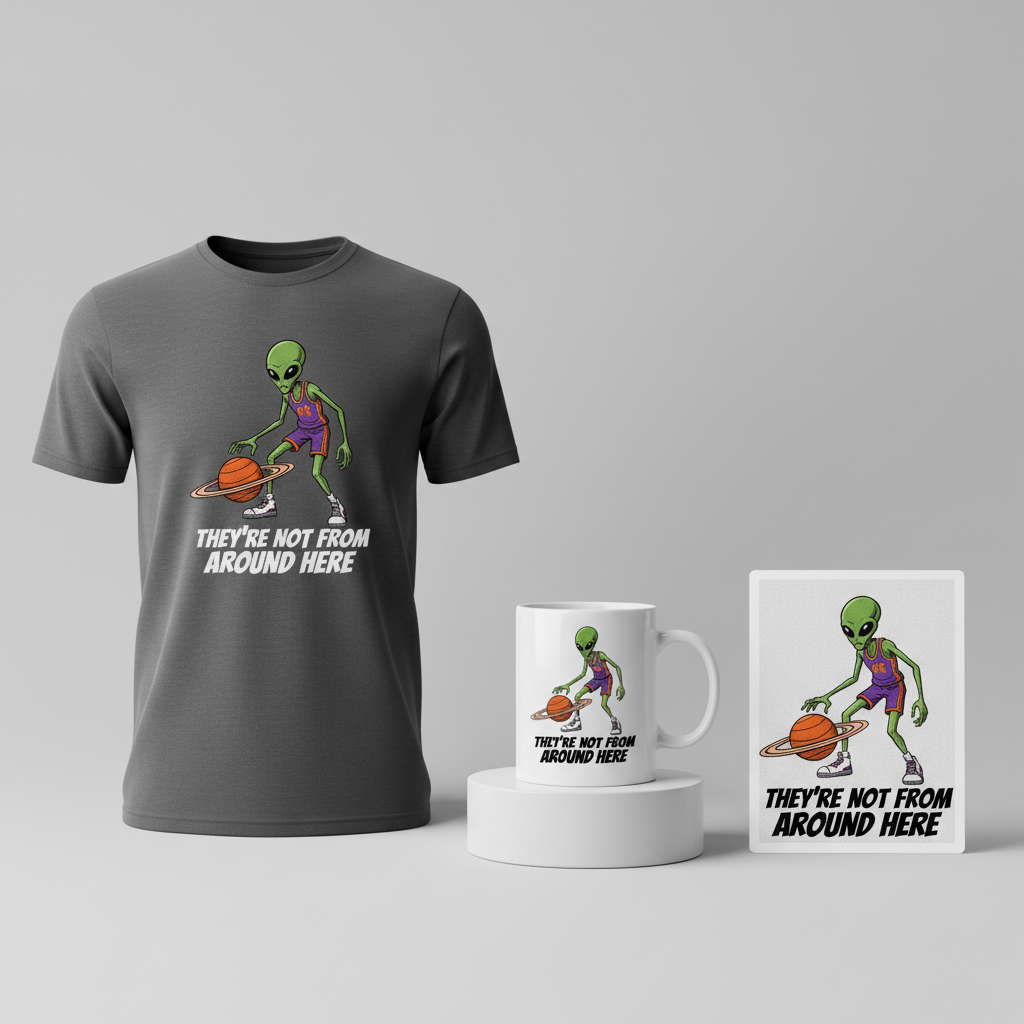
- 🎨 Visual Concept: One compelling visual angle could feature a minimalist, comic book-style illustration. Imagine a tall, lean, generic alien figure, perhaps with elongated limbs, donning a classic basketball jersey and shorts. Instead of a mundane basketball, this extraterrestrial talent dribbles a celestial orb – say, the planet Saturn, complete with its iconic rings. This detail not only leans into the “alien” theme but also adds a touch of retro-futuristic charm. The entire visual could be enhanced with a slightly distressed, grainy texture, reminiscent of the beloved 90s bootleg rap tees that have made a massive comeback, giving it an authentic, lived-in feel.
- ✍️ Typography Ideas: Complementing this visual, a bold, slightly warped sans-serif font would fit perfectly. This style often evokes a retro-futuristic vibe, aligning with both the alien concept and the 90s aesthetic. The text, “THEY’RE NOT FROM AROUND HERE,” directly plays into the popular commentary surrounding exceptional athletes, serving as an inside joke for those “in the know.” This phrasing is intentionally broad, making it applicable to any uniquely skilled player and keeping it safe from typical copyright pitfalls.
- 👕 Product Canvas: For this particular design concept, dark apparel would serve as an ideal canvas. The contrasting bright visuals against a deep black, charcoal, or navy fabric would make the details pop, enhancing the comic book style and the celestial elements. Dark garments also lend themselves well to the “bootleg” aesthetic, providing a classic backdrop for the edgy graphic.
Strategic Market Insight
Targeting basketball fans who revel in the extraordinary, particularly those who appreciate the humor in calling exceptionally skilled players “aliens,” presents a rich market. The psychological trigger here is twofold: admiration for unparalleled talent and participation in a widely recognized, affectionate joke within the sports community. This design cleverly sidesteps intellectual property issues by focusing on a universal trope—the ‘alien’ athlete—rather than a specific player’s image or team branding. This strategic pivot ensures the design is not only legally safe but also evergreen, appealing to fans of any athlete who achieves ‘alien’ status. Furthermore, by avoiding specific locations, teams, or even the sport’s direct mention in the primary text, the design bypasses automated text checks that flag common infringement patterns, making it highly versatile for Print-on-Demand platforms. It’s about celebrating a *type* of player, ensuring broad appeal and longevity beyond a single season or athlete’s tenure.
⚖️ Estimated Copyright Risk: LOW
Our Findings: The design uses a generic alien figure and avoids the player’s name, likeness, team, and jersey number. The term ‘alien’ in a sports context is a common, non-trademarked trope used to describe extraordinary talent. The text is a common phrase and not subject to copyright.
Always verify intellectual property rights before listing.
Check US Trademark Database (Justia) for “Victor Wembanyama” ➔
AI Image Generation Prompts
The following prompts are optimized for leading generators to produce production-ready assets:
👕 Apparel / T-Shirt Prompt
A minimalist, hyper-stylized comic book illustration for a t-shirt print, depicting a tall, exceptionally thin, gangly alien figure. The alien has smooth, matte grey skin, oversized, expressive black eyes, and a small, featureless mouth, giving it a generic yet iconic appearance. It is wearing an oversized, loose-fitting 90s-style basketball jersey in dark charcoal with an abstract, blocky graphic pattern (e.g., retro stripes or a simple number like '93'), and matching baggy basketball shorts with visible fabric folds and a subtle sheen. The alien is dynamically dribbling a basketball that is clearly the planet Saturn, complete with intricately detailed, thin rings, a subtly swirling gas giant texture in cosmic blues and purples, and faint star specks within its form. The illustration style is reminiscent of late 90s bootleg rap tees and vintage screen prints, featuring thick, prominent black comic book outlines, flat, saturated color fills with deliberate, subtle off-registration color effects (like faint cyan or magenta shifts at the edges), and a robust, gritty distressed texture overlay. This texture includes fine grain, halftone dot patterns visible upon close inspection, slight ink bleed, and faded, slightly desaturated color spots, giving it a truly aged and worn screen-printed feel. The overall mood is cool, quirky, and nostalgic. Typography features the bold, slightly warped sans-serif text 'THEY'RE NOT FROM AROUND HERE' positioned prominently below or around the alien, rendered in a thick, condensed, retro-futuristic font with a subtle digital glitch effect and a soft, dark drop shadow, enhancing its bootleg aesthetic. The entire illustration is isolated on a solid dark charcoal background, rendered in a clean vector illustration style as the base, then meticulously distressed for print. The lighting is flat, graphic, and evenly distributed to emphasize the detailed texture and vibrant, yet aged, colors. The ONLY text allowed in the image is exactly 'THEY'RE NOT FROM AROUND HERE'. Absolutely NO other names, words, or random letters. --ar 3:4 --v 6.0
🔍 Search this niche on:
☕ Drinkware / Mug Prompt
A duplicated side-by-side layout showing the exact same graphic on the left and right, designed perfectly for a panoramic mug wrap. Each graphic features a highly detailed minimalist, comic book-style illustration of a tall, thin, generic alien figure. The alien has smooth, matte grey skin, large, captivating black eyes, and a small, simple mouth. It is depicted wearing a vibrant 90s-style oversized basketball jersey in dark sapphire blue with a bold, retro geometric pattern (like a stylized lightning bolt or abstract '93') and matching loose-fitting basketball shorts. The alien is caught mid-action, dynamically dribbling a basketball that is unmistakably the planet Saturn, rendered with astonishing detail: vivid swirling gas cloud textures in deep space blues and purples, distinct, bright yellow-orange rings, and a faint celestial glow. The artistic style is a homage to 90s bootleg rap tees, incorporating thick, crisp black comic book outlines, areas of flat, saturated color, and a finely tuned distressed texture that includes a subtle overall grain, delicate halftone dot patterns, and hints of ink spread, giving it a vintage, screen-printed feel while maintaining high clarity for print. The mood is energetic, retro, and slightly otherworldly. The bold, slightly warped sans-serif text 'THEY'RE NOT FROM AROUND HERE' is integrated into the design, positioned dynamically around the alien, rendered in a robust, condensed, retro-futuristic font with a subtle wave or distortion effect and a dark, soft shadow, echoing a digital yet aged aesthetic. The background connecting the two identical graphics is a seamless, deep space black with very subtle cosmic dust or faint nebula patterns, ensuring a continuous wrap effect. The rendering is high-resolution, digitally optimized for ceramic print, ensuring vibrant colors and sharp details, with soft, even studio lighting highlighting the graphic without harsh shadows. The ONLY text allowed in the image is exactly 'THEY'RE NOT FROM AROUND HERE'. Absolutely NO other names, words, or random letters. --ar 3:1 --v 6.0
🔍 Search this niche on:
✨ Die-Cut Sticker Prompt
A die-cut sticker design featuring a vibrant, 2D flat pop-art style illustration of a tall, thin, generic alien figure. The alien possesses sleek, matte grey skin, prominent, stylized black eyes, and minimalist facial features, presented in a clean, graphic silhouette. It sports an oversized, boxy 90s-era basketball jersey in a saturated, contrasting color like deep teal or violet with a simple, bold retro number (e.g., '23') or abstract graphic, paired with matching baggy shorts and chunky sneakers. The alien is in the act of dribbling a basketball, which is vividly rendered as the planet Saturn, showcasing simplified yet impactful rings and a stylized gas giant surface in bright, punchy blues and yellows. The art style emphasizes thick, clean black outlines, expansive areas of flat, highly saturated color, and minimal, graphic shading to create a strong visual impact, characteristic of classic pop-art and flat vector graphics. A subtle distressed overlay provides a hint of vintage texture, such as faint halftone patterns or a delicate grit, without compromising the design's clarity or flatness. The typography is a key design element: the bold, slightly warped sans-serif phrase 'THEY'RE NOT FROM AROUND HERE' is integrated seamlessly below the alien, rendered in a thick, condensed, retro-futuristic font with a dynamic, subtle wave effect, reflecting a digital age aesthetic. A thick, crisp white outline border encases the entire design (alien, Saturn, and text), preparing it for perfect die-cut production. The lighting is flat and direct, designed to eliminate shadows within the illustration and highlight the clean lines and bold colors. The mood is playful, iconic, and graphic. The ONLY text allowed in the image is exactly 'THEY'RE NOT FROM AROUND HERE'. Absolutely NO other names, words, or random letters. --ar 1:1 --v 6.0
🔍 Search this niche on:
Frequently Asked Questions
How does this design concept avoid intellectual property issues while still being relevant to current basketball trends?
The design cleverly pivots from directly referencing a specific, IP-protected player to a generic, universally understood trope: the “alien” athlete. By illustrating a generic alien figure and using a broad, commonly used phrase like “THEY’RE NOT FROM AROUND HERE,” it taps into the cultural conversation around exceptional players without infringing on name, likeness, or team branding. This makes it a safe yet highly resonant design for the trend.
What makes the minimalist, comic book, and 90s bootleg aesthetic particularly effective for this trend?
The minimalist comic book style offers a clean, impactful visual that stands out, while the 90s bootleg rap tee aesthetic adds a layer of nostalgia and rebellious cool that resonates with streetwear and sports culture. This combination gives the design an authentic, edgy feel that appeals to a demographic looking for unique, culturally savvy apparel that isn’t overtly commercial or corporate.
Why is dark apparel specifically recommended for this design?
Dark apparel, such as black or deep navy, provides an excellent contrast for the proposed design. The vibrant, possibly distressed graphics and the celestial elements would pop against a dark background, enhancing the overall visual impact and retro feel. It also aligns well with the “bootleg” aesthetic, which often features bold graphics on darker garments, making the design feel more authentic and visually striking.
Final Thoughts
The current buzz around groundbreaking athletes offers fertile ground for creative Print-on-Demand designs. By understanding the cultural currents and applying clever design strategies that respect intellectual property while capturing the essence of the trend, there’s significant e-commerce potential. Success in this niche hinges not just on recognizing the trend, but on delivering a unique, well-executed concept that speaks directly to the fan base. Remember, while these ideas provide a strong foundation, the ultimate appeal often comes from the personal spin and quality of execution.
💬 What’s Your Take?
Art is subjective, and this is just one angle! How would you spin this “Victor Wembanyama” trend? Did we miss the mark, or is there a better inside joke to use here? Drop your design ideas and let’s brainstorm in the comments below!