Windy City Grit
A fresh wave of anticipation is sweeping through the Windy City, reigniting the fervor of its dedicated sports fans. The recent signing of NFL special teams standout Kalif Raymond to a one-year contract with the Chicago Bears has sent ripples of excitement across the city, proving once again that Chicago’s passion for its teams is as deep and enduring as Lake Michigan itself. This isn’t just a roster move; it’s a new chapter for an athlete known for his electrifying returns, and the city is buzzing with the promise of what he might bring to the field.
The Cultural Significance
The acquisition of a player like Kalif Raymond, especially one with a reputation for dynamic playmaking, instantly energizes a fanbase. For Chicago, a city steeped in a rich football tradition, every new signing is scrutinized with a mix of hope and fierce loyalty. This particular buzz goes beyond mere team news; it taps into the collective identity of a city that prides itself on grit, resilience, and an unwavering spirit, mirroring the very qualities admired in its athletes. Fans aren’t just cheering for a team; they’re celebrating a shared ethos, making these moments powerful opportunities to connect with local pride.
Design Brainstorm: Capturing the Aesthetic
Translating this excitement into a compelling design involves capturing the essence of the city’s spirit without infringing on intellectual property. One creative direction could be a visual narrative that speaks to the “Windy City” identity while subtly nodding to the team’s symbolic animal and the player’s tough-minded approach.
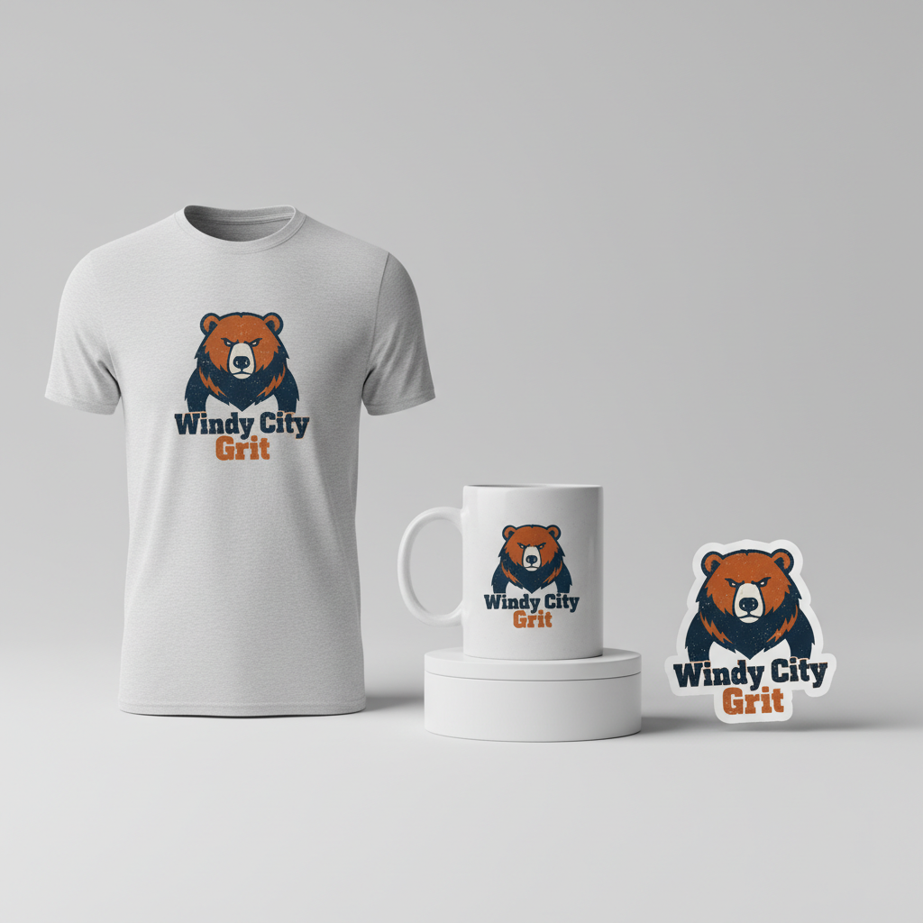
- 🎨 Visual Concept: Imagine a minimalist, distressed graphic of a stylized grizzly bear, depicted with a determined gaze. The key here is to keep it generic enough to avoid trademark issues, focusing on the powerful, independent nature of the animal rather than a specific team mascot. The distressed texture lends a vintage, worn-in feel, suggesting longevity and a classic appeal that resonates with sports history.
- ✍️ Typography Ideas: Below the bear, the phrase “Windy City Grit” could be rendered in a vintage-style typography, drawing inspiration from classic American sports apparel. Think bold, slightly condensed fonts with subtle serifs that evoke a sense of tradition and timeless strength. This pairing of a well-known city nickname with a character trait like “Grit” forms a powerful, non-trademarked statement that speaks directly to the target audience’s values.
- 👕 Product Canvas: This design concept could translate well onto light-colored apparel. Neutral backgrounds like heather grey, natural beige, or even a soft white would allow the chosen design colors—perhaps a simple, non-trademarked combination of navy blue and a muted orange—to stand out. This approach offers versatility, ensuring the design appeals across seasons and different wardrobe styles.
Strategic Market Insight
Targeting passionate football fans from Chicago with this design strategy offers a unique opportunity. The psychological triggers behind a purchase here aren’t just about supporting a team; they’re about expressing deep-seated local pride and a connection to the city’s hardworking, blue-collar identity. By choosing “Windy City Grit” over specific team or player names, the design intelligently sidesteps common copyright pitfalls while fostering an evergreen appeal. This approach creates merchandise that celebrates the spirit of Chicago and its sporting culture, making it a safe, appealing, and enduring choice for fans who want to show their allegiance without worrying about trademarked imagery or bot rejections. It’s about celebrating a civic identity through sport, a powerful motivator for many.
⚖️ Estimated Copyright Risk: LOW
Our Findings: The design avoids all specific, trademarked intellectual property. ‘Windy City’ is a common nickname for Chicago and is not exclusively trademarked for apparel in a way that would cause conflict. The phrase ‘Windy City Grit’ is original, and the generic bear graphic does not infringe on the Chicago Bears’ specific logo.
Always verify intellectual property rights before listing.
Check US Trademark Database (Justia) for “Kalif Raymond” ➔
AI Image Generation Prompts
The following prompts are optimized for leading generators to produce production-ready assets:
👕 Apparel / T-Shirt Prompt
A minimalist, highly stylized grizzly bear graphic with a determined expression, rendered in a clean vector illustration style with subtle distressed textures overlayed within the navy blue and burnt orange color blocks. The bear is depicted in bold, simplified geometric shapes, emphasizing its strength without being overtly aggressive. Below the bear, the text 'Windy City Grit' is rendered in a vintage-inspired American sports apparel typography, reminiscent of classic collegiate or athletic fonts, featuring a bold outline and slight arch, also in navy blue and burnt orange. The entire design is isolated on a solid light off-white background, ensuring clean lines and high contrast suitable for t-shirt printing. The distressed effect is subtle, like a fine grit or weathered screen print texture, integrated within the solid color areas, not breaking the clean vector outlines. The color palette is strictly navy blue, burnt orange, and an off-white for negative space, with no other hues present. The rendering is crisp, high-resolution, and perfectly vectorized for scalability. The mood is strong, determined, and enduring. The ONLY text allowed in the image is exactly 'Windy City Grit'. Absolutely NO other names, words, or random letters. --ar 3:4 --v 6.0
🔍 Search this niche on:
☕ Drinkware / Mug Prompt
A duplicated side-by-side layout showing the exact same graphic on the left and right, designed perfectly for a panoramic mug wrap. The graphic features a minimalist, distressed stylized grizzly bear with a determined gaze, composed of clean, bold vector shapes in navy blue and burnt orange. The distress effect is a subtle, integrated weathered texture within the primary color fields, not disrupting the sharp outlines. Below the bear, the phrase 'Windy City Grit' is presented in vintage-style American sports typography, featuring a strong, collegiate-inspired font with a slight arch and bold outlines, matching the navy blue and burnt orange palette. The overall design is clean, impactful, and isolated, created with high-resolution vector art principles. The background is a crisp, light neutral tone, allowing the graphic colors to pop. The duplicated graphics are perfectly aligned and identical, intended for a seamless wrap around a cylindrical object like a coffee mug. The illustration style is flat and graphic, with excellent contrast and legibility. The mood is determined, resilient, and classic. The ONLY text allowed in the image is exactly 'Windy City Grit'. Absolutely NO other names, words, or random letters. --ar 3:1 --v 6.0
🔍 Search this niche on:
✨ Die-Cut Sticker Prompt
A bold, die-cut sticker design featuring a highly stylized, minimalist grizzly bear with a determined expression, rendered in a striking 2D flat pop-art style. The bear is composed of solid, geometric shapes, primarily in navy blue and burnt orange, with a subtle, integrated distress texture applied within the flat color areas to give a weathered effect without losing the pop-art flatness. Below the bear, the text 'Windy City Grit' is displayed in a vintage-inspired American sports typography, with chunky, block letters and a distinct outline, also in navy blue and burnt orange. The entire design is enclosed by a prominent, thick white outline border, clearly defining its die-cut shape. The background outside the white border is transparent or implied for sticker cutting. The colors are vibrant and saturated, typical of pop art, with high contrast between the navy blue, burnt orange, and white border. The illustration is sharp, clean, and graphic, with a strong visual punch. The mood is fierce, cool, and retro. The ONLY text allowed in the image is exactly 'Windy City Grit'. Absolutely NO other names, words, or random letters. --ar 1:1 --v 6.0
🔍 Search this niche on:
Frequently Asked Questions
How does this design concept avoid trademark infringement, given its inspiration?
The design concept cleverly navigates trademark laws by focusing on non-trademarked elements. It uses “Windy City,” a common nickname for Chicago, instead of “Chicago Bears.” The bear graphic is stylized, minimalist, and not depicted in official team colors or likeness, ensuring it doesn’t resemble a specific mascot. The overall aesthetic aims for general city pride and sporting spirit rather than explicit team endorsement, making it legally safer and broader in appeal.
Why is “Grit” a particularly effective word choice for Chicago fans?
“Grit” resonates deeply with the blue-collar, resilient identity often associated with Chicago. It embodies the city’s historical perseverance, its weather, and the hard-nosed nature of its sports culture. For football fans, it speaks to the tough, determined spirit valued in both players and the fanbase, making it a powerful and authentic expression of local pride and sporting ethos.
What kind of long-term appeal does a design like “Windy City Grit” have, beyond the immediate buzz of a player signing?
Unlike designs tied to a specific player or a single season, “Windy City Grit” possesses evergreen appeal. It taps into enduring local pride and the timeless values of perseverance and determination. While a player signing might spark initial interest, the core message about the city’s spirit ensures that the design remains relevant and desirable for Chicagoans long after any specific news cycle passes, becoming a staple for expressing civic identity.
Final Thoughts
The passion of sports fans in cities like Chicago presents a rich landscape for creative merchandise. By understanding the cultural nuances and employing strategic design choices that honor local identity without infringing on intellectual property, it’s possible to create highly desirable and evergreen products. The “Windy City Grit” concept illustrates how thoughtful design, combined with an understanding of target audience psychology, can lead to compelling merchandise that resonates deeply. Ultimately, success in this space hinges on innovative execution and a keen eye for what truly connects with the heart of a community.
💬 What’s Your Take?
Art is subjective, and this is just one angle! How would you spin this “Kalif Raymond” trend? Did we miss the mark, or is there a better inside joke to use here? Drop your design ideas and let’s brainstorm in the comments below!