
Wor Flags. Wor City. Wor Toon. – Our Flags. Our City. Our Town.
Across the United States, football (soccer, for many) fever is reaching new heights, especially when titans clash on the European stage. Right now, a particularly electrifying moment in the UEFA Champions League has captured attention: the high-stakes encounter between Newcastle United and FC Barcelona. This isn’t just another game; for Newcastle, it’s being hailed as potentially the most significant match in the club’s long and storied history, generating immense buzz and rallying cries from its passionate global fanbase, including a significant following stateside.
The Cultural Significance
The allure of European football often transcends geographical boundaries, drawing in fans who appreciate the sport’s drama, skill, and rich traditions. This particular Newcastle vs. Barcelona fixture taps into a potent mix of underdog spirit, historical weight, and sheer sporting spectacle. Newcastle United, a club with a devoted following known as the ‘Toon Army,’ is experiencing a resurgence, and their journey in the Champions League represents a dream for many long-suffering fans. When a manager labels a game the ‘biggest in club’s history,’ it creates a cultural flashpoint, an event that resonates beyond just the sports pages and sparks a profound sense of identity and collective hope among supporters. This emotional investment is fertile ground for merchandise that speaks directly to that shared passion.
Design Brainstorm: Capturing the Aesthetic
Translating such intense cultural moments into evergreen merchandise requires a thoughtful design approach. One compelling angle focuses on timeless local pride rather than fleeting match specifics, offering fans something deeply resonant.
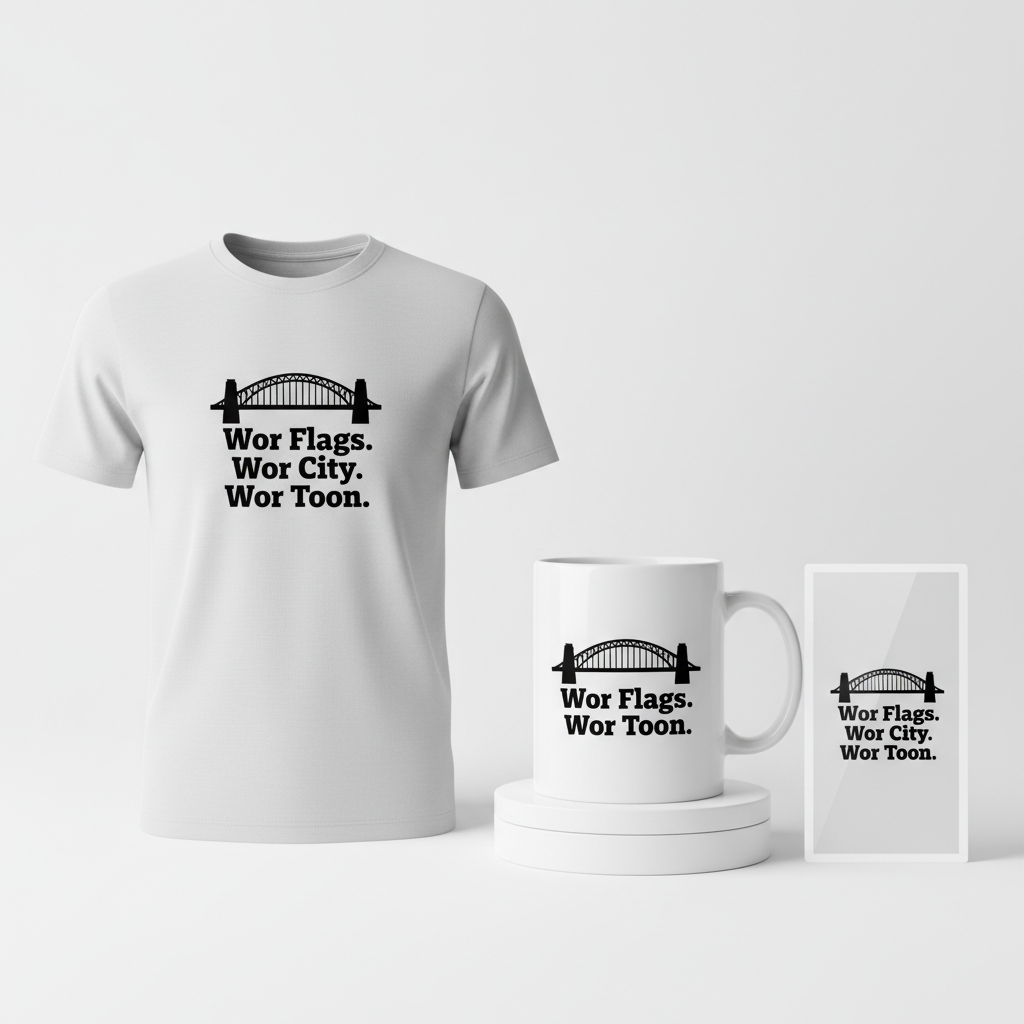
- 🎨 Visual Concept: Imagine a clean, minimalist, and distinctly retro-style design. At its heart, a stylized silhouette of the iconic Tyne Bridge stands proud. This landmark isn’t just a bridge; it’s a symbol of Newcastle itself, instantly recognizable to anyone with a connection to the city or the club. The simplicity allows for versatility and a classic appeal that won’t date quickly.
- ✍️ Typography Ideas: Below the bridge, bold, slightly distressed typography in a strong sans-serif font could proclaim, “Wor Flags. Wor City. Wor Toon.” This isn’t merely text; it’s a statement. ‘Wor’ is authentic Geordie slang for ‘our,’ and ‘Toon’ is the beloved local nickname for both the city and its club. This choice of text immediately signals an insider’s understanding, fostering a strong sense of belonging and community. The distressed effect lends a vintage, lived-in feel, enhancing the retro aesthetic.
- 👕 Product Canvas: Given the proposed black and white color palette, which offers stark contrast and timeless elegance, this concept would translate exceptionally well onto light-colored apparel. A white or light grey tee, for instance, would allow the black graphic and text to pop, ensuring maximum visibility and a clean, crisp look that appeals to a wide demographic.
Strategic Market Insight
The brilliance of this design concept lies in its strategic market targeting. By focusing on “Geordie Pride” rather than overtly mentioning football clubs, leagues, or even the sport itself, it cleverly sidesteps common copyright pitfalls while tapping into an incredibly loyal and passionate demographic: the ‘Toon Army.’ This approach pivots to a hyper-local, evergreen niche that celebrates regional identity. The use of ‘Wor’ and ‘Toon’ acts as an authentic shibboleth, immediately resonating with insiders and making the merchandise feel exclusive and meaningful. Purchasers aren’t just buying a shirt; they’re buying into a community, expressing a deeply held local pride and connection that transcends any single game. This psychological trigger—the desire for belonging and the celebration of identity—drives powerful purchasing decisions.
⚖️ Estimated Copyright Risk: LOW
Copyright Evaluation: The design avoids all trademarked terms like ‘Newcastle United’, ‘FC Barcelona’, and ‘Champions League’. Phrases like ‘Toon’ and ‘Wor’ are regional dialect. While the club has attempted to trademark ‘Howay the Lads’, this design uses different, more generic local slang. The Tyne Bridge is a public landmark, free to depict.
Always verify intellectual property rights before listing.
Check US Trademark Database (Justia) for “Newcastle – Barcelona” ➔
AI Image Generation Prompts
The following prompts are optimized for leading generators to produce production-ready assets:
👕 Apparel / T-Shirt Prompt
A clean, minimalist vector illustration, highly stylized and graphic, designed for a t-shirt print. The central motif is an iconic, abstract silhouette of the Tyne Bridge, rendered in solid black, with sharp, precise edges and no extraneous detail, embodying a retro-futuristic or 1960s graphic design aesthetic. The bridge's structure is simplified into bold geometric forms, creating a strong visual impact through high contrast. Below the bridge, the text "Wor Flags. Wor City. Wor Toon." is prominently displayed in a bold, sturdy sans-serif typeface, carefully integrated into the design. The typography features a very subtle, light distressed texture, as if lightly worn screen print, adding to the retro feel without compromising readability. The entire design is strictly two-tone: solid black shapes on a pure white background, creating a stark, impactful visual. The illustration maintains a flat, two-dimensional quality, resembling a crisp linocut or woodblock print, with absolute precision in its vector lines and solid color fills. There are no gradients, shadows, or complex textures; only pure black and white. This artwork is isolated on a solid light background, specifically optimized for screen printing or direct-to-garment apparel application, ensuring clean edges and a distinct, striking appearance on fabric. The aesthetic is reminiscent of vintage travel posters but adapted for a modern, minimalist sensibility, focusing on the powerful silhouette and compelling text. The visual mood is proud, timeless, and effortlessly cool. The ONLY text allowed in the image is exactly 'Wor Flags. Wor City. Wor Toon.'. Absolutely NO other names, words, or random letters. --ar 3:4 --v 6.0
🔍 Search this niche on:
☕ Drinkware / Mug Prompt
A duplicated side-by-side layout showing the exact same graphic on the left and right, designed perfectly for a panoramic mug wrap. The central design element, identically replicated, is a minimalist, retro-style graphic featuring a sharply defined silhouette of the iconic Tyne Bridge. This silhouette is rendered in solid black, with crisp, clean vector lines, embodying a sophisticated, timeless simplicity. Below the bridge, the text "Wor Flags. Wor City. Wor Toon." is displayed in a bold, strong sans-serif font. The typography has a subtle, light distressed effect, akin to a vintage screen print that has subtly aged, adding character without hindering readability. The entire design is strictly black and white, with the solid black graphic contrasting sharply against a pure white background, ensuring maximum impact and legibility on drinkware. The overall aesthetic is flat, graphic, and pop-art inspired, utilizing negative space effectively to highlight the bridge and text. The illustration style is reminiscent of simplified linocut prints or graphic design from the mid-20th century, focusing on strong shapes and high contrast. This dual graphic presentation ensures that the complete design is visible from multiple angles on a cylindrical surface, making it ideal for a coffee mug. The rendering should appear as a perfectly printed decal on a glossy white ceramic mug, showcasing the crispness of the lines and the subtle texture of the distressed text. The mood is classic, proud, and stylishly understated. The ONLY text allowed in the image is exactly 'Wor Flags. Wor City. Wor Toon.'. Absolutely NO other names, words, or random letters. --ar 3:1 --v 6.0
🔍 Search this niche on:
✨ Die-Cut Sticker Prompt
A highly stylized, 2D flat pop-art graphic optimized for a die-cut sticker, featuring a bold and iconic silhouette of the Tyne Bridge. The bridge is rendered in solid black, with ultra-crisp, sharp lines and simplified geometric forms, evoking a strong sense of retro design from the 1960s or 70s. Below this striking silhouette, the text "Wor Flags. Wor City. Wor Toon." is presented in a powerful, clean sans-serif font, carrying a very subtle, almost imperceptible, distressed texture to maintain a vintage, worn feel without sacrificing clarity. The entire design is strictly monochromatic: solid black elements on a pure white background, creating maximum visual contrast and impact. The distinctive feature is a thick, perfectly uniform white outline border that surrounds the entire combined design (bridge and text), creating a clear separation from any potential background and defining its die-cut shape. This border gives the sticker a distinct, bold, and collectible quality, enhancing its pop-art aesthetic. The illustration is completely flat, without any shadows, gradients, or complex textures, emphasizing the graphic nature and the strong, clean silhouette. It should look like a precisely cut vinyl sticker with a glossy finish, ready to be peeled and applied. The overall mood is cool, graphic, and timeless, suitable for a collectible item. The ONLY text allowed in the image is exactly 'Wor Flags. Wor City. Wor Toon.'. Absolutely NO other names, words, or random letters. --ar 1:1 --v 6.0
🔍 Search this niche on:
Frequently Asked Questions
Why avoid direct mentions of the club or specific match details in the design?
One strategic reason for this approach is to navigate intellectual property and trademark concerns. By using generic local slang (“Wor,” “Toon”) and a public landmark (Tyne Bridge silhouette), the design embraces a ‘Geordie Pride’ theme that is evergreen and inherently low-risk from a copyright perspective. It also broadens its appeal to those who appreciate the city’s culture beyond just football, ensuring a longer shelf-life for the design.
How would a design so specific to Newcastle resonate with a US audience?
The beauty of passionate fandom is its global reach. Many American football fans follow European leagues and develop strong affinities for clubs, often adopting their local culture. For ‘Toon Army’ members in the US, this design offers an authentic, insider way to express their allegiance and connection to Newcastle, even from afar. It provides a unique badge of honor that speaks directly to their chosen club’s roots and community, differentiating it from generic sports merchandise.
What makes this design “retro-style,” and what era does it evoke?
The “retro-style” in this context typically leans towards a mid-20th century aesthetic, perhaps reminiscent of vintage travel posters or classic sporting event designs. The use of a simple, bold silhouette, clean lines for the bridge, and slightly distressed sans-serif typography on a black and white palette contributes to this timeless, nostalgic feel. It suggests a classic, understated cool that stands apart from more modern, complex graphic styles.
Final Thoughts
The intersection of major sporting events and deep-rooted cultural identity presents a rich opportunity for print-on-demand entrepreneurs. By carefully crafting designs that speak to specific, passionate communities—like the ‘Toon Army’—and understanding the psychological drivers behind their purchases, creators can tap into powerful, evergreen niches. The Newcastle-Barcelona buzz is a perfect catalyst, but the lasting appeal comes from designs that celebrate local pride and belonging. Execution, as always, is key; a thoughtful blend of visual appeal, authentic messaging, and a dash of unique personality can turn a trending moment into a lasting e-commerce success.
💬 What’s Your Take?
Art is subjective, and this is just one angle! How would you spin this “Newcastle – Barcelona” trend? Did we miss the mark, or is there a better inside joke to use here? Drop your design ideas and let’s brainstorm in the comments below!