Polarlichter Deutschland (Northern Lights Germany) Merch Design
📍 Target Market: Germany
🔥 Trend: Polarlichter Deutschland (Northern Lights Germany) ↗
A rare celestial spectacle is on the horizon, captivating hearts and minds across Germany. Imagine the vibrant, ethereal glow of the Aurora Borealis, a phenomenon usually reserved for the high latitudes, gracing the skies above German landscapes. With forecasts hinting at a high probability of viewing the Northern Lights in March 2026, a quiet buzz is building, transforming a natural event into a highly anticipated cultural moment.
The Cultural Significance
The Northern Lights appearing over Germany is not merely a weather forecast; it’s a momentous occasion, stirring a deep sense of wonder and excitement. For many, it represents a once-in-a-lifetime opportunity to witness nature’s most stunning light show without traveling to Scandinavia or the Arctic Circle. This rarity elevates the event, turning it into a shared national experience. It taps into a primal human fascination with the cosmos, inspiring photographers to prepare their lenses, stargazers to mark their calendars, and nature enthusiasts to simply look up. The anticipation of this natural ballet against the German skyline creates a powerful emotional resonance, making it ripe for artistic interpretation and cultural celebration long before the actual event.
Design Brainstorm: Capturing the Aesthetic
Translating such a magnificent, fleeting phenomenon into a tangible design requires a thoughtful approach, balancing artistic vision with broad appeal. One compelling interpretation could lean into the mystical and timeless aspects of the aurora.
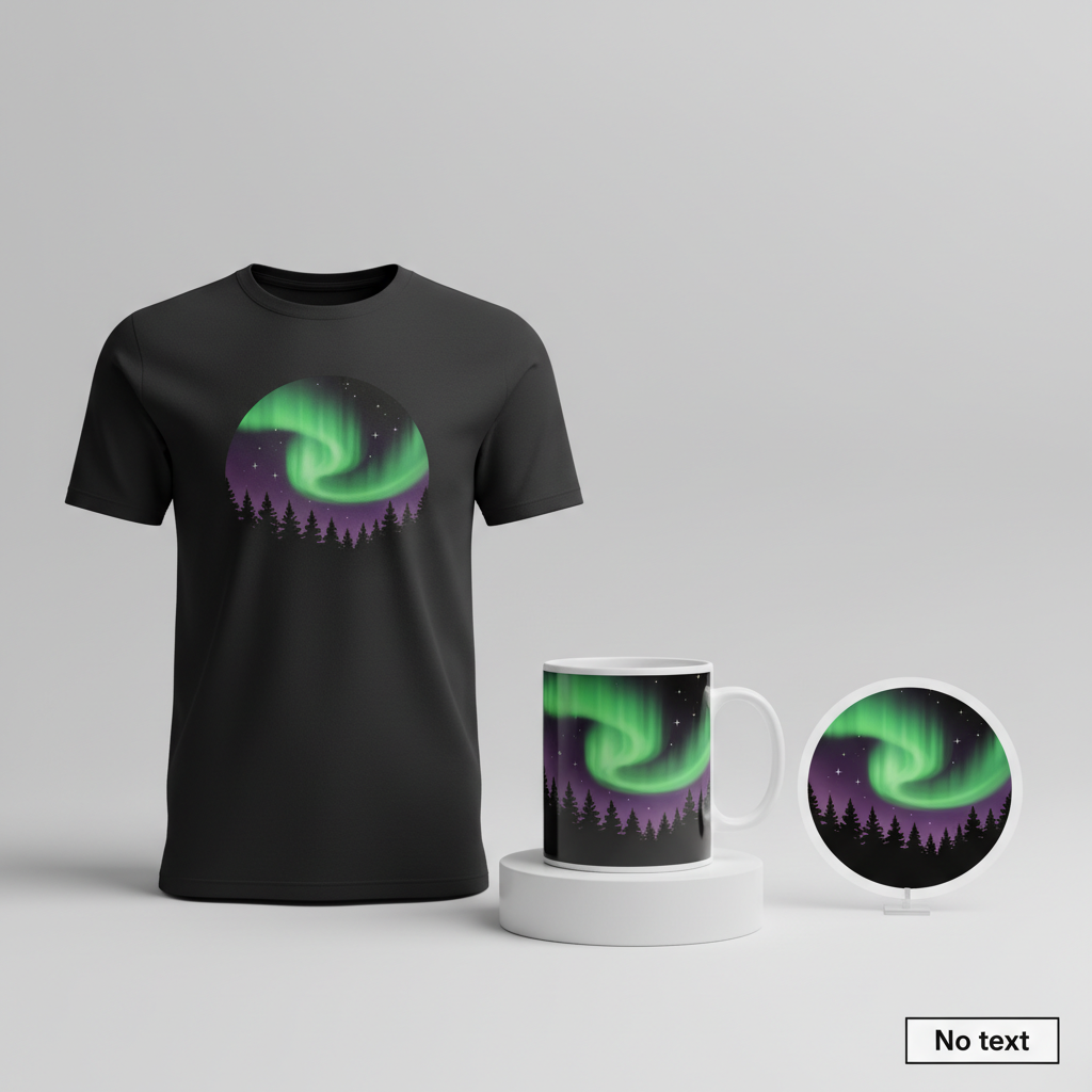
- 🎨 Visual Concept: Envision an artistic, stylized depiction of the Aurora Borealis. The design could feature graceful, flowing waves of vibrant green and purple light, reminiscent of the swirling patterns seen in the sky. To ground this celestial beauty, these aurora waves might hover above a dramatic silhouette of a dense pine forest, evoking the serene and often dark landscapes ideal for viewing. A fun way to spin the artistic style might be to infuse it with a groovy, flowing aesthetic inspired by 1970s art, adding a touch of retro charm and organic movement. A few simple, scattered stars in the sky would complete the cosmic scene, enhancing the sense of wonder.
- ✍️ Typography Ideas: For this concept, a strategic decision is to include no text at all. While specific dates or locations like ‘Deutschland 2026’ might seem tempting, omitting any text offers significant advantages. It transforms the design from a temporary news event into an evergreen, artistic representation of the aurora borealis itself. This broadens its appeal globally, allowing anyone captivated by celestial phenomena to connect with it, regardless of their location or knowledge of the 2026 forecast. It becomes a universal symbol of natural beauty, giving the merchandise a much longer sales life and avoiding any language barriers or potential text-based bot rejections. The focus remains purely on aesthetics and the profound visual impact.
- 👕 Product Canvas: Given the vibrant greens and purples of the aurora against a dark forest silhouette, ideal apparel choices would undoubtedly be dark-colored items. Think deep navy blue, charcoal gray, or classic black t-shirts, hoodies, and long-sleeved tops. The intensity of the aurora’s colors would truly pop against such a backdrop, creating a striking and sophisticated look that highlights the celestial magic.
Strategic Market Insight
Targeting the demographic of nature lovers, stargazers, and photographers for this design taps into a deeply passionate and appreciative audience. These individuals are inherently drawn to the beauty and grandeur of the natural world, particularly rare celestial events. The psychological trigger here isn’t just about celebrating the 2026 forecast; it’s about owning a piece of that wonder, a subtle nod to a shared natural aspiration. For many, it’s a way to express their fascination with the cosmos, perhaps even to commemorate a future experience or a deep appreciation for Earth’s natural artistry. By creating a text-free, purely graphical representation of the aurora over a forest, the design pivots from a temporary news item into an evergreen, artistic statement. This allows it to resonate with anyone globally who loves the Northern Lights, far beyond the initial buzz of the German forecast. It becomes a universally appealing motif, extending its sales longevity and market reach significantly.
⚖️ Estimated Copyright Risk: LOW
Risk Assessment: The design depicts a natural phenomenon, the Northern Lights, which cannot be copyrighted. The artistic representation is original and does not use any third-party assets, logos, or protected text. This makes it entirely safe from any intellectual property claims.
Always verify intellectual property rights before listing.
Check EU Trademark Search for “Polarlichter Deutschland” ➔
AI Image Generation Prompts
The following prompts are optimized for leading generators to produce production-ready assets:
👕 Apparel / T-Shirt Prompt
A highly detailed, clean vector illustration style, optimized for screen printing on a dark apparel garment. The central motif is a stylized, groovy 1970s art depiction of the aurora borealis, rendered with exceptional fluidity and precision. The aurora manifests as sweeping, organic, and undulating waves, forming psychedelic ribbons of luminous light, predominantly in vibrant, electric emerald green and rich, deep amethyst purple, seamlessly blending with subtle accents of shimmering teal and indigo at their edges. These flowing streaks are characterized by smooth, clean bezier curves and perfectly executed linear gradients within each distinct shape, creating an ethereal glow that evokes a lava lamp aesthetic rather than photorealism. Below the celestial display, a dense pine forest is presented as a striking, sharp, and uniformly dark silhouette, exhibiting crisp, defined edges against the radiant sky. The pine trees are tall, majestic, and uniformly pointed, maintaining a simplified, iconic, and graphic quality typical of retro poster art. A scattering of a few simple, four-pointed geometric star shapes are sparsely and intentionally placed in the upper expanse of the night sky, acting as minimalist, glowing accents. The entire design is meticulously isolated on a solid, deep charcoal black background, ensuring maximum contrast and visual impact suitable for a t-shirt print. The illustration employs a sophisticated flat graphic rendering technique, embodying a powerful retro-futuristic aesthetic with bold, clear outlines and profoundly simplified, yet expressive, forms. The texture is smooth, without grain or noise. The lighting is inherent to the luminous aurora shapes. The mood is mystical, nostalgic, subtly psychedelic, and captivatingly serene. The artwork is designed to be infinitely scalable and production-ready for high-quality printing. The ONLY text allowed in the image is exactly 'No text'. Absolutely NO other names, words, or random letters. --ar 3:4 --v 6.0
🔍 Search this niche on:
☕ Drinkware / Mug Prompt
A highly detailed graphic illustration, meticulously designed for a panoramic coffee mug wrap, presented as a duplicated side-by-side layout showing the exact identical graphic on the left and right panels. The artwork depicts a stylized, artistic representation of the aurora borealis flowing gracefully above a dense pine forest silhouette, imbued with a distinctly groovy 1970s aesthetic. The aurora is rendered as expansive, sweeping, and dynamic waves of luminous energy, predominantly in vibrant, almost electric emerald green and rich, opulent amethyst purple, subtly streaked with deep indigo and shimmering teal. The style draws heavily from 1970s psychedelic art, characterized by organic, fluid lines and exaggerated, flowing curves reminiscent of lava lamps and retro poster art. The light has a smooth, almost liquid quality, achieved through exquisite, soft, and continuous gradients that blend the vibrant colors seamlessly across the horizontal expanse. Below the captivating celestial display, a silhouette of a dense pine forest creates a continuous, stark, and dark horizon line, with tall, stylized pine trees that maintain a strong, graphic presence. A scattering of a few simple, understated star shapes are subtly visible within the upper celestial part of the aurora, adding a touch of cosmic wonder. The rendering is a sophisticated flat graphic illustration, enhanced with a radiant, luminous glow effect emanating from the aurora, ensuring exceptional clarity, visual depth, and immediate 'pop' when viewed on a cylindrical surface. The overall mood is cosmic, deeply serene, and enchantingly retro-futuristic, meticulously crafted to create an immersive, continuous wrap-around experience. The texture is flawlessly smooth, entirely devoid of grain, and perfectly optimized for high-fidelity digital printing on ceramic drinkware. The lighting is conceptual, originating from the internal luminosity of the aurora itself, creating a soft, expansive, and even glow across the entire design. The duplicated layout must be perfectly identical side-by-side, ensuring a harmonious and seamless panoramic effect for the mug wrap application. The ONLY text allowed in the image is exactly 'No text'. Absolutely NO other names, words, or random letters. --ar 3:1 --v 6.0
🔍 Search this niche on:
✨ Die-Cut Sticker Prompt
A highly detailed, vibrant 2D flat pop-art style illustration, meticulously designed for a die-cut sticker. The central imagery features a stylized, artistic depiction of dynamic green and purple aurora borealis waves majestically flowing above a sharp silhouette of a dense pine forest. The aurora is rendered with bold, thick, and organic flowing shapes, utilizing a palette of electric lime green, vibrant fuchsia purple, and deep indigo teal. Each color segment is a distinct, flat color fill, with very subtle, strong linear gradients or flat shading within shapes to suggest depth without breaking the 2D aesthetic, giving it a playful 1970s psychedelic poster vibe. The dense pine forest below is presented as a solid, stark, uniformly dark silhouette, featuring simplified, angular, and iconic tree forms at its base, creating a strong contrast against the vibrant sky. A scattering of a few simple, graphic, bright white five-pointed geometric stars are sparsely placed in the upper celestial section, serving as bright accents. The entire vibrant design is encircled by a prominent, thick, clean white outline border, which is crucial for defining the precise die-cut shape of the sticker. The overall aesthetic is heavily inspired by groovy 1970s pop art and vintage poster design, characterized by high contrast, graphic boldness, and an undeniably playful, retro feel. The rendering is exceptionally crisp and sharp, mimicking the precision of a high-quality silkscreen print on vinyl. The texture is envisioned as perfectly smooth and glossy, reflecting light as a premium vinyl sticker would. The lighting is conceptual, bright, and evenly distributed, designed to intensely highlight the bold, saturated colors and immaculate, clean outlines. The mood is energetic, nostalgically cheerful, and visually striking, making for an iconic, memorable small graphic item. The illustration is optimized for perfect symmetry and iconic readability within a square format. The ONLY text allowed in the image is exactly 'No text'. Absolutely NO other names, words, or random letters. --ar 1:1 --v 6.0
🔍 Search this niche on:
Frequently Asked Questions
Why might a text-free design be more effective, even with a specific trending event like Polarlichter Deutschland 2026?
While specific event text can generate immediate hype, a purely graphical design like this concept offers immense longevity and global appeal. By omitting “Deutschland 2026,” the merchandise transcends a single time and place, becoming a universal emblem of the Northern Lights. This allows it to resonate with anyone passionate about celestial beauty worldwide, significantly broadening its potential market beyond the initial German audience and extending its sales life far past 2026.
How does the suggested 1970s groovy art style enhance an Aurora Borealis design?
The groovy 1970s art style, with its emphasis on flowing lines, organic shapes, and vibrant color blending, can beautifully capture the ethereal, dynamic movement of the aurora. It lends a mystical, almost psychedelic quality to the design, evoking the awe and wonder of the phenomenon in a unique, retro-inspired way. This artistic choice can make the design stand out, offering a fresh take on a popular natural subject that feels both timeless and stylish.
Beyond apparel, what other product categories could successfully carry this Polarlichter-inspired design?
Thanks to its evergreen, text-free, and artistic nature, this design could translate beautifully across a wide range of products. Consider home decor items like wall art, throw pillows, and tapestries to bring celestial beauty indoors. Accessories such as phone cases, tote bags, and even stationery could offer smaller, portable ways to express this appreciation. Its visually striking character makes it highly adaptable, allowing it to appeal to a broad spectrum of buyers seeking to infuse their lives with natural wonder.
Final Thoughts
The anticipation surrounding the potential appearance of the Northern Lights over Germany in 2026 presents a fascinating opportunity for e-commerce. By blending this specific cultural moment with an evergreen, artistically driven design, the potential for sustained sales is considerable. This interpretation, focusing on the universal magic of the aurora and leveraging a timeless aesthetic, demonstrates how thoughtful design choices can transform a timely trend into a long-lasting favorite. Ultimately, success in this niche will hinge on capturing the essence of wonder and executing designs that resonate deeply with those who gaze upon the night sky with awe.
💬 What’s Your Take?
Art is subjective, and this is just one angle! How would you spin this “Polarlichter Deutschland (Northern Lights Germany)” trend? Did we miss the mark, or is there a better inside joke to use here? Drop your design ideas and let’s brainstorm in the comments below!