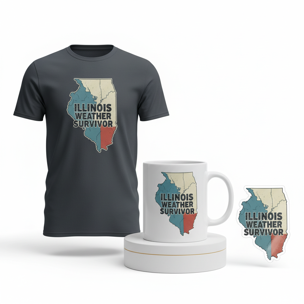
ILLINOIS WEATHER SURVIVOR
From the bustling streets of Chicago to the quiet farmlands of Illinois and Northwest Indiana, a different kind of buzz has been dominating conversations and headlines lately: the raw power of nature. Recent days have seen a dramatic display across the Great Lakes region, with suspected tornadoes and severe thunderstorms unleashing baseball-sized hail and leaving a trail of significant damage. This intense period has not only been a challenge for residents but has also cemented severe weather as a top trending topic across the United States, sparking a unique blend of community discussion and resilient local pride.
The Cultural Significance
In regions like the Midwest, weather isn’t just a forecast; it’s a profound part of the local identity. The dramatic events, from swirling storms to golf ball-sized hail, become shared experiences, forging a deep-seated resilience and a unique brand of humor. For many Illinois and Chicago residents, navigating extreme weather is a rite of passage, a testament to their fortitude. This shared narrative creates a powerful undercurrent of local pride, where overcoming nature’s challenges isn’t just about survival, but about standing strong together. The collective recounting of “weather tales” becomes a bonding experience, making any representation of this shared experience instantly relatable and resonant.
Design Brainstorm: Capturing the Aesthetic
Translating such a culturally significant event into a compelling design requires a thoughtful approach, balancing impact with respect and market strategy. One angle to consider focuses on celebrating local resilience rather than depicting specific events, ensuring evergreen appeal and policy compliance.
- 🎨 Visual Concept: The core visual could be a stylized, retro-style weather map, specifically highlighting the Great Lakes region with Illinois subtly emphasized. This aesthetic evokes a sense of nostalgia, making the design feel timeless and less tied to a single, recent event. The color palette could lean into faded blues and off-whites, creating a vintage, subdued feel, with a single, strategic pop of red accenting the highlighted state. Crucially, the design would steer clear of any literal depictions of tornadoes or damage, maintaining a focus on the broader theme of weather rather than specific tragedy.
- ✍️ Typography Ideas: To complement the retro map, a distressed, bold sans-serif font reminiscent of the 1970s could be used. This style adds character and a lived-in feel, perfectly aligning with the “survivor” theme. The design text, “ILLINOIS WEATHER SURVIVOR,” functions as a powerful, yet safely generalized, statement of local pride and resilience. This phrase is a common trope, sidestepping specific dates or disaster imagery, thus becoming a year-round sentiment that celebrates the enduring spirit of the community.
- 👕 Product Canvas: Given the proposed color palette and distressed aesthetic, this design could translate well onto dark apparel. A deep charcoal, navy, or classic black garment would allow the faded blues and off-whites to pop subtly, enhancing the vintage appeal while providing a strong, enduring base for the graphic.
Strategic Market Insight
Targeting the demographic of proud Illinois and Chicago residents accustomed to extreme weather taps into a potent sense of local identity. The psychological trigger here is multi-faceted: it’s about acknowledging a shared experience, celebrating resilience, and expressing pride in one’s home. The phrase “Weather Survivor” acts as a badge of honor, resonating with anyone who has lived through the region’s unpredictable climate. By pivoting away from the specific, sensitive details of recent events and focusing on an evergreen ‘Local Pride’ and resilience angle, the design smartly navigates Amazon’s policies against profiting from disasters. This approach ensures the merchandise is not only culturally relevant but also enduring, making it a viable purchase year-round, connecting with a deep-seated community sentiment rather than fleeting news cycles. The careful avoidance of specific dates, disaster images, or restricted keywords further future-proofs the design for a broader market.
⚖️ Estimated Copyright Risk: LOW
Our Findings: The design uses a generic map outline and a common, non-trademarked phrase. It does not reference any specific event, organization, or copyrighted work, making it a broad concept of regional resilience.
Always verify intellectual property rights before listing.
Check US Trademark Database (Justia) for “Weather” ➔
AI Image Generation Prompts
The following prompts are optimized for leading generators to produce production-ready assets:
👕 Apparel / T-Shirt Prompt
A highly detailed clean vector illustration, optimized for a t-shirt print, depicting a stylized retro-style weather map of the Great Lakes region. The map features simplified, geometric representations of landmasses and bodies of water rendered in a distinct 1970s aesthetic, utilizing a restrained color palette of faded, muted blues and subtle off-whites. Illinois is subtly but clearly highlighted with a single, desaturated red accent, drawing attention without dominating the design. The illustration employs bold, unwavering outlines and flat, solid color fills, emulating a classic screen-printed look. Textural elements are finely integrated: the map background may feature a very subtle vintage paper or canvas texture overlay, and the states might have a faint halftone dot pattern for added retro charm, ensuring clarity for print. The typography 'ILLINOIS WEATHER SURVIVOR' is centrally integrated into the map design, rendered in a distressed, bold sans-serif font characteristic of the 1970s, showcasing deliberate, subtle imperfections to enhance its aged appeal. The overall mood is nostalgic, resilient, and graphic. The composition is balanced and self-contained, isolated on a solid Dark background, with ample negative space around the design for apparel application. The ONLY text allowed in the image is exactly 'ILLINOIS WEATHER SURVIVOR'. Absolutely NO other names, words, or random letters. --ar 3:4 --v 6.0
🔍 Search this niche on:
☕ Drinkware / Mug Prompt
A duplicated side-by-side layout showing the exact same graphic on the left and right, designed perfectly for a panoramic mug wrap. Each instance of the graphic is a highly detailed, flat graphic design of a stylized retro-style weather map of the Great Lakes region, capturing a vibrant yet aged 1970s aesthetic. The map's geographical features, including state borders and lake contours, are rendered with smooth, clean lines and distinct, solid color blocks in a palette of faded blues and off-whites. Illinois is precisely and subtly highlighted using a singular, muted red accent color, providing visual focus without overwhelming the vintage tone. The overall rendering emphasizes a printed quality, with a very fine, almost imperceptible screen print texture or a delicate aged paper overlay integrated into the design to enhance its retro authenticity. The text 'ILLINOIS WEATHER SURVIVOR' is prominently featured within the map's composition, styled in a bold, distressed sans-serif typeface from the 1970s, showcasing its characteristic worn look. No dynamic weather phenomena or damage are depicted; the focus is solely on the static, stylized map. The duplicated graphics are identical in all aspects, including color fidelity, textual distress, and composition, ensuring a seamless visual wrap around a mug. The ONLY text allowed in the image is exactly 'ILLINOIS WEATHER SURVIVOR'. Absolutely NO other names, words, or random letters. --ar 3:1 --v 6.0
🔍 Search this niche on:
✨ Die-Cut Sticker Prompt
A highly detailed, vibrant 2D flat pop-art style illustration, optimized for a die-cut sticker, depicting a stylized retro-style weather map of the Great Lakes region. The design features iconic, simplified geographical shapes of states and lakes, rendered with ultra-crisp edges and bold, opaque color fields. The primary color palette consists of faded blues and off-whites, creating a distinct 1970s visual identity. Illinois is precisely and subtly highlighted with a clean, single accent of muted red, offering a focused pop of color. The artwork exhibits minimal shading and strong graphical impact, typical of pop-art and vintage poster design. The text 'ILLINOIS WEATHER SURVIVOR' is integrated prominently, executed in a bold, distressed sans-serif font from the 1970s, with slight, intentional textural imperfections to convey an authentic retro feel without compromising legibility. The entire self-contained design, including the map and text, is encapsulated by a thick, clean white outline border, clearly defining the die-cut perimeter of the sticker. The overall mood is nostalgic, graphic, and resilient, presented in a high-contrast, eye-catching format. The final rendering should suggest a smooth, glossy surface quality inherent to a high-quality sticker, while the artwork within maintains its flat, printed texture. The ONLY text allowed in the image is exactly 'ILLINOIS WEATHER SURVIVOR'. Absolutely NO other names, words, or random letters. --ar 1:1 --v 6.0
🔍 Search this niche on:
Frequently Asked Questions
Why focus on Illinois for a ‘weather survivor’ theme?
The recent severe weather events, including suspected tornadoes and significant hail, have made Illinois and the Great Lakes region a focal point of current news and local conversation. This direct relevance creates an immediate connection with residents, tapping into their shared experience and strong local pride, making it an ideal, timely, yet evergreen target for this specific ‘survivor’ narrative.
How does this design navigate sensitivities around severe weather events and platform policies?
This concept is carefully crafted to pivot from specific tragedies to a broader theme of local resilience. By using the generic, widely understood trope “Weather Survivor” and a retro, stylized map without specific dates or images of damage, it avoids directly referencing current events or profiting from a disaster. This allows it to celebrate community strength safely and respectfully, aligning with platform policies while retaining cultural relevance.
What’s the appeal of a retro-style weather map for this concept?
A retro-style weather map offers several advantages. It provides a timeless, artistic aesthetic that feels less like breaking news and more like a classic tribute. This vintage appeal can evoke a sense of nostalgia and enduring regional identity. It also allows for a creative, stylized representation of geography rather than a literal, possibly unsettling, depiction of a severe weather event, making the design broadly appealing and visually interesting without being overtly somber.
Final Thoughts
The confluence of current events and deep-rooted regional identity presents a compelling opportunity for print-on-demand designers. By thoughtfully interpreting the trend of severe weather in the Midwest through a lens of local pride and resilience, rather than specific disaster, concepts like the “ILLINOIS WEATHER SURVIVOR” design can carve out a meaningful niche. The key, as always, lies in the execution – ensuring the retro aesthetic, typographic choices, and overall message resonate authentically with the target audience. With creativity and strategic insight, leveraging these cultural touchpoints can transform trending topics into enduring, popular merchandise.
💬 What’s Your Take?
Art is subjective, and this is just one angle! How would you spin this “Weather” trend? Did we miss the mark, or is there a better inside joke to use here? Drop your design ideas and let’s brainstorm in the comments below!